Felicia Simion is a 21-year-old photographer and retoucher from Romania. She began taking photos at the age of 13, when she received a Canon 400D as a birthday gift from her family. Since then, she has experimented with various fields, such as portraiture, street, macro, photo-manipulation.
Felicia has been awarded in photography competitions such as: Travel Photographer of the Year, Sony World Photography Awards, Paris PX3, IPA Awards, Moscow International Foto Awards.
To see more of her work, follow her on 500px, visit her website, or show her some love on Facebook and Instagram.

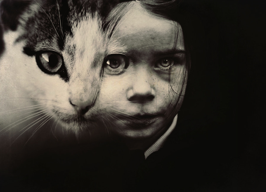
For this fun Halloween-themed tutorial, we asked talented 500pxer Felicia Simion to explain how she created her creepy “Morphosis” photograph, a tribute to the iconic self-portrait by Wanda Wulz.
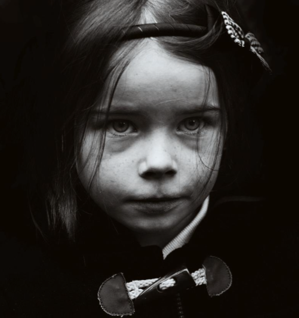
The photo was created by merging the two photos below… we’ll let Felicia take it from here!

First, I cropped the image of the little girl, and turned it into black and white (Reds: -18, Yellows: 114, Greens: 40, Cyans: 60, Blues: 20, Magentas: 80), then I adjusted the Brightness and Contrast (Brightness: +30, Contrast: +75).
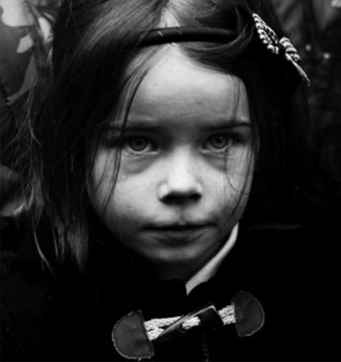
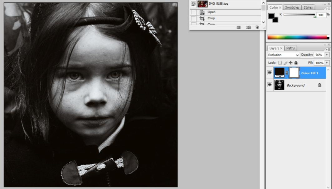
The next step was to add a Color Fill Layer (Layer->New Fill Layer->Solid Color), choosing a brown tone (on the Exclusion mode) to create a sepia effect.
What I wanted now was to get rid of the background and other elements that may distract us from the portrait. I did this by using the Brush Tool on the Background layer, coloring in black (Opacity 85%) what I wanted to erase from the picture.
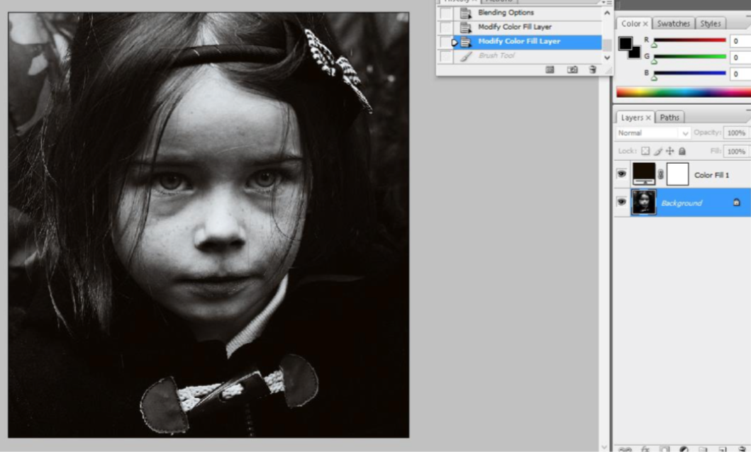
This was the result:
I gave the image a landscape orientation by adding a Black Canvas (it is up to you to choose the width, depending on the photo dimensions).
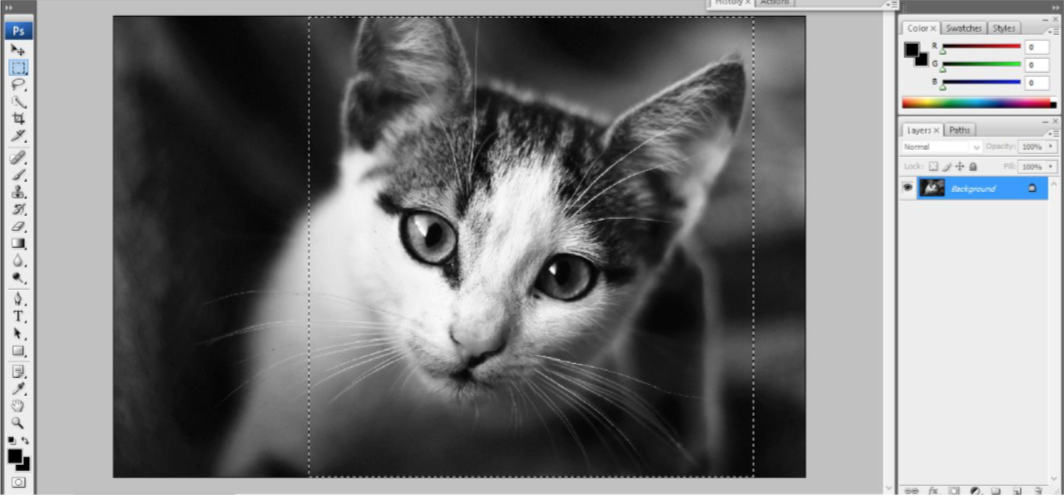
Then I blended the two photos. For this, I selected the cat’s face with the Rectangular Marquee Tool and then Pasted it as a new layer on the little girl’s portrait.
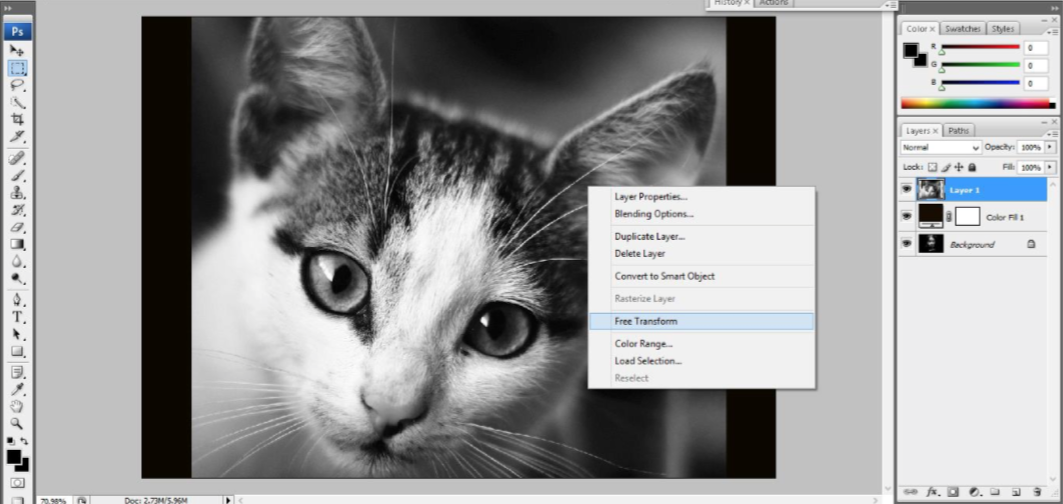
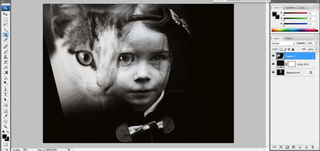
Afterwards, I used the Free Transform tool (right click on the image, then choose Free Transform) to adjust the dimensions of the new layer and I also inclined it until it blended right onto the portrait.
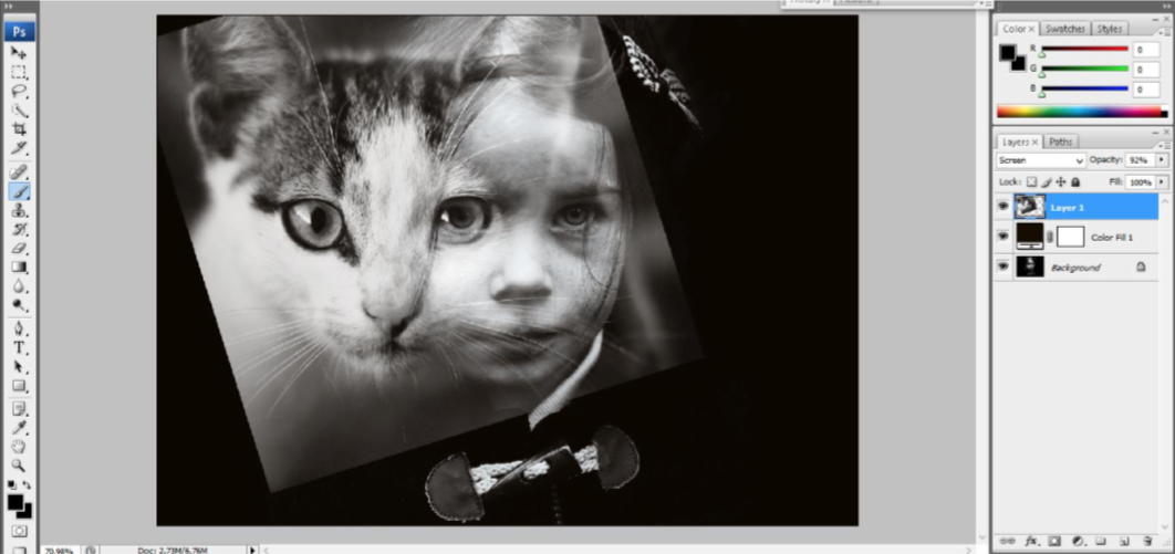
I made the adjustments on the Screen mode (right click on the cat layer, then Blending Options where we choose the Screen Blend Mode on full opacity). Then I got rid of the extra background from the cat photo, using a black Brush tool on Normal mode, with opacity 100%, painting around the areas I wanted to remove.
The next step was to crop the whole photo, to give better impact to both the expressions.
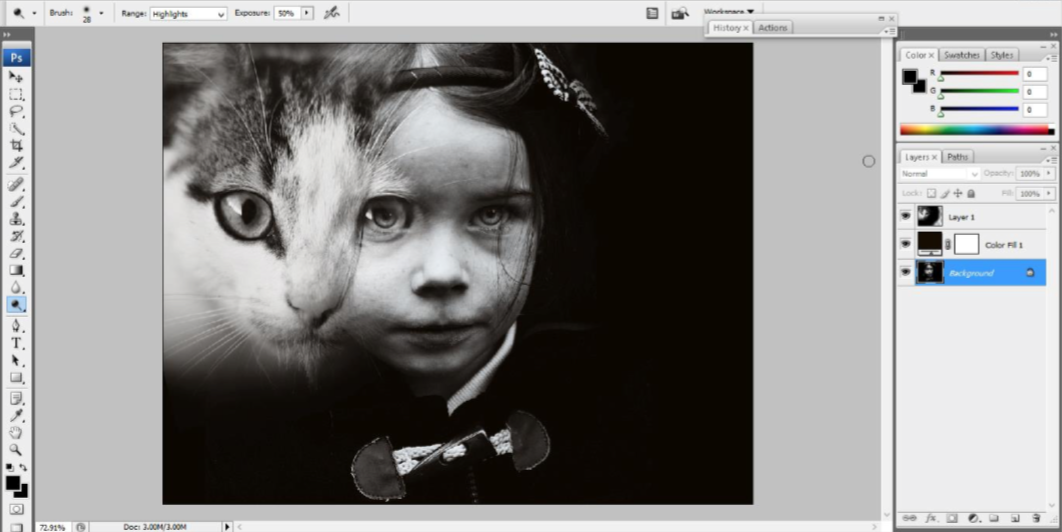
I emphasized the little girl’s eyes using the Dodge tool on Highlight Mode, Opacity 50%, adding a spooky touch.
Next I painted on the background layer with a black brush to remove other distractive elements—this is what I did with the girl’s blouse and ribbon.
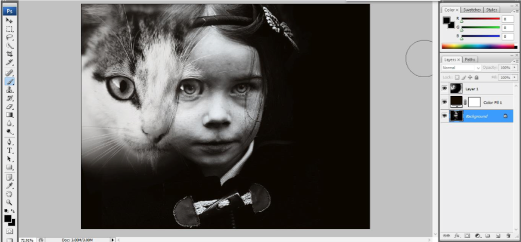
The next step was to crop the image a little further, for a deeper effect into the atmosphere.
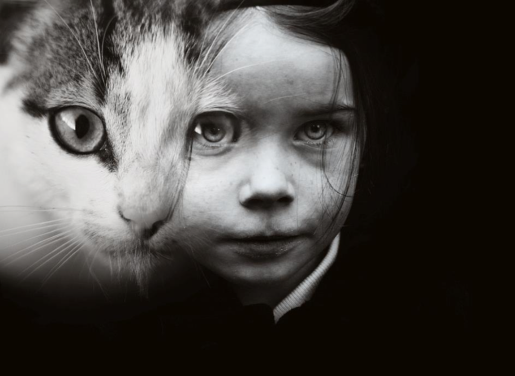
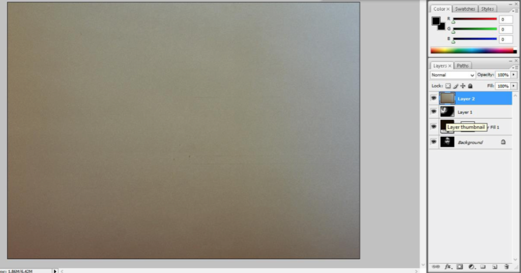
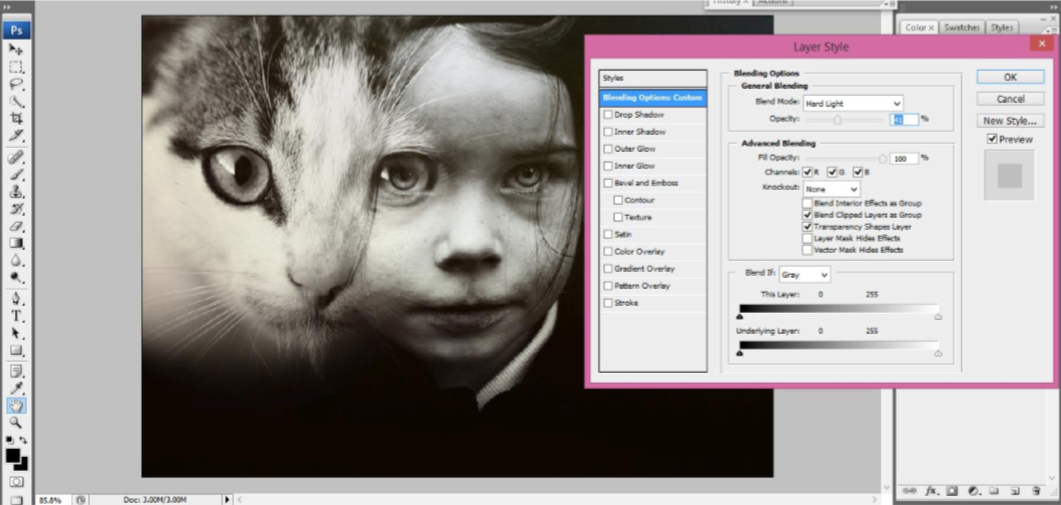
To make the image look more vintage, I added a film texture on the Hard Light mode, around 40% opacity.
The result:
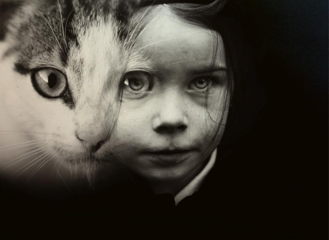
For the last steps, I played with the Brightness and Contrast. I wanted a darker mood, so I lowered the brightness by 30. Then, to emphasize the skin, I used the Dodge tool on the Highlight mode again, as before.
I chose an orange sepia tone by adding a solid Gradient Map Layer (Layer->New Adjustment Layer- >Gradient Map) in duo tone—black and neutral. The blending mode here was Multiply, and the opacity was somewhere around 60%.
Here is the final image again, a tribute to the photographer Wanda Wulz:
