There are many reasons why Photoshop has so far managed to hold its ground as the undisputed king of the image processing world. One of the primary reasons is that it keeps evolving every year, as it has for thirty-one years. It stays up to date in two main ways. First, it improves upon existing features like selection and healing tools. And second, it keeps coming out with new features every year or two. One of the key new features this year – and also one of the most anticipated – is a sky replacement option. Let me demonstrate in this article how to use the new sky replacement feature and how effective it is.
Sky Replacement
Despite all the hype around the sky replacement feature, I was skeptical about it initially. Through the years, I have come across many tools in Photoshop and other software that sounded great on paper but did not work as expected. Nevertheless, the sky replacement tool proved me wrong.
Replacing a sky might trigger an ethical debate. So I guess it is best to leave it to personal choice. In my opinion, replacing a sky that you did not see in the first place is unethical. But as always, photography is an art form, and no one gets to point fingers at an artist’s choices.
Also, contrary to what you might think, it is also possible to use the sky replacement feature without triggering an ethical debate. For example, there are many situations where I go for a different exposure and white balance setting for the sky compared to the foreground. Previously, it could have taken a long time with layer masks or blend if to get a seamless result. But with the sky replacement feature, it gets a lot easier and faster.
So, let me take you through a step-by-step process of replacing the sky effectively using Photoshop’s sky replacement option using the image below:
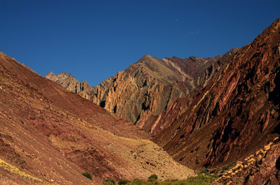
With the image opened in Photoshop, simply go to the top menu option “Edit > Sky Replacement” and a new window pops up, as you can see below:
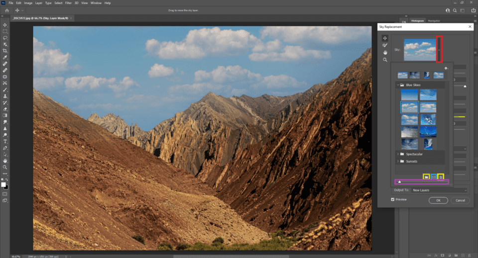
Sky Replacement Window
When you click on the dropdown option, Photoshop lets you choose a new sky for the image. There are three sources available for use as a new sky: a pre-installed sky in Photoshop, an image from your local hard drive, or an image from Adobe Stock if you’re subscribed to it.
You can also group the skies by type – as you can see in the image above, some of the defaults are “blue skies,” “spectacular,” and “sunsets.” You can create custom groups by clicking on the folder icon (shown in the image above with a lime green box around it). You can also add a sky from your hard drive with the browse icon (directly next to it, with a blue box around it in the image above). The trashcan icon that follows is to remove a sky from the list. And then the purple slider is just a basic way to change the size of the sky’s thumbnail preview.
The moment you click on a sky, you could see that the sky will be automatically applied to your selected image. The rendering is unbelievably seamless, and even adjusts the foreground colors to match the chosen sky. I have worked on manually blending composites before, and I know how long it can take to get a similar result to what you see below.
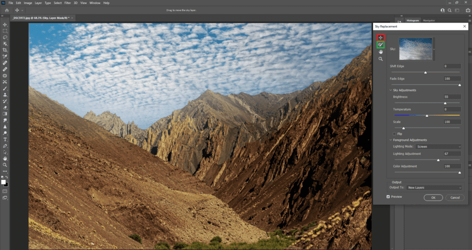
The sky replacement feature is AI-based but allows a good degree of customization. Let me take you through some of the most useful customizations one by one.
First, depending upon how much of your frame is filled with your foreground, you might want to reposition the sky to match the foreground. Make sure the “move” icon is clicked (marked red in the screenshot above). Then click on the sky and drag it to the position you prefer.
The sky replacement AI works by selecting and masking your foreground. It works great most of the time, but if you feel that the selection isn’t as it should be, you can use the sky brush option (marked green). After you’ve selected it, click/drag on any area of the sky you wish to add to the mask, or click/drag while pressing the Alt/Option button to remove from the mask. This will allow you to fine-tune Photoshop’s automatic foreground selection if it doesn’t look quite right.
Even if the blend looks seamless, always make a habit of zooming into 100% and looking at the edges. In some cases, there might be a halo around the extreme edges or part of the foreground that Photoshop missed, which is where the sky brush tool comes in handy.
Blending Foreground and Sky
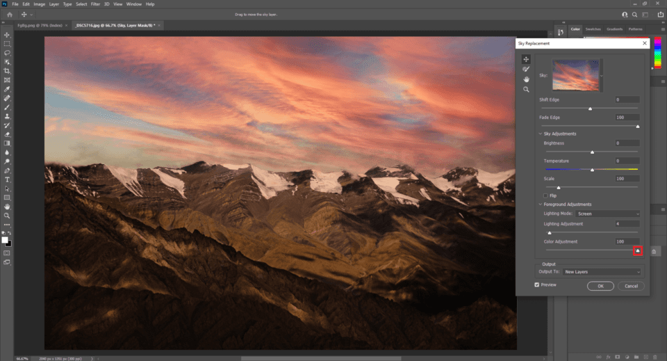
Getting a seamless blend is the main challenge, as is true of most compositing in Photoshop. If done improperly, it will be pretty obvious to a trained eye that the sky is copy-pasted from elsewhere. That’s why Photoshop has foreground and sky customization options with a series of sliders.
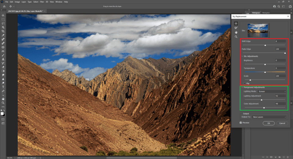
Most of the options are self-explanatory and can be optimized quickly with some trial and error. You can adjust the masking between the sky and foreground with the “shift edge” and “fade edge” sliders. You can adjust the tones in the sky with “brightness” and “temperature,” and how large it is with the “scale” slider (though going too high here will reduce the sky’s resolution). You can also flip the sky horizontally if you so choose.
And then the foreground adjustments are useful in cases where it is not possible to get a seamless appearance by adjusting the sky alone. The more different the conditions were between foreground and sky, the more editing you may need to do here.
These sliders are also pretty intuitive and easy to use in practice – just slide them until you like how the photo looks – but I will make a quick note about the “lighting mode” dropdown. It has only two options: Multiply and Screen. To put it simply, Multiply darkens the area where the foreground blends with the background, whereas Screen brightens the areas where the foreground and background overlap. The intensity by which the blend area needs to be brightened or darkened can be adjusted using the Lighting adjustment slider.
Your goal with the sky replacement tool should be to make the transition from sky to foreground look as seamless as possible. You can do further editing later to the hues and contrast of the image, so long as you’re starting from a good base.
Outputting the Sky Replacement
The last option shown is the Output tab. This gives us a couple options: “Duplicate Layer” and “New Layers.” If you select “Duplicate Layer,” Photoshop flattens all these edits into a single layer, which it places above the layer you’ve been working on. On the other hand, if you select “New Layers” instead, Photoshop outputs each component of the sky replacement as its own layer. For example, you may end up with a “Sky” layer, a “Foreground Lighting” layer, and a “Foreground Color” layer, all of which are automatically created by Photoshop.
While the end result looks the same regardless of which output you choose, it’s always best to go with the “New Layers” selection if possible, because it lets you go back and re-adjust any edits rather than baking them into one layer. However, it does increase the image’s file size if you don’t flatten the layers later.
Here is what your layers will look like in Photoshop if you’ve selected “New Layers” and clicked ok:
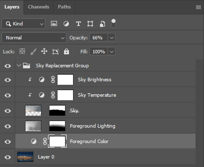
In the illustration above, notice how Photoshop has created individual layers for every slider in the Sky Adjustment and Foreground Adjustment tabs. You can edit the properties of each of these layers by double clicking on it, just like any other adjustment layer in Photoshop.
Here’s a diagram showing the original slider that created each layer (on the left) and the adjustment that opens when you double click the layer (on the right):
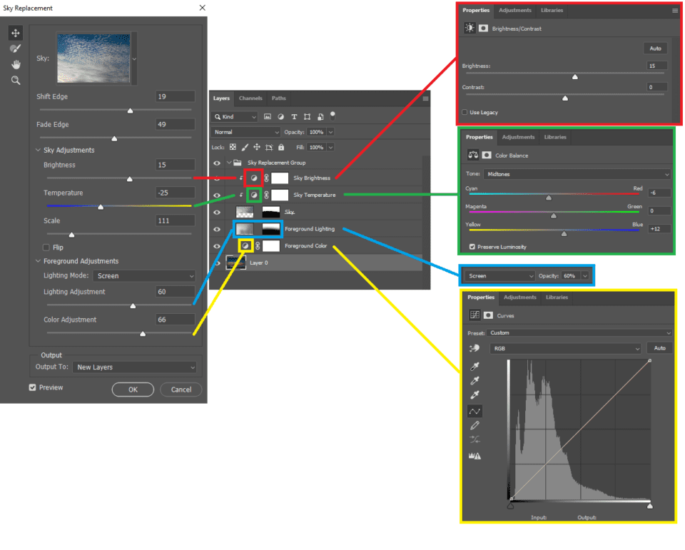
You can also change the masks that Photoshop created on layers like Foreground Lighting and Sky, should you so choose. And you can also change the opacity of each layer, or the whole group, in order to tone down any particular effect.
Conclusion
In this article, I have explained sky replacement, one of Photoshop’s most anticipated new features this year, including how to use it for the best results. I personally find it very useful. It might not be a one-click solution for all scenarios. But sure does make blending a lot easier, whether you’re after an easier method of blending an HDR or a full-on swapping the sky for a composite image. You may be surprised at how often it’s useful even for standard sky edits, so don’t avoid it just because you’re averse to full-on sky replacement.
If you have any questions about how this tool in Photoshop works, let me know in the comments below. Happy clicking and blending!