
When Fujifilm announced the X-S10 near the end of 2020, many thought that it might be the end of the X-T30/X-E3 line. With the announcement of the new X-E4, Fuji not only continues the compact rangefinder-style design, they also make it a very competitive camera.
Design
On the outside, the X-E4 looks fairly similar to the X-E3. One theme throughout the camera is that it’s more angular than the X-E3. Instead of rounded/soft corners found on the X-E3, the X-E4 sharpens them up, and visually it looks quite nice.

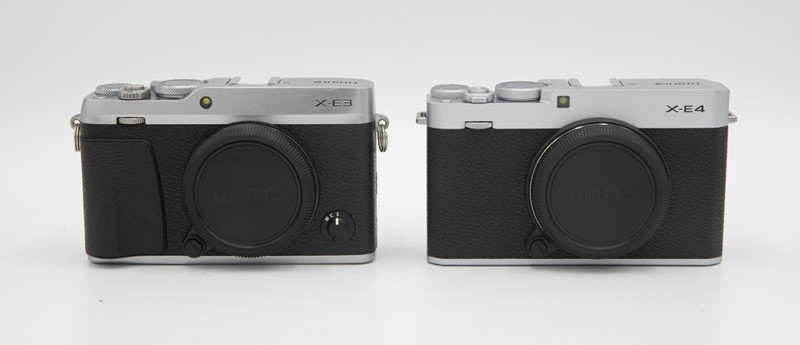

From the front, there are 2 obvious changes, and both might be controversial. The X-E4 does away with the built-in grip (hit-or-miss depending on if you use an external grip), and the M/C/S AF selector. If you’re hoping that Fuji moved the AF selector to the side of the body like on the X100F, you’re in for a disappointment. To change the AF modes, you have to go to the Q-Menu now. This is a bit of a head-scratcher, as the design of the X-E4 hasn’t changed that much, and it looks like there should be plenty of room for an external dial.
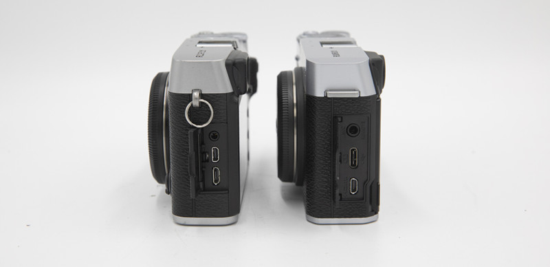


On the sides, the X-E4 now has a 3.5mm port for a microphone or remote, and a USB-C port for charging. Fuji also includes a USB-C to 3.5mm adapter so you can use the port as a headphone jack. The only other minor change is the strap lugs that are able to accept a thin-width camera strap without having to use snap rings or other attachments.
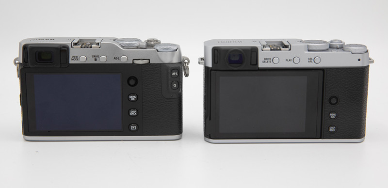


From the back, the changes are pretty substantial despite an initial glance. Most noticeably, the new LCD. It takes its design from the X100V with a flush-mount design, tilts almost 90 degrees downward, and tilts up 180-degrees to become a selfie screen above the camera. The resolution has also been bumped up a bit. The EVF is likely to be hit or miss with many people. The new design is circular, and feels smaller. Personally, I preferred the rectangular design of the X-E3, especially when wearing glasses.


The button layout, while not overhauled, has some noticeable changes. The 3 buttons along the top row, instead of being Vide Mode/Drive & Delete/AEL are now Drive & Delete/Playback/AEL & AFL. To the right of the LCD, instead of replacing the playback button, there are now only 2 buttons and the joystick – which are shifted down. While it was still easy to reach, I preferred the location of the joystick on the X-E3. The thumb rest/bump with the AFL and Q-Menu buttons is now gone, and the design is much more simplistic. The camera itself was a bit less comfortable to hold, and didn’t feel as secure, but with the hand grip, the ergonomics felt much better than the X-E3. The biggest downfall (in my opinion) of the rear design is the removal of the rear dial. Personally if given the choice, I would’ve given up the front dial.
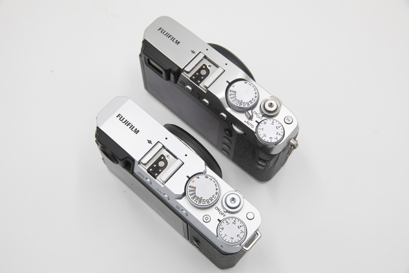
Along the top, Fuji has done away with the Auto switch, and instead placed the Q-Menu button there. It’s in a bit of an awkward place (especially when the thumb rest accessory is installed), but after using it for a few days, it felt natural. It was considerably easier to push when holding the camera with one hand compared to the Q-Menu button on the thumb-pad of the X-E3. The shutter speed dial now also has a P selection added to it. Overall, if you own a X-E# series camera, the X-E4 is going to feel quite familiar.
Specs


Video Features
Just like most recent Fuji cameras, the X-E4 is a pretty powerful video camera. You can record at 4K/30p in 4:2:0 8-bit color to your SD card or 4:2:2 10-bit color to an external device via HDMI, and it includes the F-Log profile. You can also set the rear progress LED and AF Assist LED on the front to be tally lights when recording. Like slow motion video? Fuji throws in 1080/240P with autofocus. Now with the forward facing selfie-screen, you can easily use it as a vlogging camera, or film yourself at your desk and reduce the guesswork of framing the scene without an external monitor.
Sample Photos:












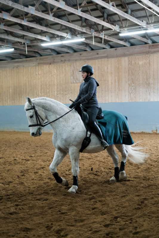


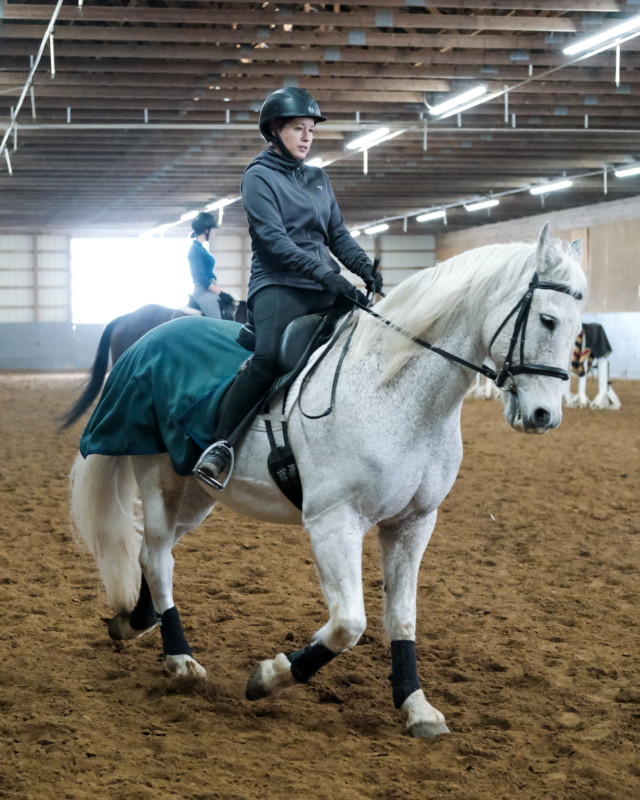

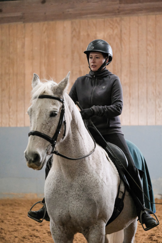


Final Thoughts
Several months ago, people were wondering if the X-E line was dead, but Fuji clearly had other plans. With its compact rangefinder styling, and performance that is nothing to scoff at, the X-E line lives on, and ought to be pretty popular amongst Fuji faithful, and new photographers looking for a feature-packed retro-looking camera. While some of the design choices may be subjective, and the removal of the M/S/C switch and rear dial are head-scratchers, they’re hardly deal-breakers when you factor in all of the improvements. The X-E4 will be available in black and silver (slightly lighter than the silver on the X-E3) and can be paired with the all-new XF27mm f/2.8 R WR as a kit.
The X-E4 is expected to start shipping March 11th, and can be pre-ordered here.
About the author: Ihor Balaban is a photographer and store manager of the camera store Pixel Connection in Avon, Ohio. To learn more about the store, head over to the Pixel Connection website. This post was also published here.