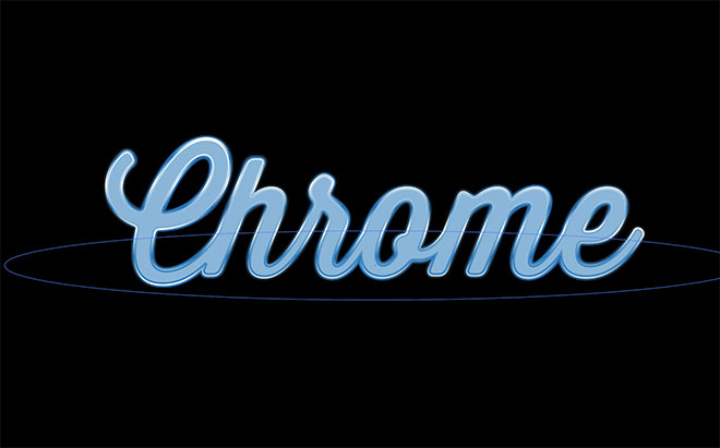
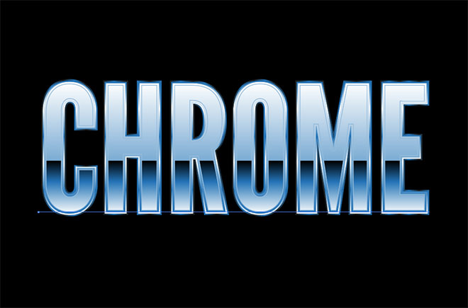
Chrome text effects might now be seen as gaudy and tasteless, but they once formed an extremely popular art style in the 80s and 90s. Those retro styles have made a comeback over recent years, so it’s useful to know how to produce shiny and metallic effects in your digital design software. I’ve previously shown how to produce an 80s style chrome text effect in Photoshop, follow today’s tutorial to create a similar retro style metallic text effect in Adobe Illustrator.
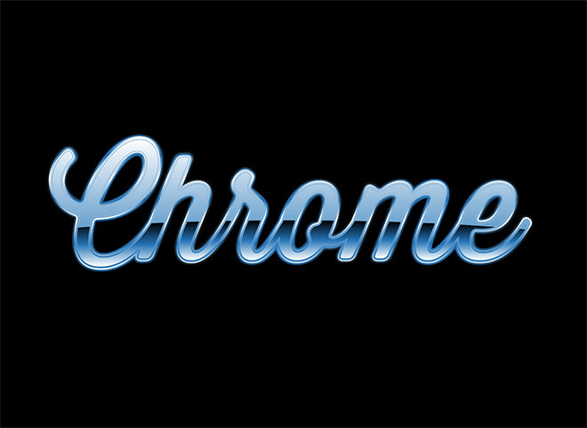
The effect we’ll be producing in this tutorials is a shiny chrome appearance made from a combination of gradient fills. We’ll create the effect using outlined text for best results, but I’ll also cover some useful techniques to replicate the effect with the Appearance panel, which allows the styling to be applied to editable live text.
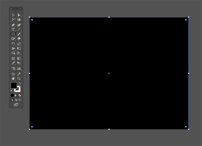
Open up Adobe Illustrator and create a new document. I’m using a typical A4 layout in the RGB colour mode with pixel units. Select the Rectangle tool and draw a shape that matches the artboard. Give this shape a black fill with no stroke, then go to Object > Lock > Selection to use it as a background without accidentally moving it out of place.
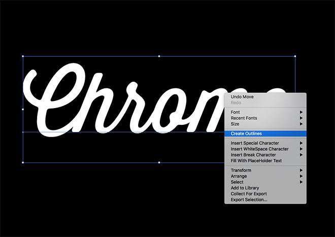
Lay out your chosen wording with the Type tool. Right click and choose Create Outlines to convert the text into shapes. This will lose the ability to edit the text, but allows many more tools and techniques to be applied to the vector paths.
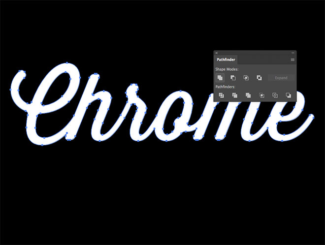
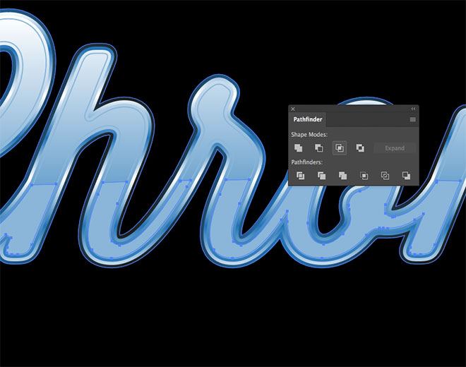
Since the Thirsty Soft font I’m using is a script which overlaps the letters, it’s necessary to combine them into one continuous outline with the Unite function of the Pathfinder panel.
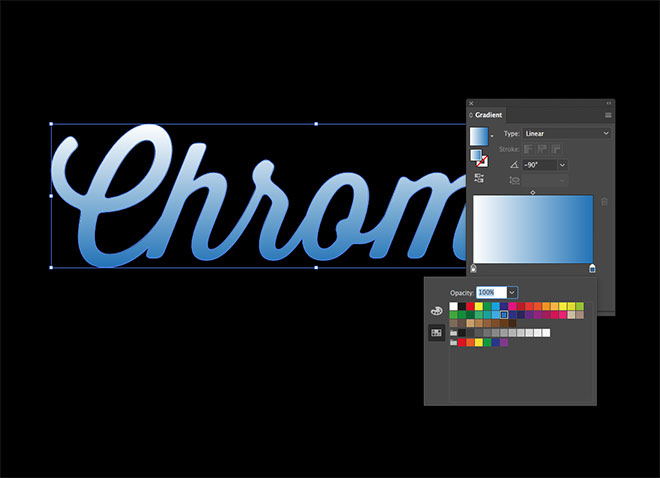
Change the fill to a Linear Gradient, then edit the colours in the Gradient panel from a mid-blue swatch to white. Change the angle to -90 degrees.
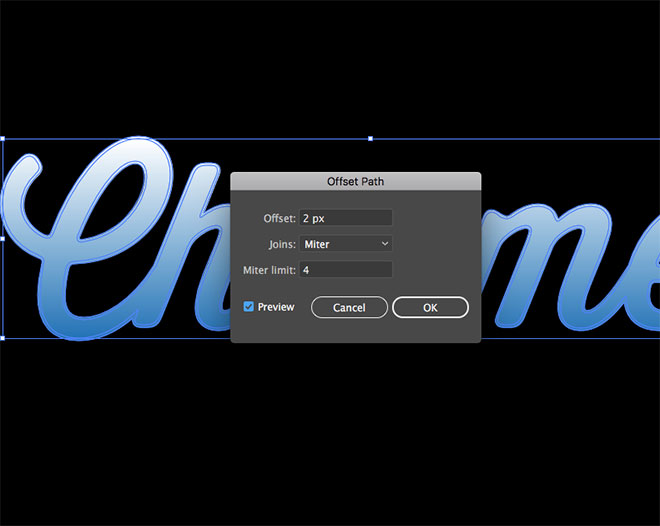
Go to Object > Path > Offset Path, then enter 2px in the offset window to create an expanded outline around the text.
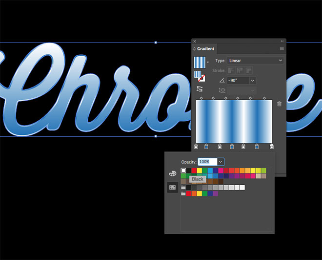
Edit the gradient by adding a series of additional gradient handles, then alternate the colours between blue and white.
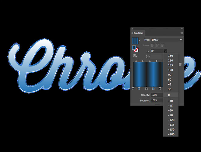
Add another 2px Offset Path, then drag a black swatch over every white gradient handle. Change the angle of this gradient to zero degrees.
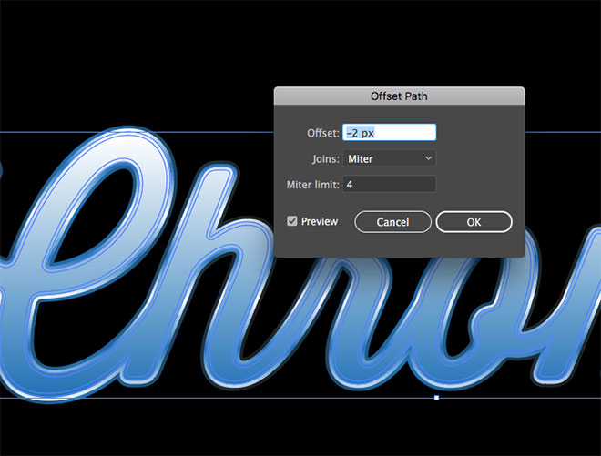
Head to Object > Path > Offset Path again, this time enter -2px to create an inset outline.
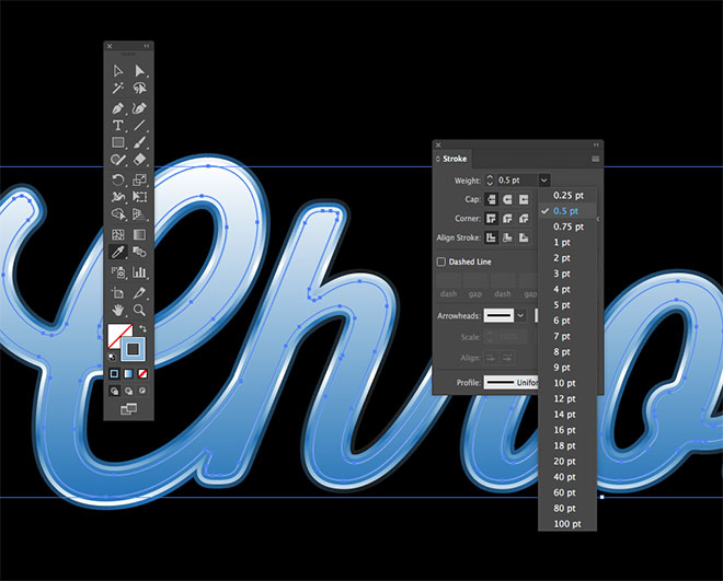
Remove the fill from this shape, but add a Stroke. Hold the Shift key and sample a colour halfway up the existing gradient with the Eyedropper tool, then change the stroke weight to 0.5pt.
Press CMD+C to Copy, followed by CMD+F to Paste in Front a duplicate of this inner shape, then switch the stroke over to a fill.
Select the Ellipse tool and draw a long, thin oval that covers the lower portion of the text. Aim to place the top edge halfway up the text face.
Hold the Shift key and add the inner text shape to the selection, then click the Intersect button in the Pathfinder panel to trim the oval to the outline of the text.
Apply a gradient fill, but add an additional black gradient handle and alter the angle to flow in the opposite direction.
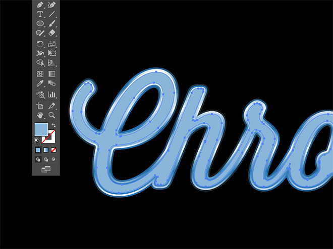
Individually each shape is filled with a simple gradient, but combined they give the appearance of shiny highlights and reflections.
To make use of many of Illustrator’s tools, text elements have to be outlined so they’re converted into standard shapes. It is possible to reproduce the effect using just Fills and Strokes within the Appearance panel, which retains the ability to edit the text and change the font.
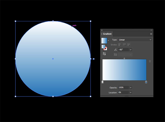
For the effect to work on live text, it first needs to be created as a Graphic Style. Draw a simple shape on the artboard to apply the various modifications to, starting with the blue to white gradient.
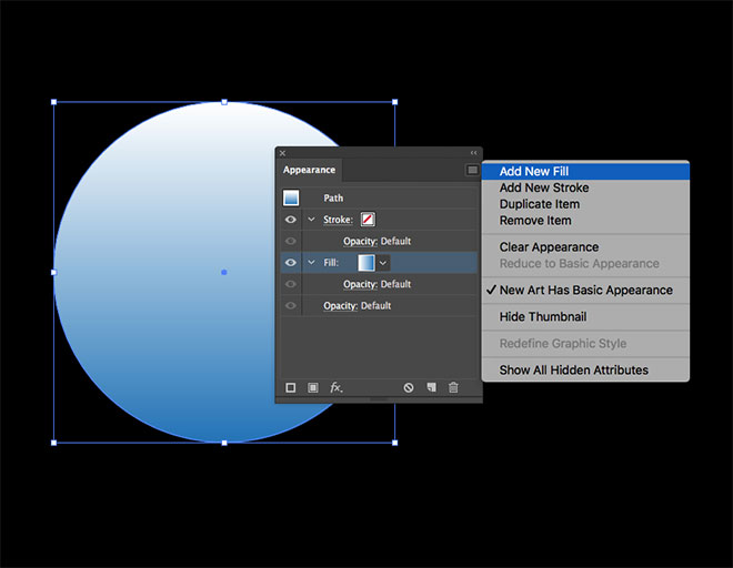
Multiple fills and strokes can be applied within the Appearance panel. Click the menu icon in the top corner and select Add New Fill.
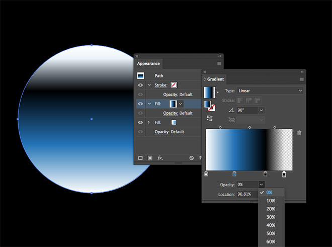
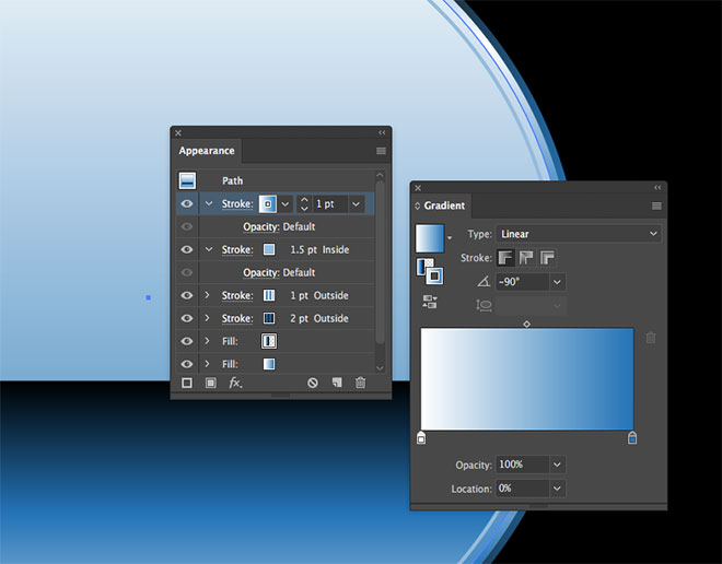
Edit the gradient of this particular fill to include black, then add an extra handle towards the right and set the opacity to 0%.
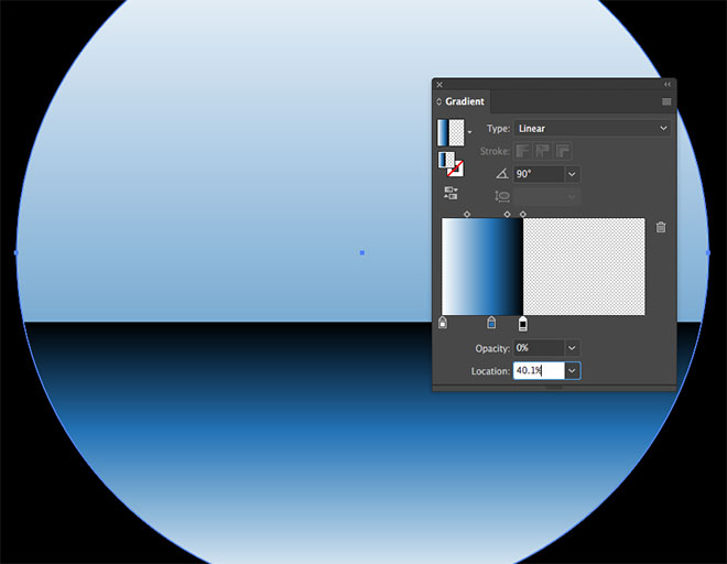
Move the black gradient handle to a specific location, such as 40%, then set the zero opacity handle to 40.1% to produce a hard line. The blue and white colours could also have been applied to this one fill, but it’s useful to see how fills can be layered.
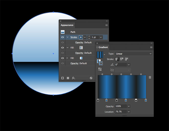
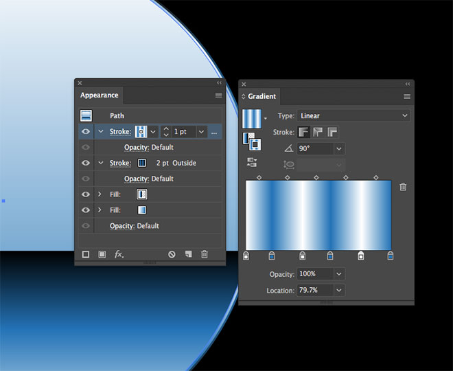
Apply a gradient fill to the stroke, then adjust it to alternate between black and blue. Set the angle to zero.
In the Stroke panel, adjust the stroke weight to 2pt and align the stroke to the outside of the shape.
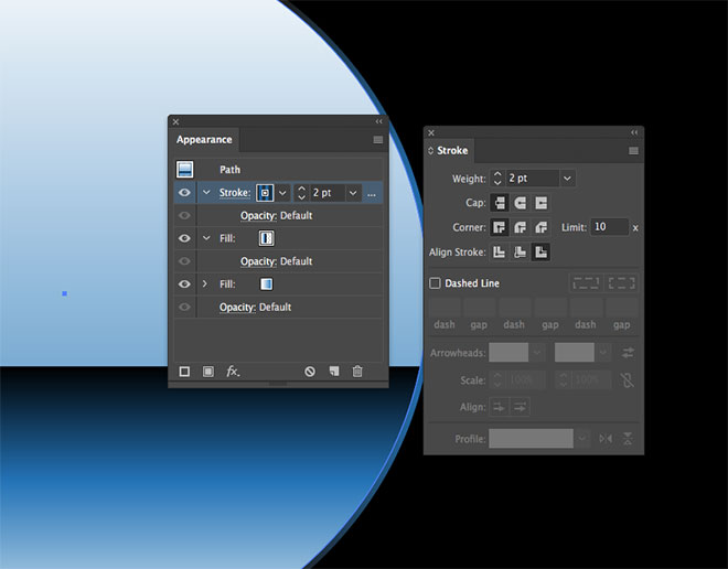
Add a new stroke to the shape from within the Appearance panel. Drag a white swatch over all the black handles in the Gradient setup, then change the angle to 90 degrees. Alter the settings of this stroke to 1pt, aligned to the outside. Since the black and blue stroke is 1pt larger and underneath this white and blue stroke in the Appearance panel, it is visible around the edge.
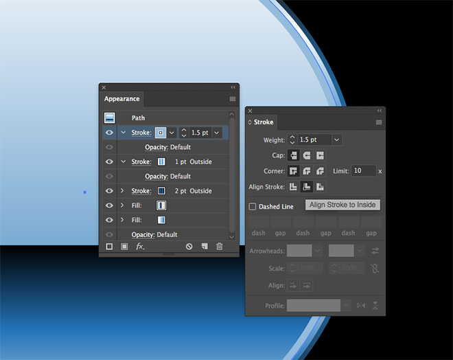
Add another stroke, then hold the Shift key and click a mid-blue from the existing gradient to select a solid colour. Change the settings to 1.5pt and aligned to inside.
Set up a fourth stroke with the same blue to white gradient used in the first fill, which will cover some of the previous stroke to leave a 0.5pt line that appears to be offset from the main outline.
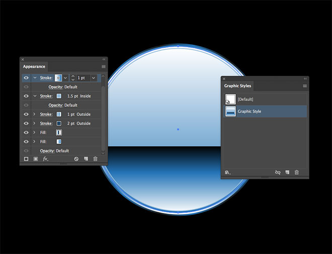
With the shape that has these Appearance settings selected, click the New Graphic Style icon in the Graphic Styles window to save the effect.
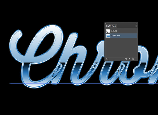
This new Graphic Style can be instantly applied to any object, including text elements without the need to create outlines. However, when used with script fonts, not outlining and uniting the letters ruins the appearance!
The problem can be solved by changing the font to a sans-serif typeface that doesn’t overlap, leaving a great looking chrome text effect that can still be edited with the Type tool.
Download this file