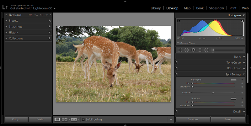
Lightroom is one of the most powerful and well-known post-processing tools available today! However, the downside to all of the features, options, dials, and buttons –is that it can be tricky to use –especially when you’re first getting started.
If you’re new to Lightroom and are looking for some a good place to start, this tutorial’s for you! In it, we’ll take a look at four simple processes that you can follow that will take you through the steps of cropping, straightening, adjusting the white balance, and adding vignettes to your images.
To start, here’s a look at the original image that I’ll be using:
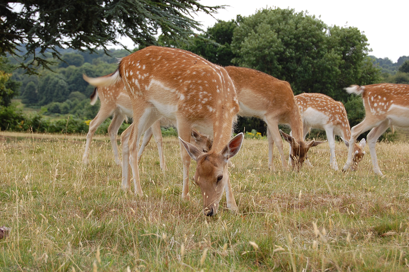
As you can see, the angle of the deer is alright –since the main subject is facing the camera. But the composition isn’t as tight as it could have been, and the white balance needs to be adjusted a bit as well. Additionally, the horizon line isn’t straight, so we’ll be making a few much-needed adjustments in post to see if we can salvage this photo.
Cropping
First, let’s take a look at cropping. Start by selecting the Develop tab, located on the menu at the top right-hand side of your workspace. Then, navigate to the right-hand side of the page. Just below the histogram, you’ll see the Crop Overlay tool. Alternatively, you could always type “R” on your keyboard –it’s a shortcut that will bring up the crop tool.
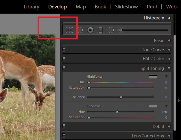
The Crop Overlay button
Click the Crop Overlay tool. Then ensure that the Aspect is set to Original. This will keep your image’s proportions the same while you’re cropping. Next, click your image. Holding your cursor down, draw a grid over your image. You can adjust it as you’d like, repositioning it over your image. Once you’re happy with it, click the “Done” button at the bottom of your workspace.
Disappearing Done Button: If your Done button disappears at any time, just hit “T” on your keyboard, to bring up your toolbox –and your Done button as well.
Ok, this image has now been cropped so the composition’s a bit tighter. The horizon line is still not straight though.
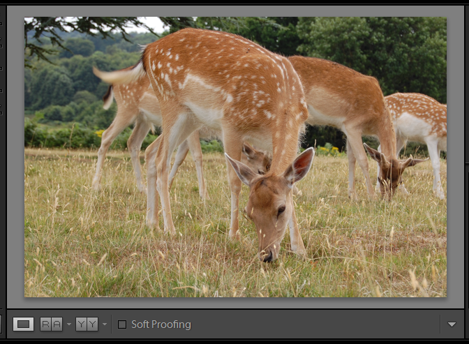
Now, let’s take a look at straightening your image –ideal for leveling wonky horizons.
Straightening
Under the same area –beneath the Crop section, locate the Angle button and slider.
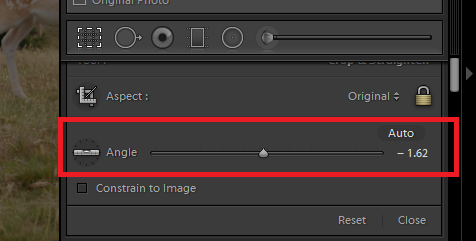
Angle button and slider
Click Angle, and a grid should appear over your image. Using the grid for reference, simply adjust the slider until the image is positioned where you’d like it. It’s easy to make the horizon straight with this tool.
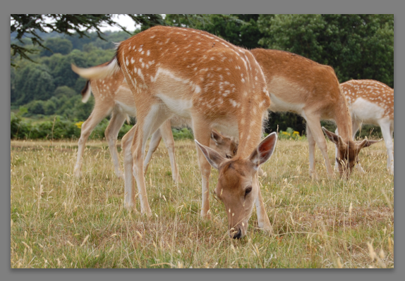
That’s a bit better!
Now, let’s take a look at adjusting the white balance.
Disappearing Menu: If, at any time, you find that your tools have disappeared, just click the little arrow button located on the right-hand side of your program. Then, right click and select “manual” to keep the menu in place.
Adjusting the White Balance
Click the Develop tab on the top menu, and navigate to the right-hand side of your workspace again. Select the Basic tab located under the histogram.
From there you should see a “WB,” and directly across from it a drop-down menu with “As Shot” appearing.
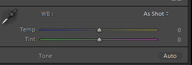
Tools for adjusting the white balance
Click “As Shot” and you’ll be able to change the white balance from As Shot to Auto or Custom. I clicked Auto, and for this photo, that was enough to adjust the color temperature to a warmer shade.
You can also adjust your white balance manually, however –which will give you a lot more flexibility over the outcome. To manually adjust it, select “Custom” from the drop-down menu. Then, adjust the Temp slider as-needed! You can move it to the left to add a cooler cast to the image, or to the right to add a yellow tiny, warming the image up.
Then, use the Tint slider to balance you any magenta or green that appears in the image. Move the slider very slightly to the right to add magenta and remove some of the green tint, and move it to the left to add more green, canceling out the additional magenta.
Alternatively, you can use the White Balance Selector Tool.

White Balance Selector tool
Click on the selector, and you’ll see a pixel grid appear. The center of this grid is the pixel you’re targeting. You’ll want to find a neutral grey pixel in your image that Lightroom can use for reference. Beneath the grid itself are a series of RBG percentage values. You can use these to find a neutral color. When you hover over a neutral tone, all three percentages; R, B, and G will be equal.
Once you’ve found a pixel, click on it, and Lightroom will adjust the image accordingly. If at any time you decide that you don’t like the results, simply hit undo (hit “ctrl” and then “Z” on your keyboard) to reverse them.
Adding a Vignette
Ok, now let’s move on to the last stage of our editing process –adding a vignette.
To find the vignette tool, click the Develop tab (it should be familiar to you now!) and navigate to the Effects section on the right-hand side, down below the histogram.
You should see something that’s called “Post-Crop Vignetting” appear in the workspace now.
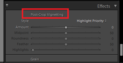
Post-Crop Vignetting
Below that are some sliders that you can use to adjust the vignette effect on your image. Feel free to adjust all of them, but pay special attention to the “amount” slider.
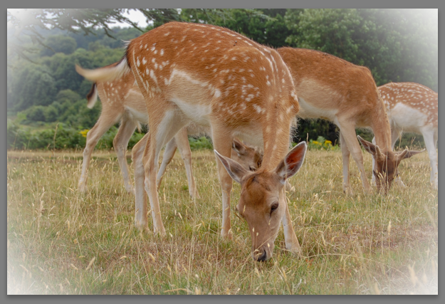
A vignette –slightly overdone!
I’ve overdone the vignette effect here to show what can be done, but ideally, you’ll want to go much more subtle with vignettes.
Another great way to add a vignette, and a tool that’ll give you more flexibility is the Radial Filter tool. This tool lets you place a vignette wherever you’d like in the image, allowing you to achieve more subtle results. The Radial Filter tool can be found by clicking the Develop tab, and navigating once again to the right-hand side of the page.
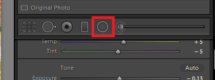
Radial Filter tool
Using the Radial Filter tool, you can select circular areas on your image to adjust. It’s a far more subtle way to add vignettes to your images. To learn more about using the Radial Filter tool, check out this helpful and informative tutorial.
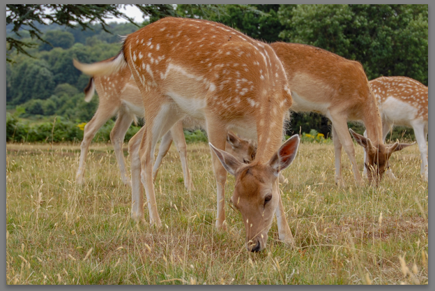
I applied a few radial filters to my image, positioning one over the main deer’s face, and one along the neck, which lightened the area a bit –drawing attention to the main subject. I also tweaked the white balance one more time, increasing the Temp slider very slightly to add just a bit more warmth to the image.
And here’s the final result!
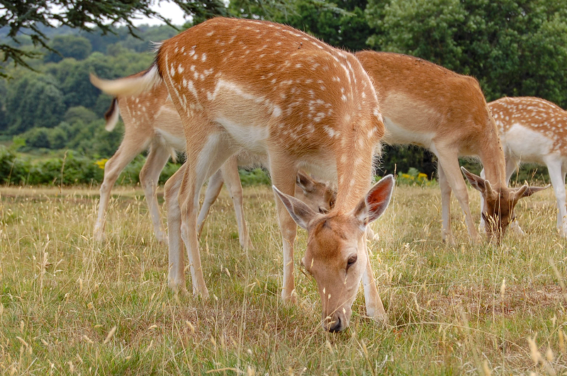
The final image
There are so many different things that you can do with Lightroom, this really is just the tip of the iceberg. Remember: there’s no right or wrong way to use this tool, you can go as subtle or as over-the-top as you’d like! Just be sure to keep your big-picture goals in mind –that is, how you’d like the final image to look.
Hopefully this guide has been helpful, and inspired you to try even more challenging tutorials. The sky really is the limit when it comes to Lightroom –so have fun experimenting with different techniques, and remember you can always revert to your original image at any time, so have fun!
Do you use Lightroom? What’s your favorite fast and simple tip?