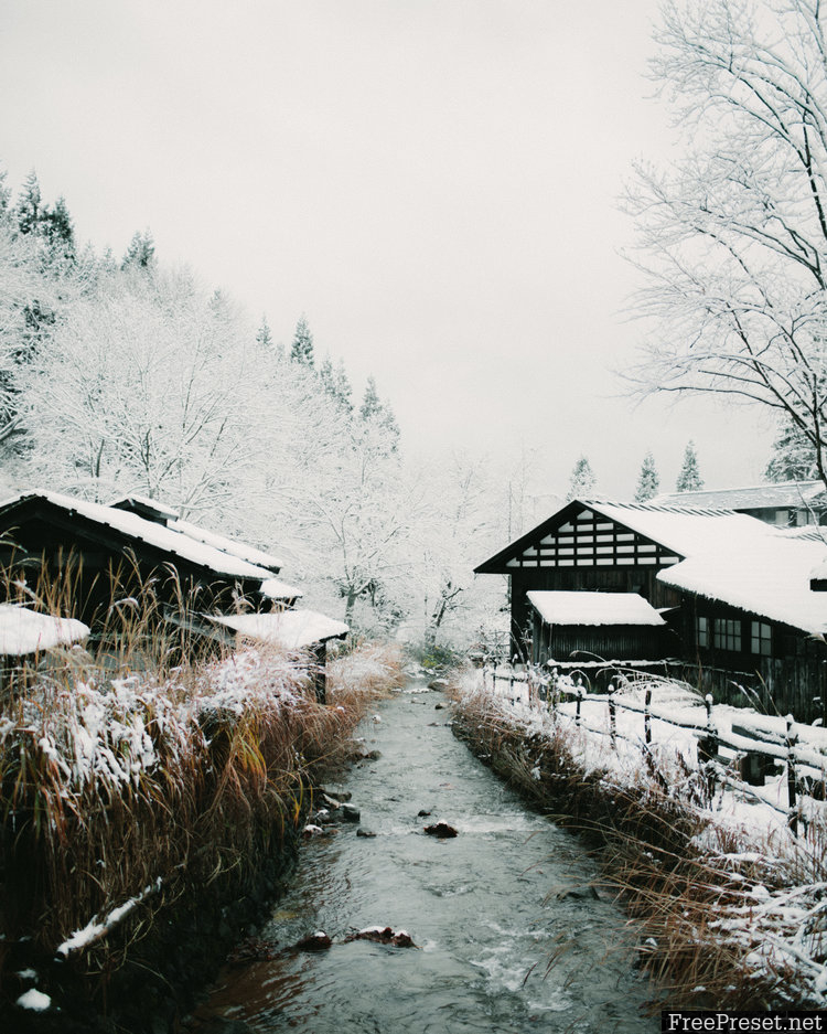
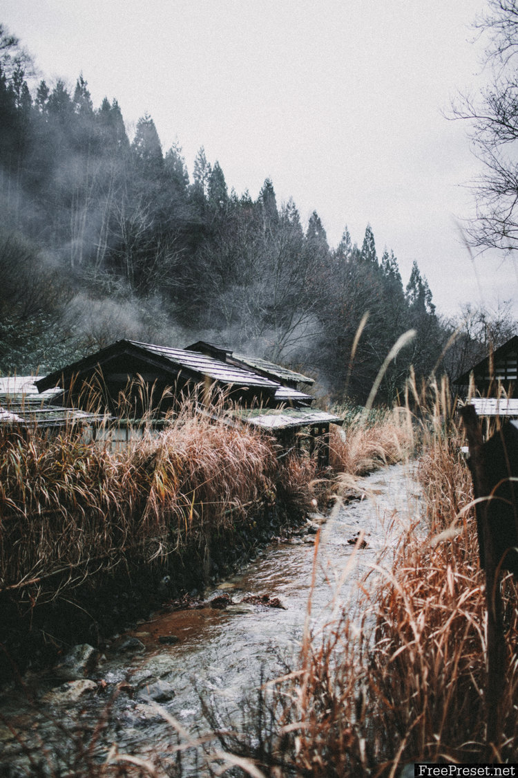
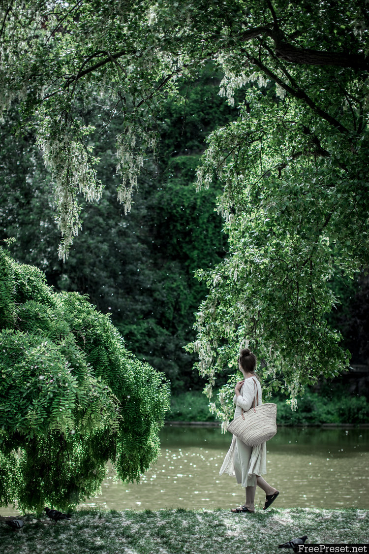
The Travel Collection consists of 50 presets designed to achieve various styles in various white balance and lighting conditions. They were inspired by our travels through Greece, Morocco, Japan, and France, and they’re the product of years of editing travel photos in Lightroom for Instagram, print, and the blog—which won both editor’s and reader’s choice for best photography in the Saveur Blog Awards! Ranging from dark and moody to soft and filmesque, these are a wide array of presets that will help you find your style and keep it consistent throughout your brand be it on instagram or your website.


Why so many? This pack contains a whopping 50 presets because I wanted to create filters for YOUR style, not just filters so your photos can look like mine (of course, those are in there too!) My editing style is cool, shadowy, and crisp. But maybe your style is vintage and moody? Or warm and bright? Well, this pack has presets for you too. You’ll probably find that you gravitate towards a handful of the presets and use them over and over again, and that’s exactly what’s intended: I wanted to create so many there would be something for every style.
Like all presets, please remember that these will look different on every photo because every photo is different due to lighting, white balance, subject, camera, etc. They perform best on properly exposed images though some are designed to darken very bright images and some are designed to brighten up dark images. Some are designed to cool warm images and vice versa—not every preset works on every photo. The best way to find out which preset is the best fit for your image is to try them all on and see what you like best!
A little tweaking will likely be necessary after applying the preset to your image to get your desired look due to the diversity of images. Try adjusting the exposure and/or tone curve if you want a brighter or darker image; try setting the white balance back to “as shot” and then adjusting the white balance if you want a cooler or warmer image; and try adjusting the hue/saturation/luminance of various colors in the photo if you’d like to adjust the color. For instance, if you find the greens too blue, you can make them more yellow in the color mixing HSL panel by adjusting the hue of the greens. Think of these as a base to lay down and make them your own!
Password Unzip : Freepreset.net
The file is compressed using Zip or Rar format...please use Winrar to extract this file
If you found the link was error , please comment !!!