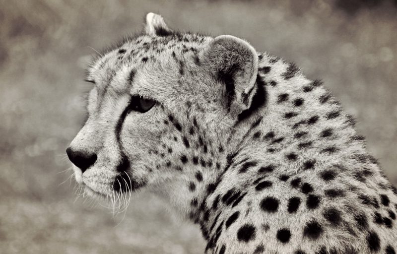
Photo by cocoparisienne / CC0
Monochrome is something universally appreciated but sometimes it’s not used to its full advantage. Black and white filters are often applied to photographs that actually look better in color. Just because something looks “artsy” does not make it universally appealing (looking at you, high dynamic range photography). So how can we get the most out of monochrome, especially in nature photography?
Monochrome Emphasizes Textures over Color
The colors of an image are often as much a consideration as the subject matter. Nature photography, with the bright feathers and intense petals of the subjects, is especially fond of rich, saturated color. So why would we ever want to remove those colors from our imagery? Because they can actually distract from other aspects of an image.
When the colors are removed, what are we left with? The form, texture, and details of the subject. The parts of an image rich in these help monochrome photos really shine. Take a look at the photo below and try and imagine the color version. The bright sunlit sky and the color of the water would normally soak up far more of the attention of the viewer. In this monochrome image, the textures of the clouds, water’s surface, and beach sand all have just as much impact as the silhouettes of the beachgoers.
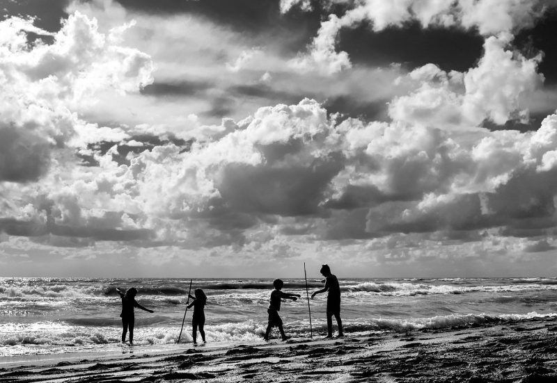
Photo by loveombra / CC0
Consider the Form of a Possible Subject
Textures and details absolutely jump out at us in black and white, but so does the form. The form includes the shape and posture of your subject. And putting more emphasis on form can change the flavor of an image entirely. One of the best ways to highlight form is by using silhouettes. A good silhouette removes most or all details of a subject except for the overall form. It lets us fill in details with our imaginations; in this case, less is definitely more!
We usually think of silhouettes as color photos shot in combination with a bright light source like the sun. But they can also be created easily by shooting in monochrome and either using a strong backlight or upping the contrast of the image. This tree would still be fairly interesting as a color photo. But creating a monochrome silhouette causes its twisting form to stand out as the subject. And this way the colors of the sky and tree and textures of the bark don’t take attention away from the form, either.
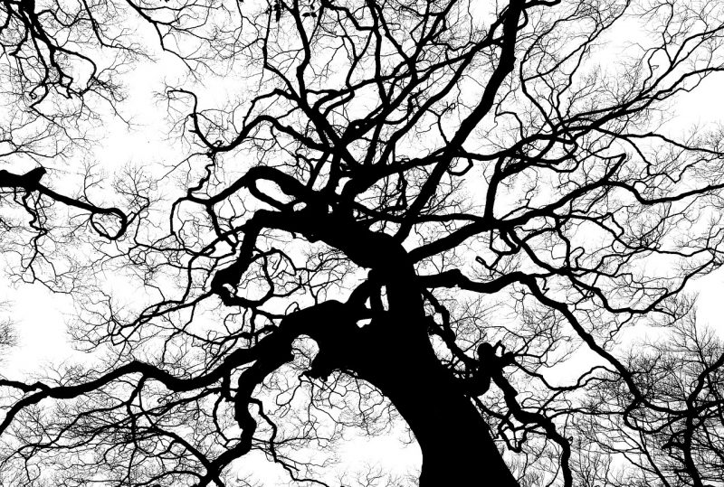
Photo by katz / CC0
Monochrome Makes Good Use of Contrast
Color and lighting contrasts are an important part of the interplay in monochrome images. Images where the colors don’t have much contrast usually end up looking rather bland as monochrome photos. So even though removing colors can give punch to textures, detail, and form, it’s also good to think about how the grey tones will turn out.
If the colors aren’t quite so vivid then consider the lighting. This means we need to look at tonal contrast which is the variation in brightness from one part of the image to another. Thanks to tonal contrast, bright mid-day lighting over a dark subject will give the resulting monochrome image a contrast boost.
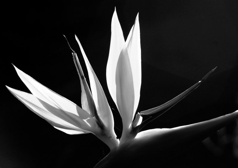
Photo by sandid / CC0
Contrasts in texture and form are also good ways to get more out of your images. Notice how both are displayed in the image below. The smooth or ribbed textures of the seashells contrast well with the tattered, chaotic nature of the dead leaf. The long length and jagged edges of the leaf in turn starkly contrast with the squat, rounded seashells. The colors of the seashells give us a nice palette of grey tones to view. Even the translucence of the leaf is in contrast to the solid nature of the seashells. Contrast is everything in this image.
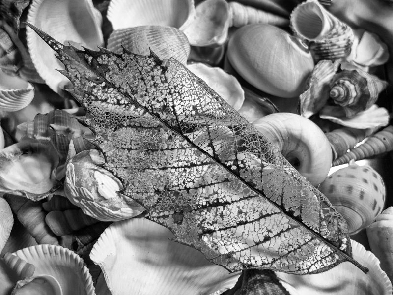
Photo by MichaelVines / CC0
Portraits in Monochrome
Monochrome is a fantastic format for portraits, human or animal. Form, texture, and details all come together in a beautiful way. And the grey tones give the image a classic feel that’s much harder to replicate in color. Animal fur, scales, feathers, and skins often have even more detail than human skin does. Monochrome on its own brings it out but sometimes a little contrast boost with bright lighting or Lightroom helps draw attention to these details further.
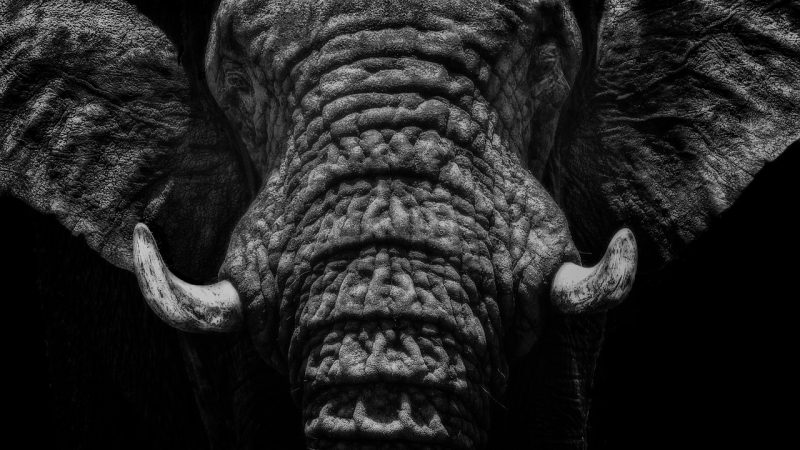
Photo by IanZA / CC0
Overall, monochrome is a very flexible style of photography. Nature photographers sometimes prefer to emphasize color and the subject over all else. But monochrome takes away the color aspect and gives you a greater appreciation for form, texture, detail, and contrast. And even mundane subjects like birds in the park can become much more interesting if the above principles are kept in mind while shooting. Monochrome is considered timeless for very good reason. So take some time to look past bright colors and see what monochrome can do for your portfolio!
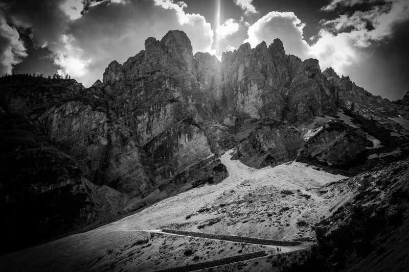
Photo by StockSnap / CC0
Photo license link: CC0