The deeper you go into photography, the clearer it will be that everything is about emotion. Each decision you make – every single part of your thought process — matters for that one reason. A prominent example? Positive and negative space. These two elements of photography are important because of the emotions they carry. So, what are positive and negative space, and how can you use them to improve your work?
1) What are positive and negative space?
It’s all about what stands out in a photo. Which parts of the image attract the most attention? Which ones fade into the background?
- Positive space is any part of the photo that jumps out from its surroundings. That includes your subject, for example, along with other noteworthy areas of detail.
- Negative space is just the opposite — parts of an image that don’t attract as much attention, surrounding the positive space and giving it a buffer.
The simplest example is writing on a page of paper. Words pop out at us, and the background doesn’t. So, words are positive space, and the background is negative space.
Photos are no different. Take a look at the picture below:

You won’t always take pictures of silhouettes with such obvious regions of positive and negative space, but my hope is that this image sets the stage for more complex compositions. These concepts always apply, no matter the photo.
2) Positive Space – Examples
Some photos have more positive or negative space than others. Below, I’ll show a couple images with high amounts of positive space, and I’ll explain what makes them that way.
2.1) The crowded forest

In this example, plenty of leaves and tree trunks across the image all attract attention. There’s no unified “background” here. You could argue that some of the blue-lit trees in the distance fit that description, which is fair, but they don’t take up much of the image. The same is true for the center of the tree trunks, which have very little detail in their darkest regions — but, again, only cover a fraction of the photograph. Other than that, most of the photo has high levels of texture and detail. It’s a very busy, crowded image.
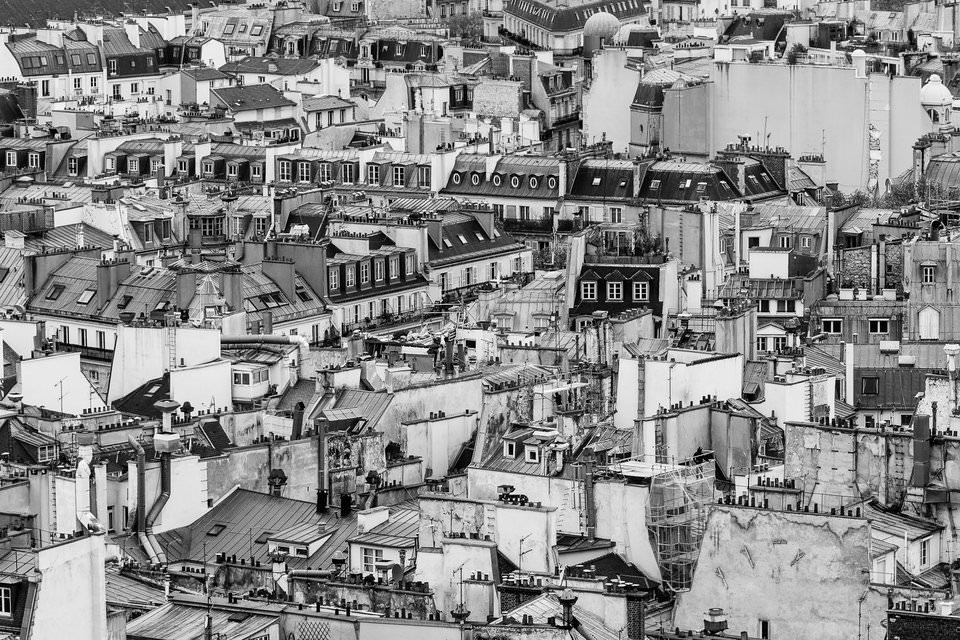
2.2) Paris architecture

This photo is a textbook example of extreme positive space. The entire image has details from top to bottom, without any clear background at all. It’s a very chaotic picture — and that’s the point.
My goal here? I wanted to show the crazy, busy jumble of interesting architecture in Paris. The photo works because the crowded composition matches the crowded nature of the city itself.
Every part of this image attracts attention, but none stands out significantly more than the rest. It’s all positive space.
3) Negative Space – Examples
Negative space is equally important in the world of photography. It might even be more important, since it’s a good place to start if you want to capture simple, effective images.
Below are some examples of negative space photos and what makes them so effective.
3.1) A Dragonfly and the Sky

This is a clear example of a negative space composition. The photograph is very empty — even minimalistic.
Only two parts of the image attract significant attention at all: the dragonfly and the plant. Everything else in the image is negative space, fading into the background.
Comparatively, the subjects are dwarfed by their surroundings. They are, essentially, floating in a void of negative space. It’s a large buffer around them, and it has a huge impact on the mood of this picture.
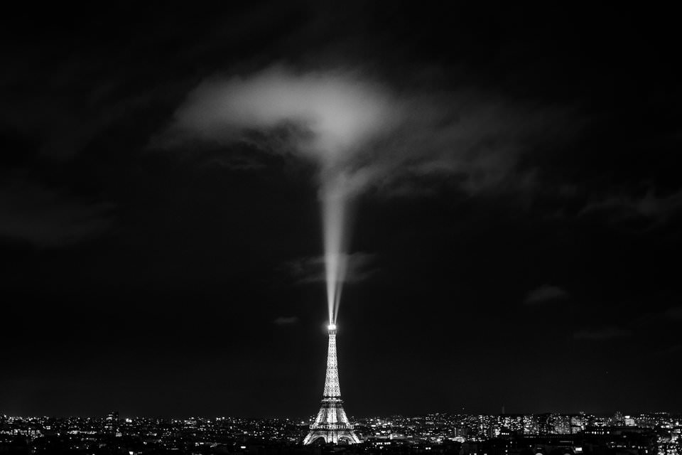
3.2) The Eiffel Tower

Everyone knows that the Eiffel Tower is a huge, magnificent structure. But compared to the size of the night sky, it’s still quite small.
At least, that’s what this example tries to convey. Like the dragonfly photo, there is a huge amount of negative space in this picture. More than half of the image is just darkness, without any details at all.
Which parts of this photo do jump out? Simple: the Eiffel Tower itself, the spotlight, and the cloud above it. To a lesser degree, all the other city lights are positive space as well, and that’s it. The rest of this photo fades into the background. It’s very heavy on negative space.
4) Positive Space – Emotional Message
Positive and negative space matter because each one carries a different emotional message.
What emotions does positive space convey? Exactly what you would expect: crowdedness, power, movement, chaos, and strength. Some of these emotions might sound negative, but they don’t have to be. If you want your photo to be active, with many areas of interest, positive space could be exactly what you’re after. Here’s one such example, where the photo carries a feeling of intensity and power:

This photo does have some regions of negative space — the water, for example — but it’s pretty heavy on positive space, too. Several different elements of the photo all stand out and attract attention, which makes the final result more active and dynamic.
Photos with high amounts of positive space are:
- Intense
- Busy
- Powerful
- Strong
- Active
5) Negative Space – Emotional Message
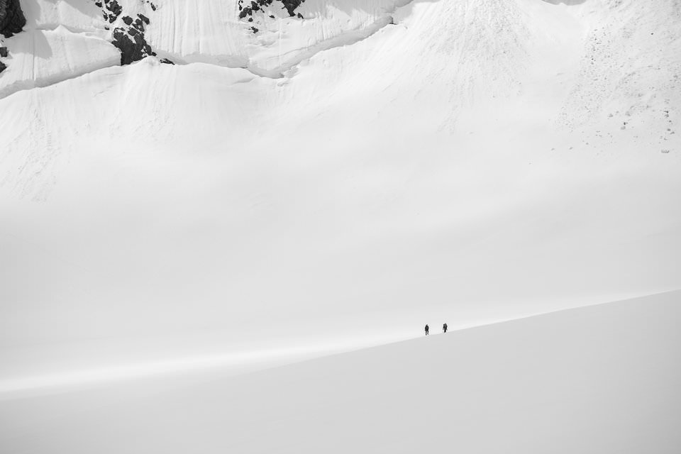
The emotions of negative space are just the opposite. They give your photos a sense of calm, peacefulness, and subtlety. Depending upon your subject, they also can appear lonely or solemn.
Negative space is very popular in photography at the moment. Part of it has to do with the purposefulness behind photos with a lot of negative space — they have a very intentional, aesthetic feel — and another part is just the simple fact of screen size.
People are looking at photos on smaller and smaller screens in today’s world. A busy, chaotic photo can work well in a large print or on a huge display, but it may fall apart when your screen is three inches wide. Negative space photos, though? They work quite well at small sizes, sometimes better than normal.

How do you find negative space? All you have to do is look for empty areas in the world. At first, this might not be easy — searching for elements that don’t stand out — but it becomes more natural over time. For example, try including the sky in your compositions. It’s huge, everywhere, and (often) filled with negative space.
The same is true for depth of field. By using a large aperture setting, you can capture a shallow depth of field and eliminate many distractions around your subject. Or, if that’s not an option, even a blank wall counts as negative space. Get creative, and you’ll find options everywhere.
Photos with high amounts of negative space are:
- Empty
- Subdued
- Peaceful
- Calm
- Isolated
6) Summary
Positive and negative space are two of the most crucial tools at your disposal as a photographer. They impact the emotional feel of a photo, which is more important than anything else.
Some photos have more negative space, making them comparatively empty. Others are filled with positive space, resulting in a crowded composition. (Certain images, of course, strike a balance, and they don’t fall clearly in either direction.)

Also, it’s important to remember that neither positive nor negative space is better in photography. Without a doubt, you can take successful photos either way. The key: Both simply carry different emotions. That’s what makes them so important in photography.