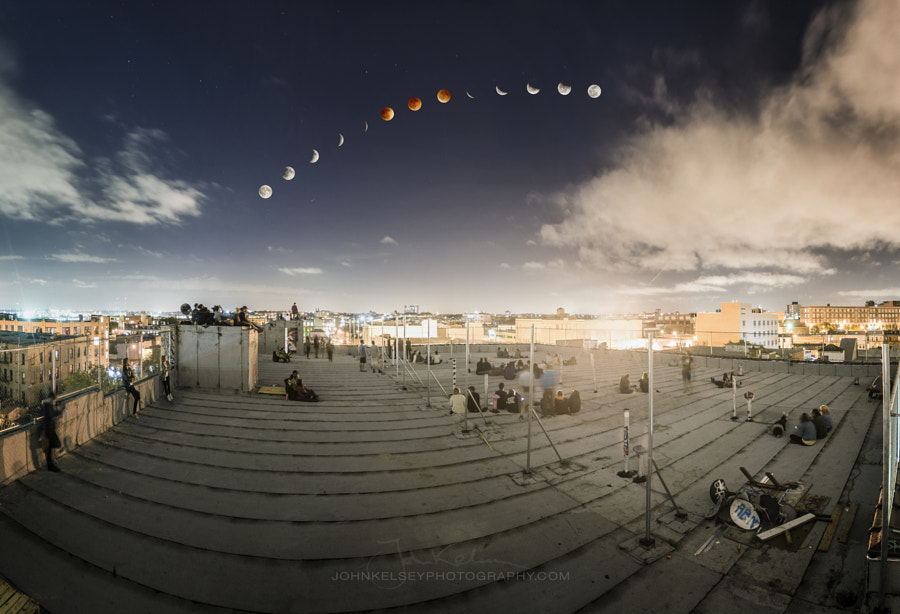
There were a ton of really cool photos to come out of the Supermoon Total Lunar Eclipse (aka. ‘super blood moon’) this past weekend, but our favorite image was, without a doubt, this photo by photographer John Kelsey.
He captured not just the eclipse in that composite style so many of us love to see, but the community that it created— people all huddled together staring up at the sky, just for a moment, united in wonder.
We got in touch with John yesterday after the eclipse to ask him about the photo, and he was kind enough to give us a full breakdown of how it was shot and processed from start to finish! A lot of you have been asking about how these composites come to be… here’s your answer. We’ll let John take it from here.

How I Got the Shot: Shooting and Post-Processing a Supermoon Eclipse Composite
I shot this image on the roof of my apartment building in Bushwick, Brooklyn. It was amazing to see so many people up there looking up at the sky for hours!
The roof scene is a wide-angle panorama taken at the peak of the eclipse when the most people were out. It’s made up of 6 vertical frames, shot at 17mm on my Nikon 17-35mm f/2.8 lens. Exposure was 2 seconds at f/2.8 and ISO 640 .
The 13 moon shots were taken over the course of the entire eclipse using my Nikon 300mm f/2.8. The exposures varied slightly as the moon got darker, but started and ended at 1/250, f/11, and ISO 200 for the full moons on either end.
To do the composition, I started by putting together the panorama using Photoshop Photo Merge and editing it how I wanted, only slightly adjusting color and contrast. I then went through and edited my selected images of the moon. I had hundreds of shots, at various stages of the eclipse, so I had to find an interval that I was happy with and match the waning with the waxing sides.
You see some of these composites with a lot more stages included, but I find that it makes things a bit busy so I’ve always gravitated to about 13 images, 5 on each side of the eclipse and three of the blood moon itself.
Once I had my selects in Lightroom, I edited the color and contrast slightly, neutralizing the whites and adding a bit of midtown contrast to make the “face” of the moon pop. I then opened each in Photoshop, made a rough selection of each moon, and dropped them onto the rooftop panorama, arranging them as I wanted. I give myself a certain creative license here, but it was more or less the path of the moons trajectory.
The moons are still just a rough selection at this point, but because I exposed for the face of the moon, the sky is pitch black around it each moon. This allows me to just set the blend mode to “lighter color” and effectively just drop out the black sky, leaving a perfect edge on the moon (with a little manual touch up here and there). Some photographers like to see the black silhouette of the shaded moon, which I have added before, but with the brighter sky I chose to eliminate it on this shot.
I then did some global edits like a little vignette and some sharpening and there you have it! There are a lot of ways to do a composite like this, and there is certainly no right or wrong way, but hopefully this can give you some ideas as to how to create your own method!
Hope everyone enjoys the photo! I enjoyed taking it!
A huge thank you to John for explaining that in such great detail! Here’s one more look at the final shot, so you don’t have to scroll back up for it.

To see more from John, give him a follow on 500px, pay his website a visit, or check him out on Instagram. We’re hoping to work with John a bunch more going forward, because his work is fantastic, so drop him a line in the comments if you have any questions and keep an eye out for more in the weeks to come!