There are many tools in a photographer’s “emotional toolbox” – the things you can do in photography to shift a photo’s emotional message in your preferred direction. The one I’ll be talking about today is texture.
Photographic Definition of Texture
Texture in photography is not much different than in other contexts. If you imagine reaching out, closing your eyes, and touching a photo, texture is how it would feel in three dimensions. Sand might feel smooth and granular. Water could be smooth and glassy, or it could be rough and sharp.
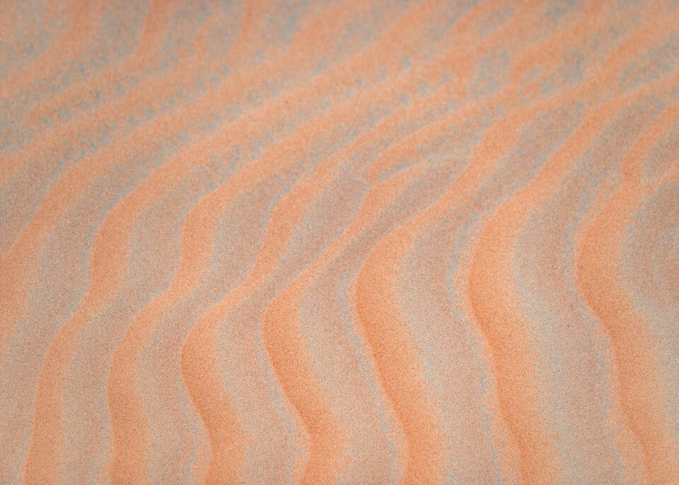

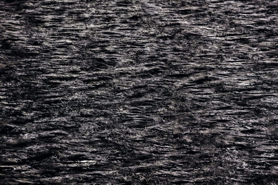
Texture is more about the “in between” details of your subject or the background, rather than the broader shapes of the composition. In other words, you could have two similar compositions (say, symmetrical left/right photos of a building) with different textures (maybe one is modern and has a lot of windows, while the other is weathered and falling apart).
Emotional Messages
Texture is one of the easiest elements of photography to explain in terms of emotions, because usually the words you would use to describe the texture are the same words to describe the emotions it carries.
If the texture is rough, it imparts rough emotions to your photo. If the texture is gentle, the mood is gentle. The more space in your photo that the texture takes up, the clearer the corresponding emotion will be.
Like all things in photography, there can be exceptions. I’d be interested to see people’s attempts to create harsh emotions out of smooth textures, or calm emotions from sharp, jagged criss-crossed shapes. It can be done, if you employ the other elements of composition creatively (such as light, balance, positive/negative space, and so on). But it’s not the norm.
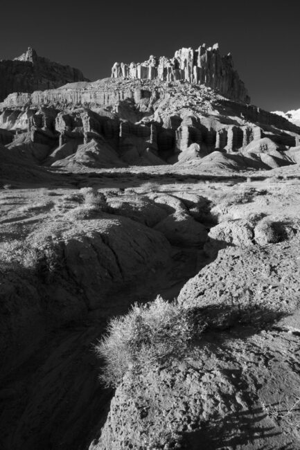
The norm is more like this. Harsh texture, harsh photo:

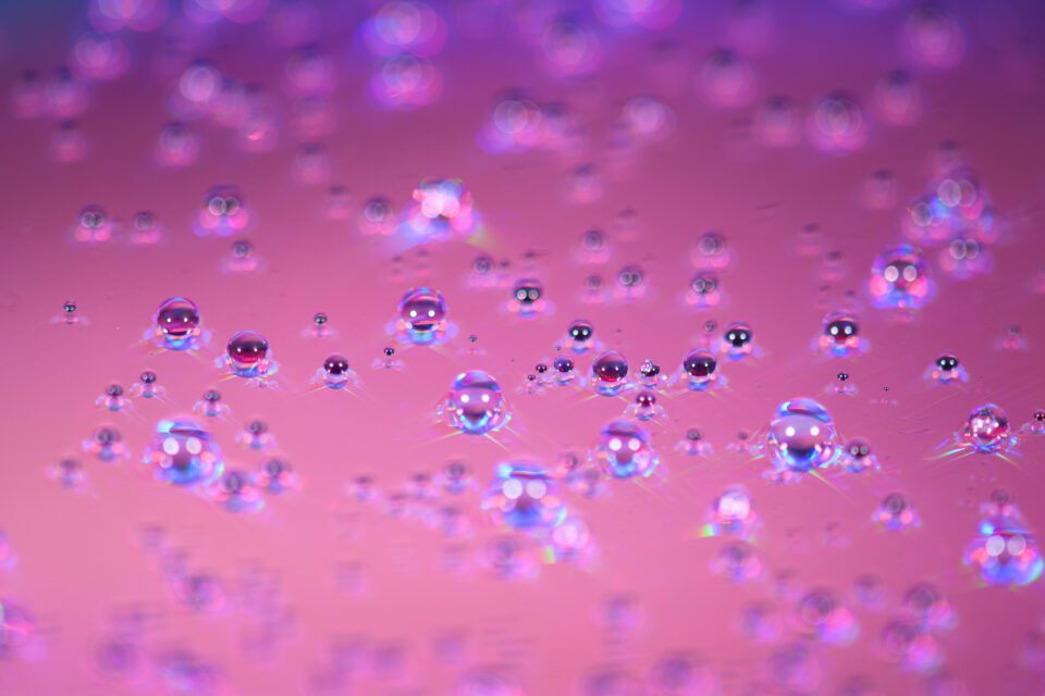
Bubbly texture, bubbly emotions:
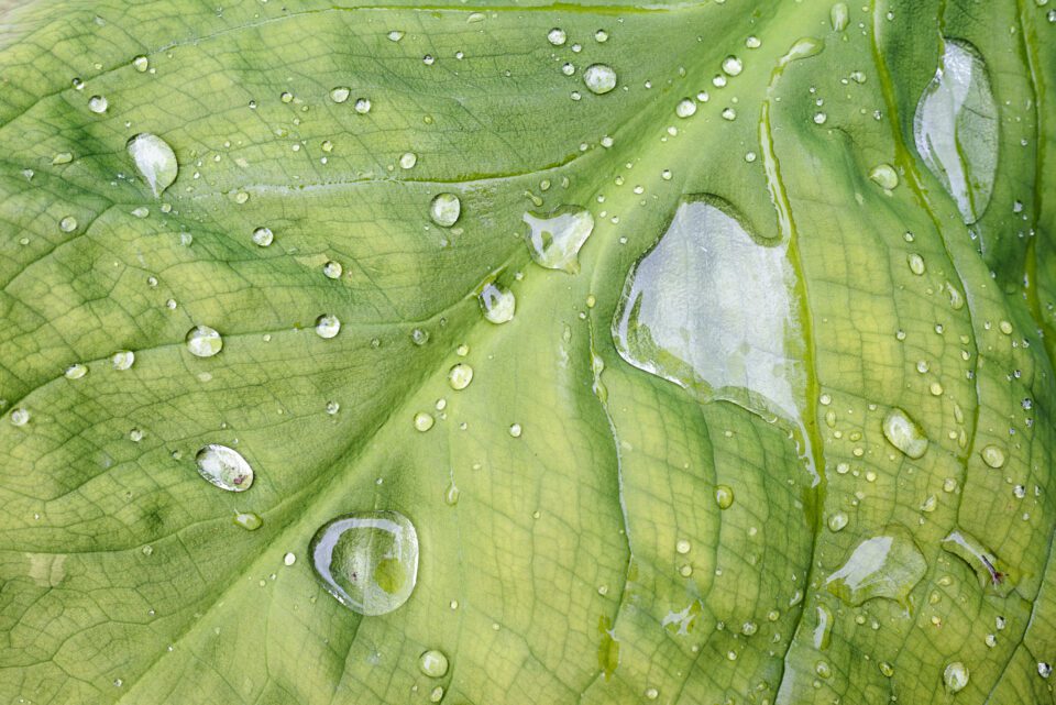
Smooth and organic texture; a sense of nature in the emotional message:
Texture as Subject
Sometimes, texture isn’t just a detail within the photo, but the whole point of the photo itself. These tend to be abstract or semi-abstract images, and they can be a powerful type of photography.
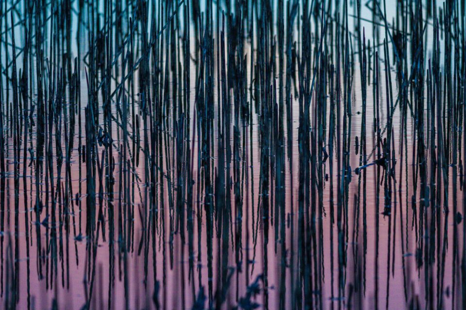
The reason why “texture as subject” photos tend to work well is that they tell a unified story. So long as nothing distracting interrupts the texture, you’ll end up taking a photo where every part of the frame is on the same page, so to speak.
Half the problem with most photos is that they don’t have a cohesive message, where as much of the photo as possible adds to the image. (It’s certainly the biggest problem with most of the photos I take and never show anyone.) Texture-based photos bypass that, to some extent. If the whole image is a single texture, many of that photo’s emotions are going to be unified almost by definition.
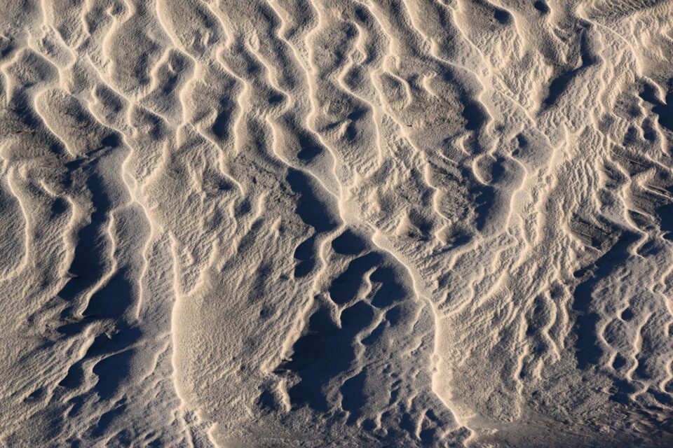
This alone doesn’t guarantee a portfolio-worthy image. The texture still needs to be interesting if you want a good photo. Odds aren’t great that a random picture of your kitchen floor will be a winner. Factors like light and composition continue to play a big role in the picture’s quality, as always. But “texture as subject” is still one of the easier ways to take a unified photo, and that can be a very good starting point.
Texture as an Element of Composition
In most photos, texture isn’t going to be the leading role and won’t command most of the photo’s attention. For example, if you take a portrait photo, chances are that people will look at the subject’s eyes more than the texture of their skin or hair.
But even when texture isn’t the reason behind a photo’s existence, it still plays a role in shaping the image’s emotions. Maybe the primary subject of your photo is a mountain on the horizon, and that won’t change regardless of the rest of the photo. But there’s still a big emotional difference between a flowing meadow in the foreground versus cracked patches of dirt and rocks.
One area that I always pay attention to in my photos is the out-of-focus background. In many photos, the out-of-focus areas take up large amounts of the image, giving them a lot of emotional impact. Take a look at the image below:

In this case, the rough and clashing highlights and shadows in the background don’t help the emotional message. In fact, the background attracts enough attention of its own that it actually draws people’s eyes away from the subject.
So, I followed the dragonfly around for a few minutes as it landed on different plants, in hopes of getting a background with a less distracting texture. I was happy to see it land here soon after, for what I consider a better photo:

The subject of the two photos is the same. The composition is also the same, just mirrored. But the second photo works better because the more gentle background texture is a better fit and doesn’t distract from the dragonfly.
(Changing the background texture is also something you can accomplish by changing your aperture, although in this case, I’m reasonably sure that I used the same aperture both times. It was a non-CPU lens, though, so I can’t say for certain, aside from noting the similar amount of the dragonfly that’s in focus both times.)
How to Make the Most of Texture
Texture isn’t something you should spend an eternity worrying about. It’s simply another tool at your disposal during composition. But it is something that you have some control over in most photos, even non-studio scenes. There are almost always going to be ways to shift a photo’s texture in one direction or another.
For example, you could change your composition either slightly or drastically. Here’s an example where I think the harsh foreground texture of the seashore, though not awful, contradicts the rest of my photo somewhat:

So, when I started taking some drone photos a bit later in the morning, I made sure to capture a similar composition but with gentler texture in the foreground. To me, this next shot is an improvement:

You could also search for different subjects in the first place. As I watched the sunrise from a mountain several years ago, I found a particularly jagged subject to photograph:
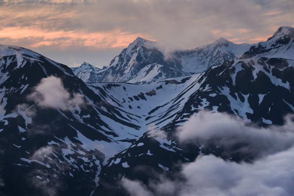
Whereas the texture on the same morning, but in a different direction, was almost the complete opposite:
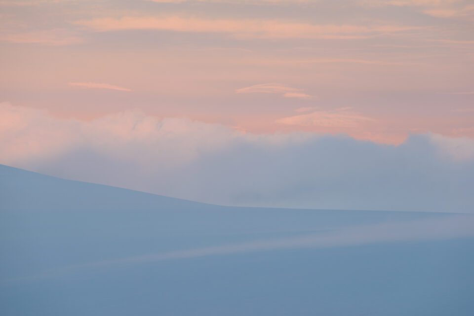
I’m not saying either is better or worse, just that you can get drastically different results simply by keeping your eyes peeled for a variety of subjects. This goes along the same lines as my recent article on timing and direction in landscape photography. Based on the time of day that you’re taking pictures, and the direction you face, you can end up capturing drastically different textures – and, therefore, drastically different emotions.
You may have noticed that most of what I’ve talked about so far has to do with field-based photography under natural light. But if you’re taking pictures in a studio, you have almost limitless control over the texture throughout your image.
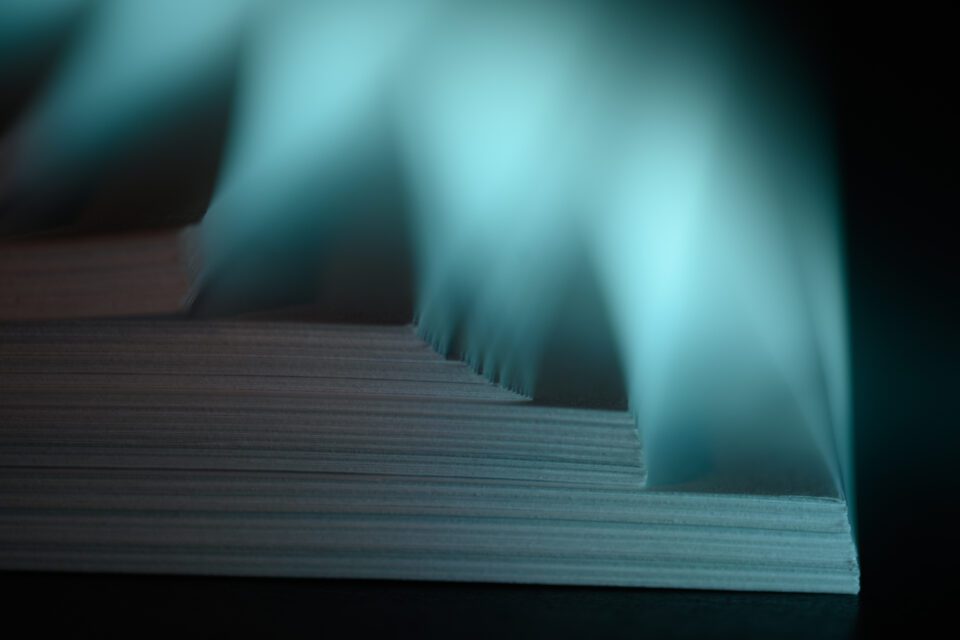
Here, I photographed some sheets of paper in a way that emphasizes how course and rough they are:
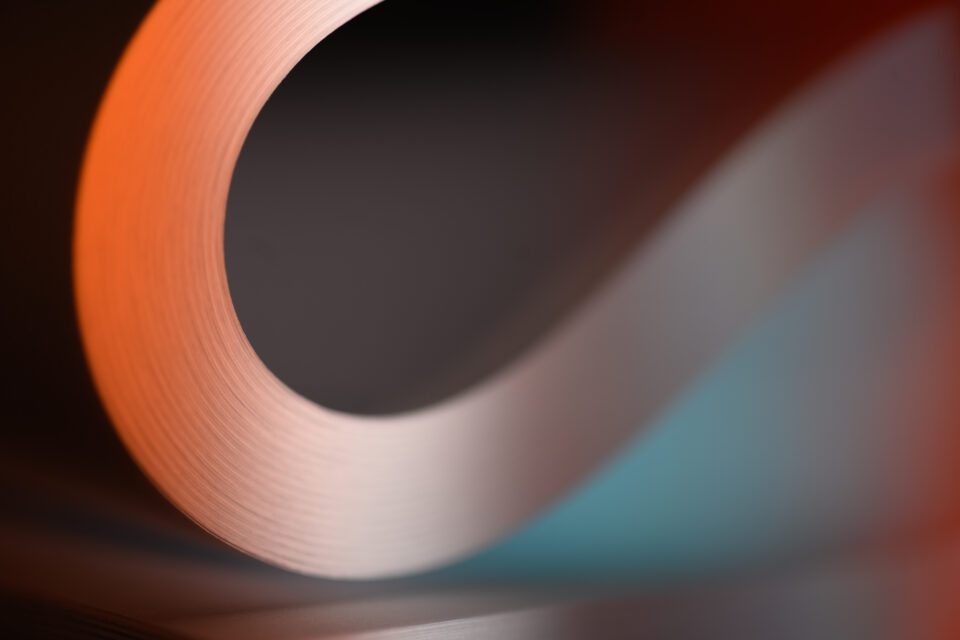
But from a different angle, and by using softer and warmer light, I was able to capture a much gentler texture:
Even if you don’t have the luxury of shooting in a studio, you can also control texture to some degree in post-processing. For example, to emphasize the cracks in the wall in the following photo, I boosted Lightroom’s clarity slider – and, yes, the texture slider! – to +15 and +5 respectively:

But it’s easy to go overboard. Maximum or minimum slider settings aren’t usually a good idea, especially when dealing with especially harsh sliders like Lightroom’s clarity option. It’s easy to see a texture you like, but then take things way too far:

Everyone’s tastes are going to be different, but the image above crosses the line from a photo to digital art in my mind, and not in a way I’m happy with. So, make sure not to overdo it if you decide to start emphasizing or de-emphasizing certain textures in post.
Lastly, your camera settings can have an impact on your photo’s texture, and not just in terms of depth of field like I covered a moment ago. Here’s an example where I used a deliberately slow shutter speed of 1/10 second and shot handheld, panning with the ocean wave, to emphasize its gentle character:

When you think out of the box, you can discover many similar cases. Long exposures, filters, flash (sometimes in combination with long exposures and filters) – all of these can be tools for capturing the textures you want in photography.
Conclusion
I hope this article gave you a good idea of how to work with texture in your own photos. I won’t claim that it’s the most important part of composition, or probably even in the top five. But it still influences a photo’s emotional message, which means it’s worth paying attention to. And if you’re completely stuck for good photo ideas at a given location, look around for some interesting textures, and you can get those creative wheels spinning again!