Youtuber Kevin Raposo believes that many photographers use the Clarity, Texture, and Dehaze sliders in Lightroom without fully understanding what each is doing. To help, he’s uploaded this quick 4-minute video that teaches you the differences between each, and when best to use them.
Raposo explains that the Texture Tool adds or reduces contrast in an image based on Frequency. He explains that frequency refers to the consistency of colors, brightness, and shadows in a section of an image. Low-frequency sections of an image are like skies, where there is a relative consistency of those elements. High-frequency sections of an image are the opposite and have less consistency.
The Texture slider specifically targets the high-frequency areas and adds sharpness and definition when moved up and blurs them when moved down.
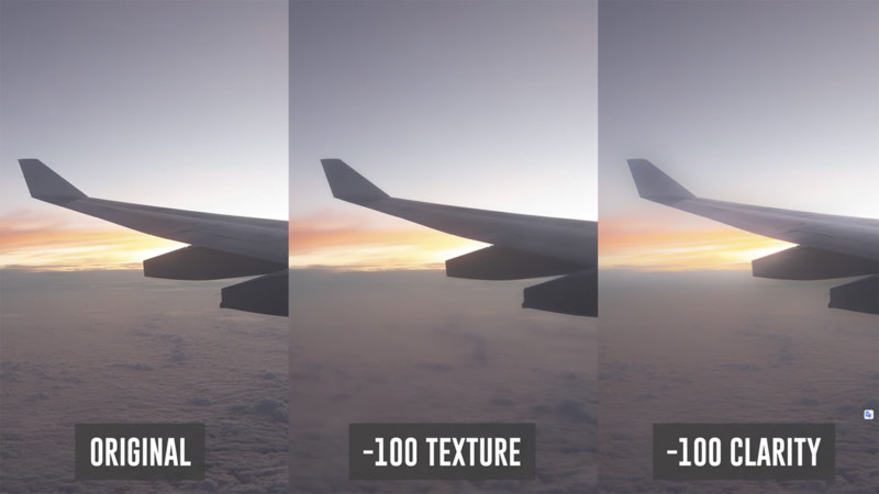
The Clarity tool affects frequency by targeting the midtones. Raposo explains the relationship between these two sliders by showing each slider’s effect on an image taken out a plane window.

The Clarity slider, when dropped down, blurs the plane wing while the Texture slider does not. This is because the plane wing is mid to low frequency, which the Texture slider largely ignores but the Clarity slider directly affects.
Dehaze is meant to be used to restore color and contrast to a washed-out image, but can also make colors unrealistic if used with too heavy of a hand.
Raposo explains the ways he uses each of these three sliders for different purposes in the video above, so make sure to watch it in full to see how he recommends utilizing each of these three tools in your own work.
For more from Kevin Raposo you can subscribe to his YouTube Channel.