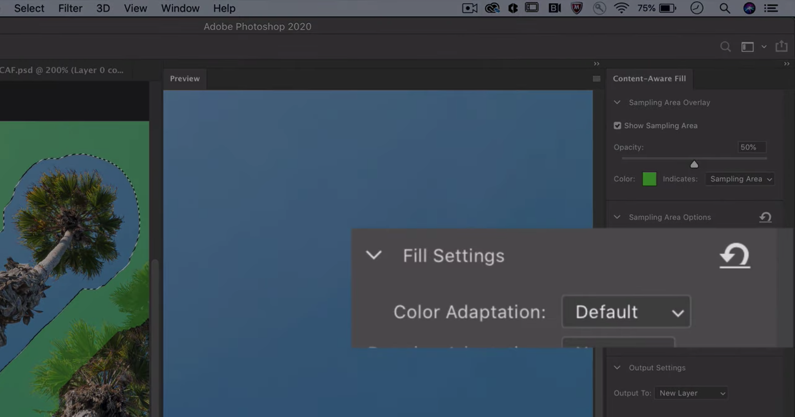
Adobe has just uploaded a very quick-but-useful tutorial that will help you get more realistic results when using Photoshop’s Content Aware Fill tool by altering one lesser-known setting: Color Adaptation.
Content Aware Fill typically does a pretty good job on its own, especially after the recent update that added some Sensei AI magic to the mix. But have you ever noticed the “Color Adaptation” drop down in the Content Aware Fill workspace?

As Adobe’s Meredith Stotznere explains, this feature controls the color, brightness and contrast of the filled area to generate the most seamless transition between the original image and the fill. So if your transition is a bit jarring or the tool is bringing incorrect tones into the filled are, you’ll want to change this setting.
In the video above, Stotznere shows you two examples: one where you need to turn the Color Adaptation up, and another where it needs to be turned down. In both cases, this simple alteration to the settings generates a more realistic result.
Check out this episode of “Photoshop Magic Minute” above to see it for yourself, and if you like these 60-second tips, you can find more of them here.