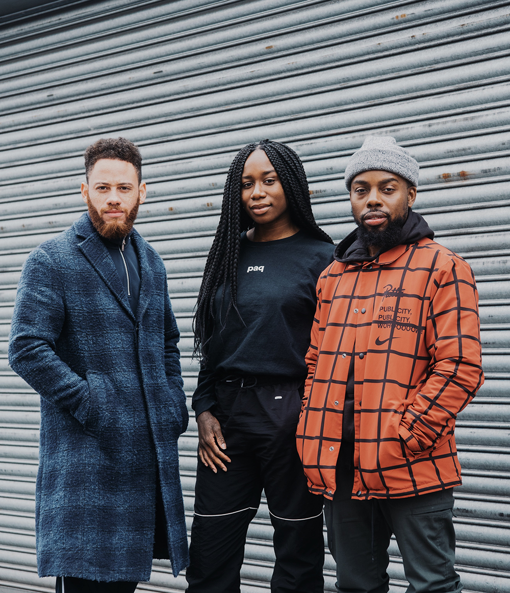
Designs by Paq incorporate bright sundial-inspired type contrasted with bold photography to show the “spirit and fun” of the monthly event.
Paq has created an identity inspired by “arguably our most precious commodity, time” for the V&A’s Friday Late series.
The new branding was launched to mark the 20th anniversary of the series, and to coincide with the Bauhaus-themed event taking place this week on 26 April.
Paq’s designs were informed by the shadows created by sundials, with elongated typography that references the evening time of the event. The colour palette, too, evokes the idea of nighttime, using yellow text against dark imagery in some applications.
According to the V&A, the “bold contrast” between the typography and the photographic imagery used looks to highlight the “life, spirit and fun” of the Friday Late event series.
Paq was invited to pitch for the project in January this year, having previously worked with arts institutions including Tate Modern and with the studio founders’ former design school Ravensbourne, where the team are guest lecturers.
Standing out from other late programmes
The V&A was looking for new branding for the Friday Late programme to cement its place as the “originators of the late programme within the UK, and to show the diversity of what they cover,” says Chiamaka Ojechi, creative director at Paq.
Joshua Allen, creative director at Paq, adds: “They wanted to appeal to different demographics and stand out form the other lates [art events] on Fridays,” such as those held at Tate and the Royal Academy.
Allen says: “We looked back at how time was told historically, going back to those original foundations, so we looked at the sundial and how they cast shadows from the light which transform in size and shape as time passes. We utilised these same principles to inform our design approach.’”
A vital part of the brief was to create designs that was flexible enough to use across print and digital—“bringing the sun dial into the present day,” as Ojechi puts it. “The identity is generally about something continuing, like time—something ongoing and flexible, with versatility,” she adds. The logo is able to “shape-shift” for various different applications across the event series.
Experimenting with V&A Sans
The Paq team was asked to use the typeface integral to the V&A’s existing branding, V&A Sans (an adapted version of TheSans by Lucas de Groot), as well as giving prominence to the institution’s logo. However, the team was given room for experimentation, and set about skewing and slanting the type. “We were able to manipulate the typography to make something bolder—we definitely had wiggle room, and they were very open to us being quite playful,” says Ojechi.

As well as working as a design studio, Paq is also a fashion brand, and the photography used as the backdrop for the type on the V&A posters is drawn directly from a previous Paq shoot for “the primary paq” range of apparel. “It fitted with the art school theme,” says Allen.
The Friday Late event date is exactly 100 years since the founding of the Bauhaus, according to the V&A, and explores the idea of art school as ostensibly a “a place of creative experimentation and rebellious ideas,” but one that today is subject to rising fees, funding cuts and “results-driven education”, prompting the question “can the art school still be radical?”