Andrew Lawrence, executive creative director at Elmwood, discusses why newly formed, break-away political party Change UK: The Independent Group is struggling to make an impact with its current brand identity.
The Electoral Commission’s rejection of Change UK’s logo on ballot papers for next month’s European elections is undoubtedly a setback. But in brand terms, it also presents a big opportunity.
Earlier this month, The Independent Group (TIG), composed of 11 former Labour and Conservative Members of Parliament (MPs), successfully registered as a political party named Change UK to take part in the European elections happening on 23 May. At these, the public will vote for UK MPs to be elected as Members of European Parliament (MEPs).
Change UK logo banned from ballot slips
But following this, the Electoral Commission ruled Change UK would have to enter the elections without a logo because the one it submitted — a black square with the initials “TIG” and the hashtag “#change” — was not sufficiently recognisable and could mislead voters. Petition website change.org also expressed disapproval of the name.
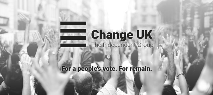
Since then, the party has adopted a new logo for its online platforms, such as its website and social media — a monochrome square, made up of four, horizontal black lines against a white background. It’s not clear if this is an interim brand or not, but either way, Change UK will have a blank spot where its logo should be on this month’s ballot slips.
Generally, political logos don’t have a great deal of equity. This is because political parties don’t invest enough in creating a meaningful and memorable brand — and this is certainly the case here.
Weak, simplistic and rushed
Aside from the obvious confusion that the party is currently running under two titles of Change UK and The Independent Group, as a piece of design, both iterations of its logo are weak, simplistic and hurriedly patched-together. They’ve come up with no discernible branding.
Furthermore, TIG has orientated itself around the word “change” and the slogan “Politics is broken, let’s change it”. Aligning the brand with a single and (hopefully) temporary issue — in this case, a broken political system — is a mistake.
What happens when the political system improves or we move on from the current Brexit crisis? In years or even months to come, Change UK risks losing relevance and purpose as the UK Independence Party (UKIP) did when the Brexit vote went through — though Nigel Farage never seems to go away for long.
Political parties don’t like to stand out
Political logos tend to be boring and predictable. The Tories replaced their freedom torch with a scribble of an oak tree in 2006, the Liberal Democrats have a dove that looks like it’s made from banana skins and Labour’s rose logo hasn’t changed since the 1980s.
And, all too often, their positioning follows an old, established pattern. British political parties tend to pursue a brand that conforms rather than drives change, and so they opt for predictable ideals — progress, liberty and strength.
But in commercial branding, competition has forced companies towards being distinctive and articulating points of difference through carefully-chosen and clearly-differentiated words.
So why don’t political parties think this way, too? The answer is simple. Because parties don’t want to stand out or do anything too different in case it exposes them to ridicule.
Powerful design can sway a nation
The trouble is, we’ve all seen how easily marketing tactics can swing an election. And the fact remains that you need a strong brand and a distinct tone of voice to make an impact with the electorate.
For proof, look no further than how some of the world’s bravest movements for change have successfully inspired populations — last year’s Hope to Nope exhibition at The Design Museum offers much inspiration.
This featured, among other pieces, Shepard Fairey’s iconic Barack Obama poster for the 2008 US presidential election – a design created in one day, printed first as a street poster, which spawned numerous variations and imitations, some officially-sanctioned.
This is a powerful example of how design can sway a nation, but also of how understanding the electorate and finessing every brand touchpoint have proven to be incredibly important.
A brand is about standing for something
The fact that Change UK has chosen not to enlist one of many big advertising agencies — which will have undoubtedly been beating down their door offering services for free — to help create their image is mystifying.
The party now runs the risk of voters thinking of empty promises when they see the blank spot next to Change UK’s name on their paper slips on European election voting day.
To change the tide of a shaky start, Change UK will need to build a meaningful brand mission that moves it beyond its origins as a loose, motley crew of disenfranchised MPs.
What it must now do, quickly, is tap into the promise of newness, difference and distinctiveness. Be anti-establishment — but do so with a sense of purpose.
A brand is not just a badge, it’s about standing for something — it’s an identity and a point of view on the world. Brand building is crucial if Change UK is to move forward as an effective political entity — and if it gets it right, it could be a force to be reckoned with.