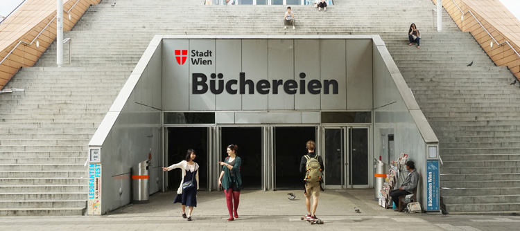
Austria’s capital, which was crowned the best place to live last year in a global survey, has a new identity designed by Saffron, which aims to unify government and public services.
The city of Vienna has been rebranded, with a new identity that looks to put “humans at its heart” and aims to serve tax-paying citizens as well as tourists.
Vienna, Austria’s capital city, is currently the best place to live worldwide, according to the Economist Intelligence Unit’s global liveability index conducted last year. The survey looks at many factors, including crime and safety, healthcare, pollution and infrastructure.
The city is known for its public services, such as free university education and healthcare, as well as low-cost housing, and a commitment to maintain half of Vienna as green spaces.
The new place brand, which has been designed by global studio Saffron’s Vienna office, looks to celebrate the “Viennese ethos” of “putting human beings at the heart of everything it does”.
It aims to be “highly prominent in the lives of Vienna’s inhabitants”, says Saffron, and is being incorporated across touchpoints that are part of citizens’ “day-to-day lives”. This includes signage at public parks, buildings and universities, print materials for local services and governmental departments, advertising for museums, banners on public transport such as buses and tourism apps.
It also brings the city’s 70 governmental departments under one brand, which previously used different, inconsistent logos.
The previous official Vienna branding included a jumbled logotype spelling “Stadt Wien”, which is Germany for “City of Vienna”. It featured letters set in many different typefaces and font styles, including italics and bold, serif and sans-serif, and lower and uppercase. The two words were separated by a red shield with a white cross in the centre, which mirrors the Austrian coat of arms, as well as the Austrian flag.
The new logo sees a unified “Stadt Wien” logotype set in bespoke, sans-serif typeface Wiener Melange, set on the right. On the left is an enlarged, refined version of the red shield with the white cross.
The type was developed alongside foundry Dalton Maag, and the style was inspired by many of Vienna’s cultural assets, including the lettering found on historic pubs and inns, and the curves of the coat of arms.
The new typeface is also being used as the core type for copy across all brand communications, such as signage and advertising posters.
The shield, inspired by Austria’s coat of arms, has been reinterpreted in different ways across the identity, incorporating illustrations showing Viennese residents doing different things, such as cycling and dancing.
A bright, secondary palette of pinks, purples, greens, yellows and greys has been used, alongside the core palette of red, white and black seen in the logo.
“Vienna now has a brand that can support the municipality’s ambition to continue being the world’s most liveable city,” says Saffron. “People in Vienna will now be able to better recognise urban services and have a consistent design identity for their city administration.”
The new identity is rolling out across the whole city, including Vienna’s 70 governmental departments’ buildings, signage and publicity materials, merchandise and collateral at events such as tote bags and cups, and advertising and signage for public places and services, such as public parks, libraries, bike racks and garbage trucks.