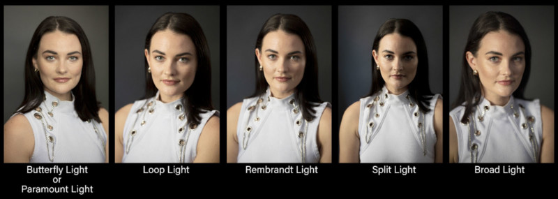
I’m Jay P. Morgan from The Slanted Lens. In this article, we’re going to show you how to set up the five lighting portrait positions using the window and how to control the light.
I’ve got Rai here with me. Rai is from London.
The first thing we did in this room is we got rid of all the light that isn’t through my one window. I’ve got a window here, and it’s roughly about three-foot-square. That’s my light source. I want light coming just from that one three by three area so I can control it.
When you set up in the studio, you put your model in place. You put your background behind them, and then you move your light to your model. When you work with window light, you have to move your model and the background to the window. So if you want to change the lighting portrait position on your talent, you have to change the background and your talent in relationship to the window.
You can change the look of window light and make it very dramatic and very open. You have so much control of window light if you’ll learn to change the model and the background in relationship to your window.
#1. Butterfly Light
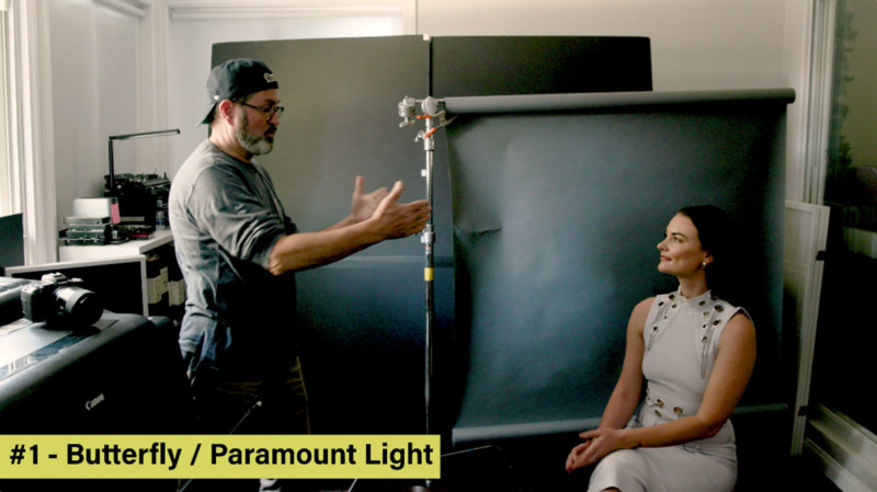
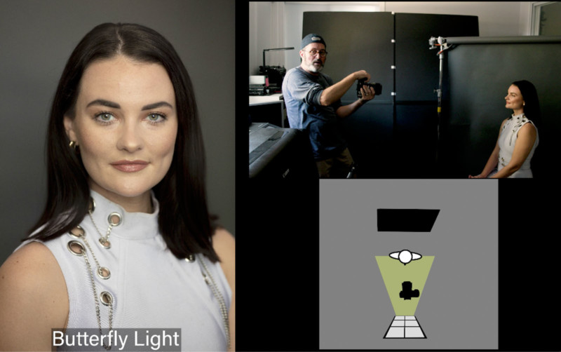
Let’s set up our first portrait lighting position. We’re going to do a butterfly light. I’m going to get Rai to turn toward me. So the idea is I’m turning her towards the window, this is my light source. If I have her stand up this light source is too low. It comes in underneath her chin and it opens up all the shadows on her chin which destroys any detail on her face. But if I have her sit down this light source is higher than her nose.
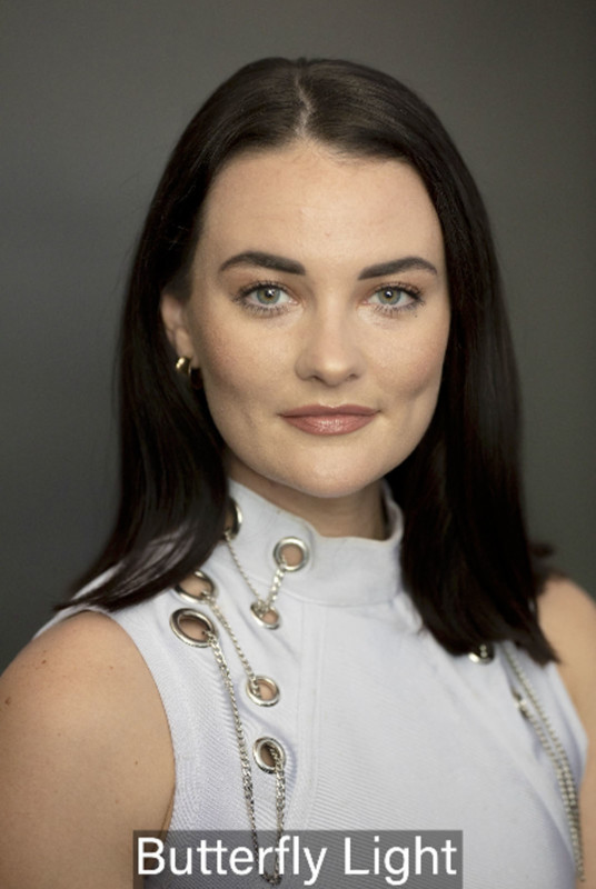


And it’s going to give me a shadow under the nose and a shadow underneath her chin, my background obviously in the wrong place, I’m actually going to put it in the next room. The reason I put it in the next room is the further I get the background behind her, the less I have to deal with the shadow from her falling onto the background. I can light them separately now. I’ve got that background in the next room.

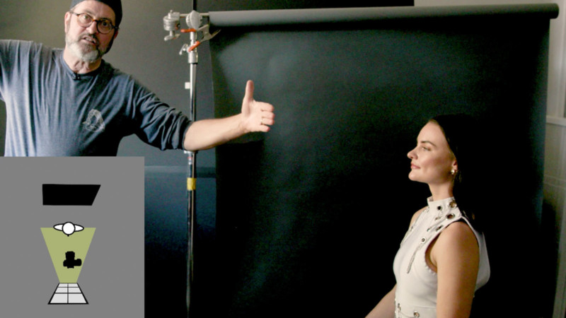

So you can change the ratio of the lighting. You can make it either a one to one ratio which is almost flat. Or you can do a one to three or one to four ratio which gives you really deep shadows. The idea though is I moved my background and my model in relationship to my light. If I want to make this a little more moody, I’m going to create more mood by moving her away from the light.
#2. Loop Light
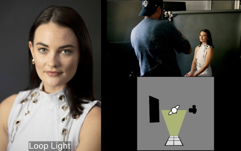
I’m going to have her turn towards me. You’ll see this little shadow on the side of her nose. See that little shadow on the nose that’s called a loop light. That loop will start to grow as she moves towards me.

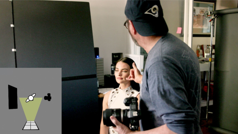

Next, I’m going to move my background back in. So there’s a loop. I’ve turned her slightly away from the light and it is becoming more dramatic. I’m shooting to the shadow side.
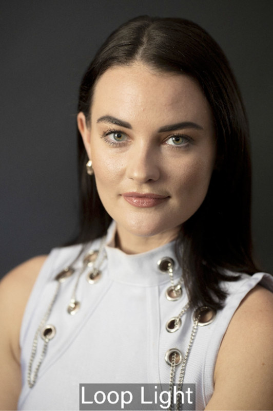


So it’s become a little more of a dramatic portrait of her.
#3. Rembrandt Light
As I now move her a little bit, it doesn’t need to be, the small loop on the bottom of her nose has closed with the shadow on her cheek and that creates a small triangle on her cheek. That’s called a Rembrandt. There is a story that the executives at Warner Brothers said, “Why are you lighting your stuff so dark? People aren’t going to pay to see that.” Then Cecil B. Demille said, “I’m lighting them with a Rembrandt light like Rembrandt used to paint.”

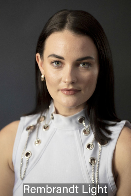

They said, “Well, that’s incredible, we can charge twice as much for that.” So it was the dawn of a beautiful rendition of light, not just everything being open and blown out.
#4. Split Light

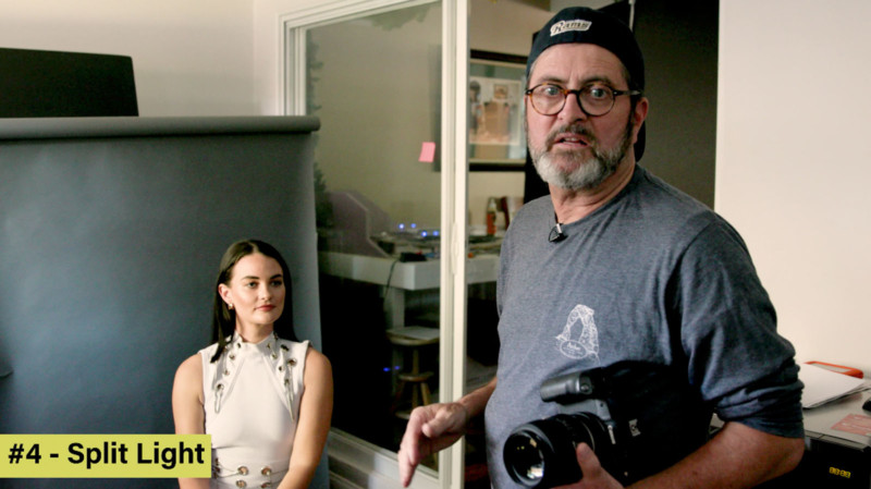

Next, we have what’s called a split light. That really is exactly what it sounds like. You’ve got a really bright highlight side and you have a dark shadow side. That’s a split light.
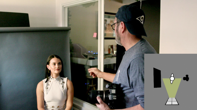


It divides her right down her nose. So this is a very moody light. And if I want to brighten it up it would be an easy one to do. Because I just take my fill card and if you look at the face, I place this to reflect light into the shadow side. You can see how that opens up.

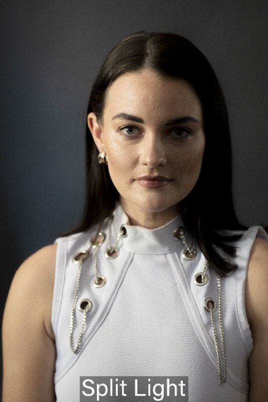

And that really opens up the highlight on the shadow side of her face. It’s all in relationship to the amount of intensity you get from the window.
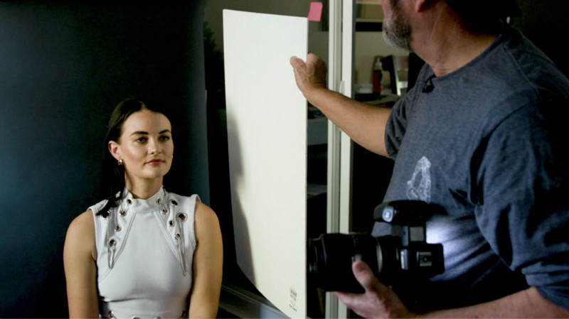


My exposure is set for the highlight side of her face, which means that this is going to take that same light that’s already coming in the window and exponentially push it back into the shadows. It’s going to open up the shadows.
#5. Broad Light
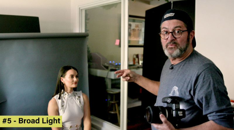


Now if I turn her even further, and I come around a little bit looking right here, this is called a broad light. I’ve switched from the shadow side to the highlight side.
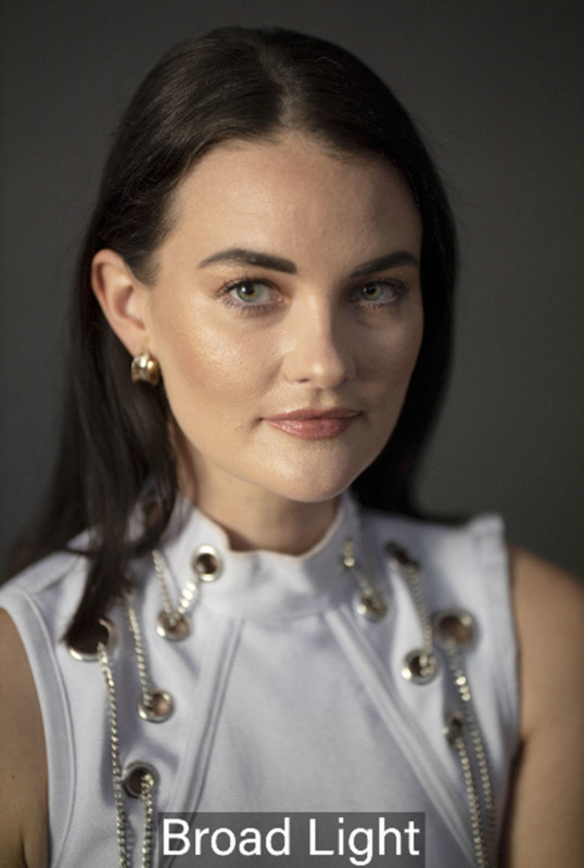


Let’s go all the way back to a Rembrandt right there. I’m shooting into the shadow side of the face. It’s more dramatic. It’s a lot more interesting and moody on the dark side of her face. But as she moves around to show the light side of her face, I have not changed how moody this is. It’s still very bright on the camera, left side and very dark on the camera right side.
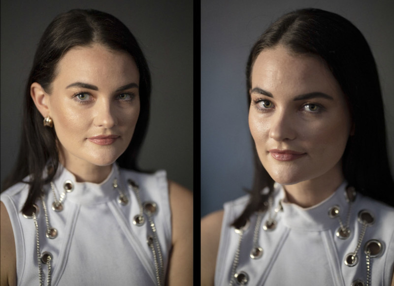


But what I’ve done is I’m not shooting into the shadow any longer. I’ve now moved around and I’m shooting into the highlight side of her face. So let’s shoot in the broadside. And if I move around I’m now shooting into the shadow side.
If you’re looking at those two side-by-side, there’s a major difference there. One feels a lot more open and less moody. The other one feels a lot more dark, a little more mysterious. So just that move from shooting into the shadow side to shooting into the highlight side changes the emotion and the mood of the shot completely.

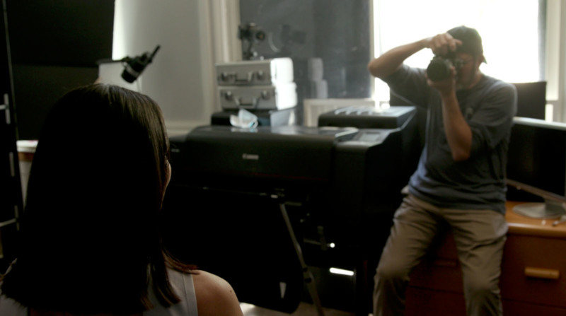

So the reason this is working is because we have two things going for us. One is that we have a smaller source, I blocked out everything except for this one source that is three foot by three foot. You could make this slightly larger like four foot by four foot. But as soon as you open up this whole wall, the light is everywhere and there’s no longer any control. There’s no direction, it doesn’t really give you the five lightning portrait positions.




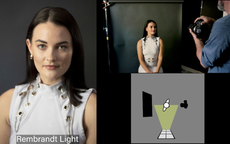

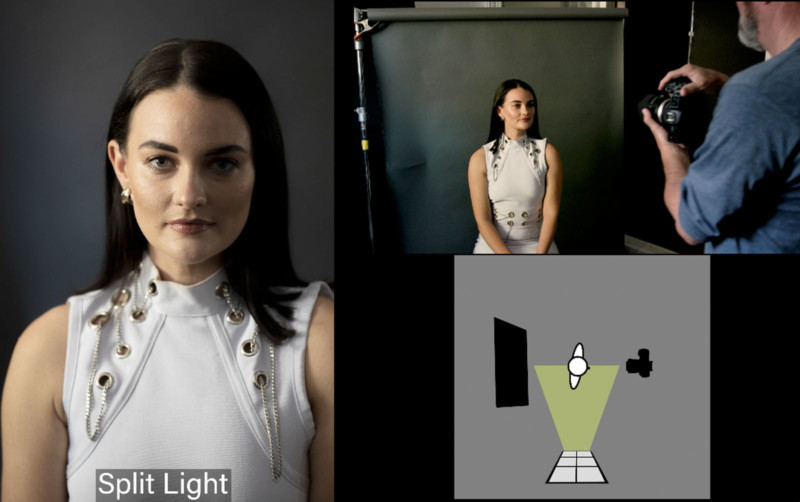


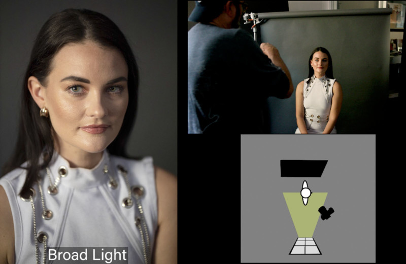


So it’s just a matter of moving her in relationship to the light source and moving the background and make sure you have a nice background light behind her.
Bonus: Rim Light
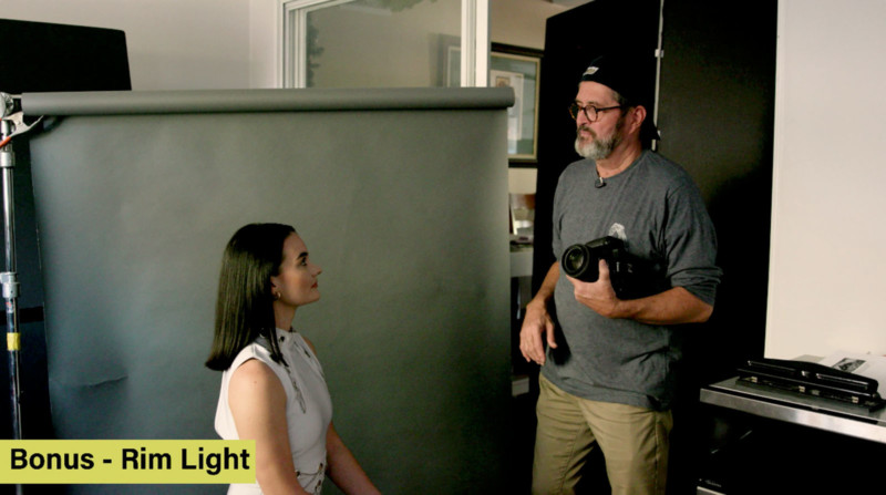


Now I’m going to move her way around. This is a back rim light that I absolutely love. I’ve got a great rim light all the way around her hair and on her cheekbones. I’m going to have to keep my background low because I don’t want it to knock out all the light in the background that’s hitting her face.
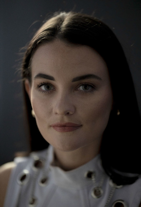


We’re going to bring my background around behind her to set up for that strong rim light. So there the light is completely behind her. It’s almost directly behind her but not quite, I can come around just a little bit here. That gives me the nice light on her hair and on the side of her face on the cheekbones.

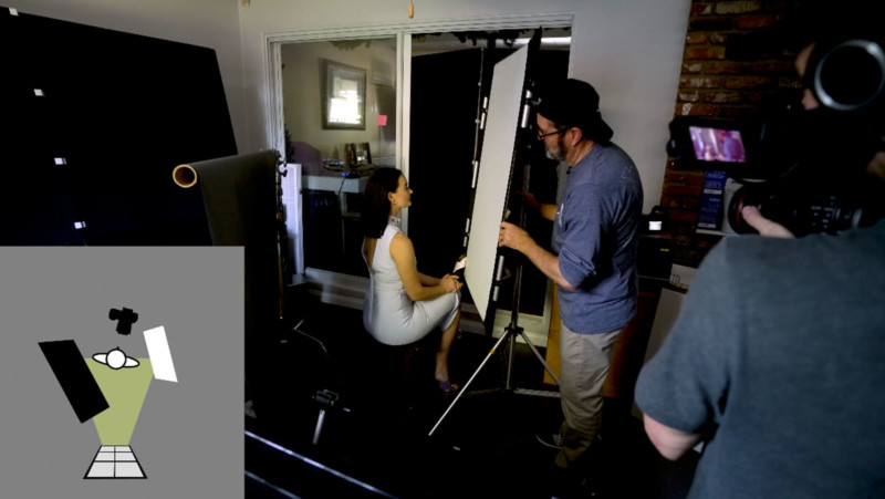

But now I’m going to bounce the light right back into her face. The closer I get that reflector or fill card to her, the more efficient it’s going to be and the more light it is going to kick back into her face.

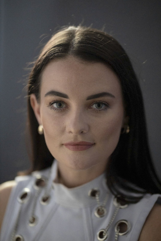

Now I’m using that window light as a rim light. And I’m bouncing light back into her face, which gives a beautiful look. It really is pretty because it wraps that light around. We have a key light and fill light from the same side. So we’ve got that hard-key on the side of her rim light. But then this reflector bounces that light back in and wraps around her face.

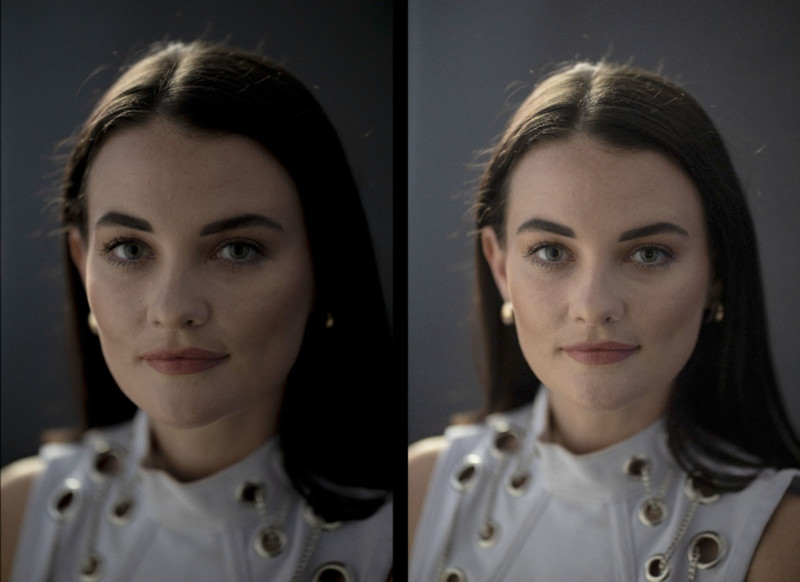

So there’s a look at using window light to create the five lighting portrait positions. Most people don’t think of window light as a source that you can control. It’s just soft in there and you just use it as is. I like to propose that you learn to create and to control it and to augment it and modify it.


If you have sunlight hitting the window, throw up a white trash bag or a sheet and it gives a beautiful soft light that comes into the room. Don’t just take it for what it is. Throw some softener in there. You can always put a card up and you can flag it. There are so many different ways to control the light that comes through the window.
People who are really good at using window light use it just like a light source. They control it, they shape it, they modify it.
P.S. If you enjoyed this article, subscribe to our YouTube channel for more content like it.
About the author: Jay P. Morgan is a commercial photographer with over two decades of experience in the industry. He teaches photography through his company, The Slanted Lens, which runs a popular YouTube channel. This review was also published here.