The multi-faceted and polygonal logo design style still seem to be really popular, especially with brands in the tech and digital industries. These logo designs are often quite detailed with lots of gradient colours and shading that gives the graphic an icon-like appearance. Follow along with today’s Adobe Illustrator tutorial to create a stylised gemstone logo graphic in Adobe Illustrator. We’ll use a range of tools to produce the design in vector format, resulting in a crisp design that could form the basis of a modern brand identity.

Typically logo design projects would begin with brainstorming to develop a concept that represents a particular brand, but we’ll jump straight to the fun stage of creating the artwork in this tutorial. The design features an abstract shape that is made up of numerous facets, each with a different shade of green. The addition of gradient shading helps add depth to the colours to give the icon the appearance of a shiny crystal.
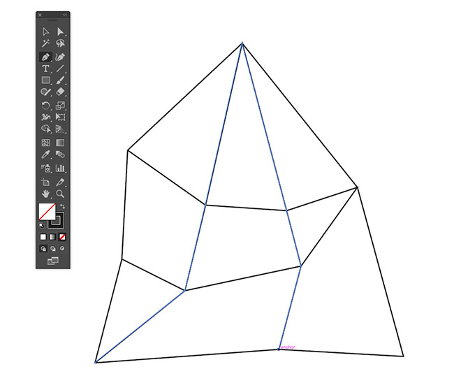
One of the old rules of logo design was to keep the concept basic with flat colours to ensure it could be reproduced in print and at small dimensions, but the primary use of modern digital brand identities is on high resolution screens, where there’s no problem in reproducing a stunning full colour graphic. It’s still important to develop a design that will work in all scenarios though, so we’ll also prepare a basic mono version of the logo that can be reserved for specific applications where the full colour design would be unsuitable.
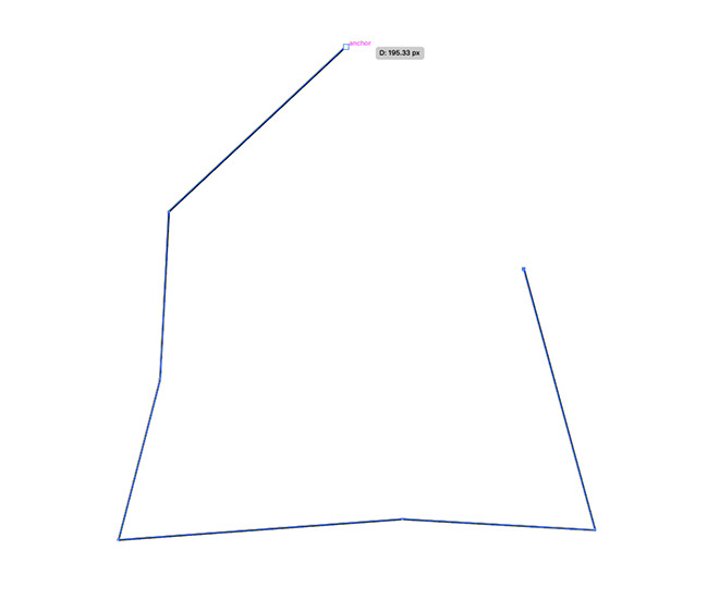
Open up Adobe Illustrator and create a new document. The size doesn’t matter at all since the artboard will just be used to provide a workspace to play with. Use the Pen tool to draw the outline of your gemstone shape, making single clicks to keep the lines straight. Remove the default white fill, leaving just a black stroke.
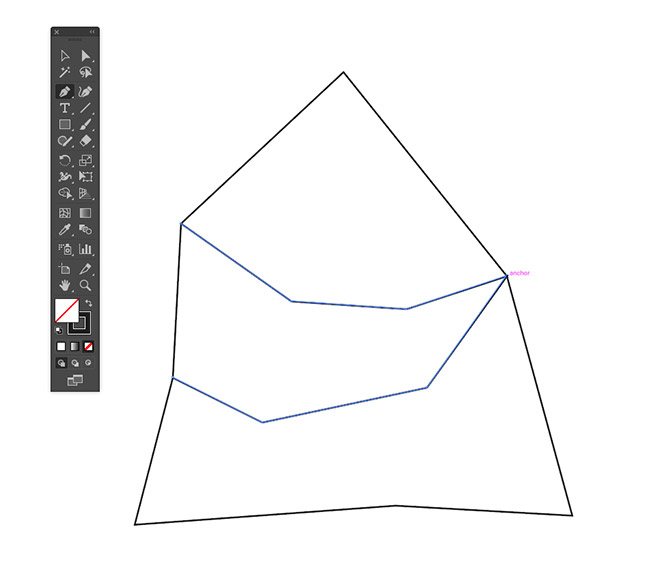
Turn on Smart Guides from under the View menu to make it easier to snap to the existing points, then draw a couple of bridging lines from one side of the shape to the other, each with a few corners.

Draw more lines that connect all the points up from the top of the shape to the bottom, ensuring the path always intersects with a point.
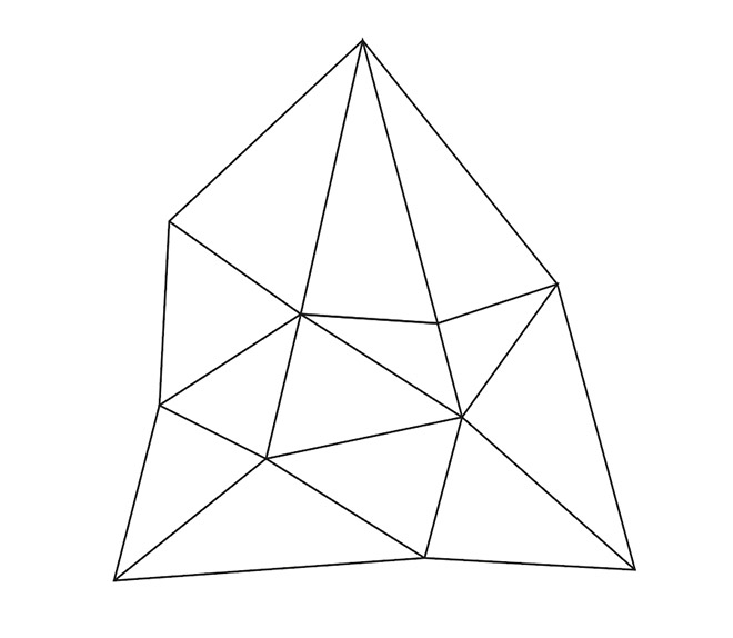
Fill in any shorter lines to divide up the shapes wherever any two corners can be connected.
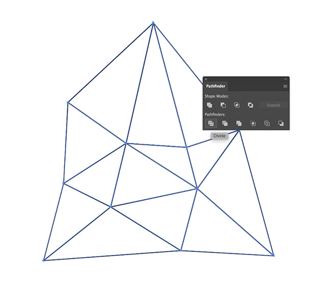
Activate the Selection tool and draw a selection across all the paths. Click the Divide button from the Pathfinder panel.
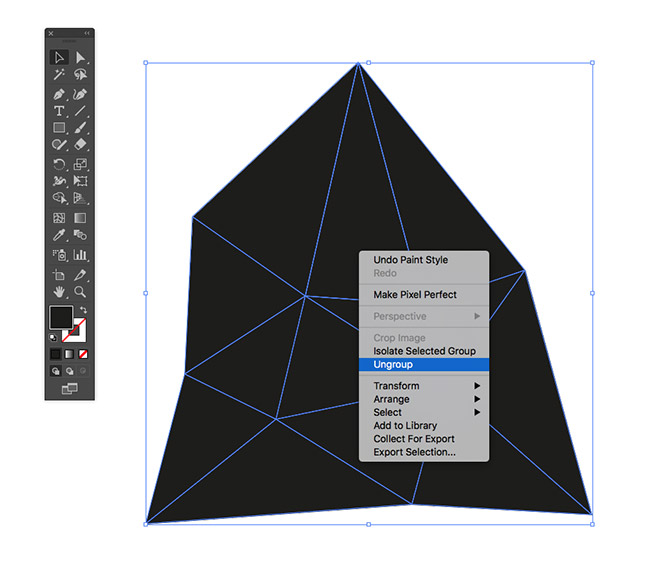
Switch the black stroke over to a fill, then right click on the shapes and select Ungroup.
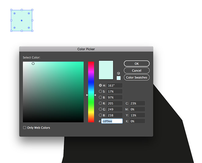
Select the Rectangle tool and draw a small square somewhere on the artboard. Give this square a fill using the lightest shade of the colour you have chosen for your logo. I’m using a light green of #cdf9ee.
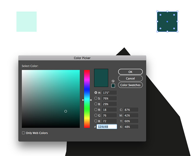
Make a copy of the square and drag it to one side. Replace the fill with a darker colour. I’m using #124c48.
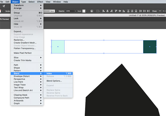
Select both squares and go to Object > Blend > Make. This will create a smooth transition between the two colours that will automatically give us a number of shades to work with.
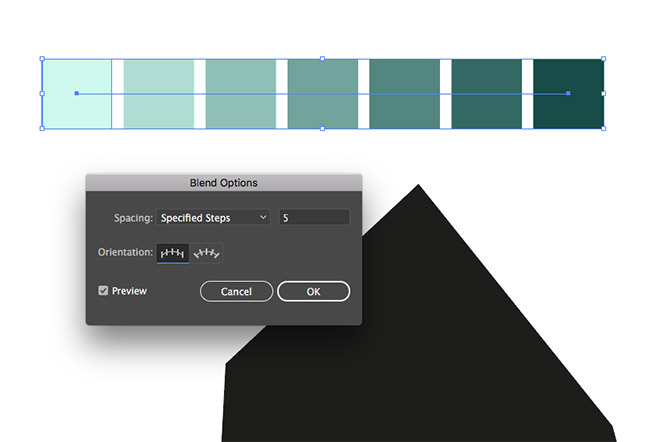
Go back to Object > Blend > Blend Options and edit the settings to Specified Steps with a count of 5 to split the transition into a series of individual colour blocks.
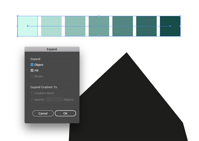
To make these new colour blocks more easily selectable, go to Object > Expand to convert the blend effect.
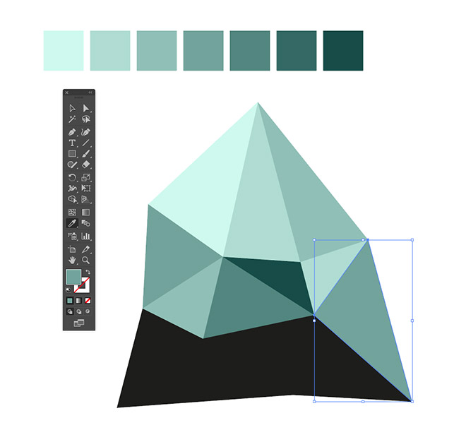
Select each shape in turn and use the Eyedropper tool to change the fill colour using a random choice from the 7 shades. You can use the CMD key to quickly toggle back to the Selection key to move onto the next shape.
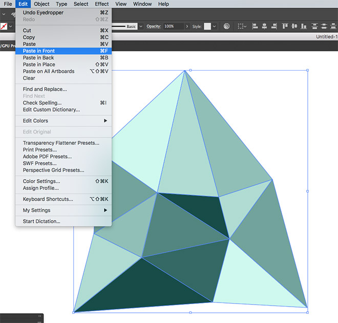
Once all the shapes have been filled, select them all and Copy, then Paste in Front a duplicate using the Edit > Paste in Front menu, or the CMD+F shortcut.
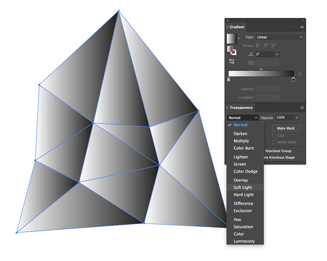
Click the black-to-white gradient from the Gradient panel to replace all the fills, then change the blending mode to Soft Light from within the Transparency panel.
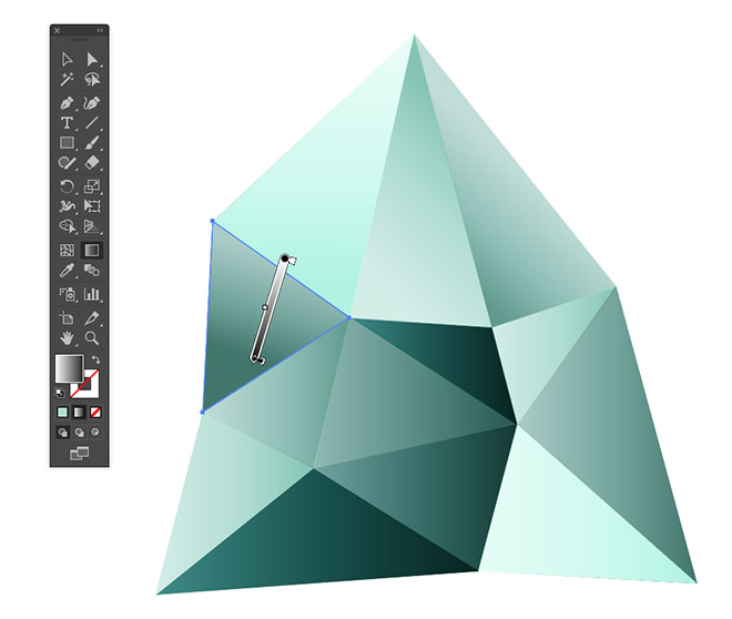
Deselect everything, then activate the Gradient tool. Select each shape in turn and drag the gradient in a random direction to differentiate the flow within each facet.
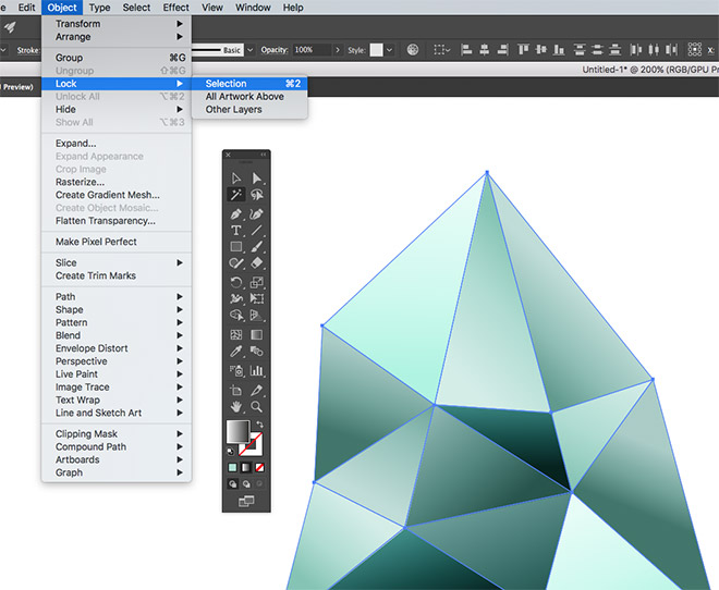
The random gradients really help boost the depth of the colours, but we can add an extra effect to give the gemstone more of a shiny appearance. Use the Magic Wand tool to quickly select all the gradient shapes, then Lock them from the Object > Lock menu.
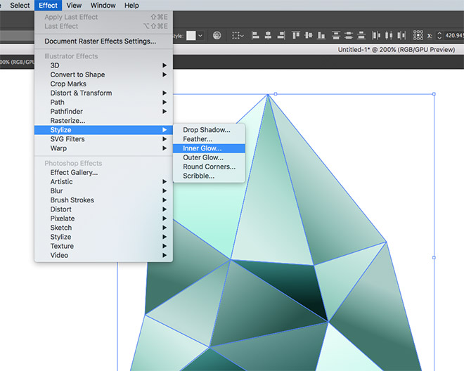
Draw a selection around the graphic, which will only select the bottom shapes because the gradient overlays are locked. Go to Effect > Stylize > Inner Glow.
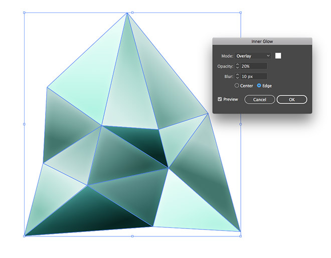
Change the settings to Overlay, with the colour white, then set the Opacity to 20% and Blur to 10px.
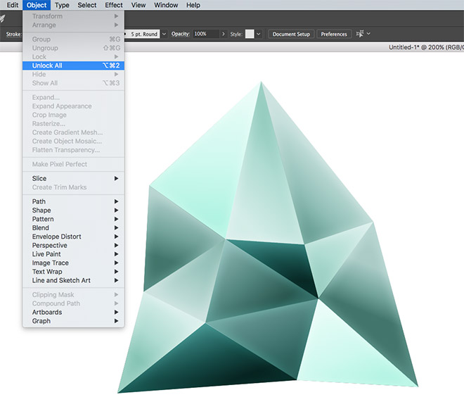
Go to Object > Unlock All to release the gradient shapes again. This extra inner glow helps add some subtle highlights.
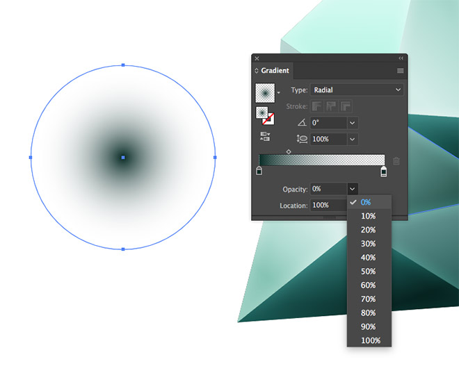
Icon graphics like this are often accompanied with a little shadow. Draw a circle using the Ellipse tool, then apply a Radial gradient. Eyedrop the same colour selection for both the gradient swatches, but change the opacity of the second to 0%.
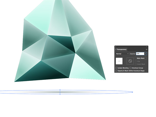
Squash and stretch the shape to form a shadow and position it underneath the icon graphic. Aligning it to the bottom of the shape will ground the object, while leaving a gap with give the appearance that the element is floating.
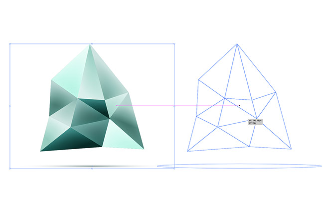
At the start I mentioned the importance of preparing an alternative version that works in a single colour. Make a selection of the entire design and drag a duplicate to one side while holding the ALT key.
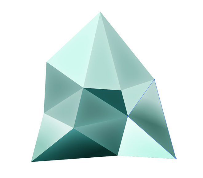
Select and delete all the gradient overlay shapes from the duplicate version to restore the graphic to flat colours.
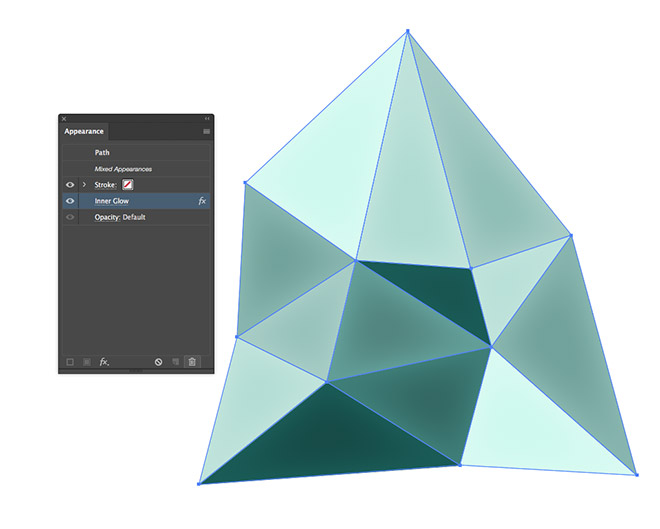
Make a selection of all the remaining shapes and delete the Inner Glow effect from the Appearance panel. This version could be saved as a print-friendly or low-resolution full-colour logo graphic.
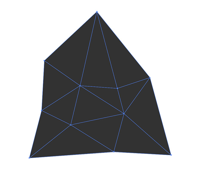
Replace the various colour fills with a single hue. The problem is, the entire design becomes unrecognisable, but a little adjustment will develop a working mono graphic.
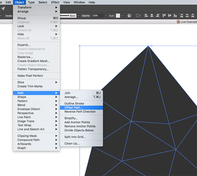
Go to Object > Path > Offset Path, then enter -1px in the settings. This will shrink the shapes down to leave a gap between them.
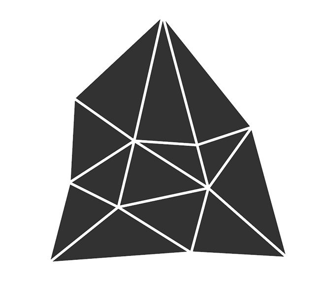
The Offset Path command preserves the original shape, so press CMD+X to Cut these new offset shapes, delete the original, then Paste (CMD+F) the new shapes back into place.

The final logo graphic looks great in full colour with the mix of colours produced by the gradient overlays and inner glow effects. This vibrant icon looks stunning on screen, where it will be primarily used, but the flat and mono versions provide important backups for use in other scenarios.
Download this file