Most of the time, when you see a good photo, you’ll get a sense that the photographer took it deliberately. But how can you tell that? What subtle things about the photo make it appear deliberate rather than random? That’s what I’ll cover today.
Getting the Technical Things Right
The first and most obvious way to make a photo feel intentional is to get as much of the technical side of photography correct as possible. This usually means that your subject is sharp, your depth of field is acceptable, your exposure is accurate, and there isn’t too much image noise.
However, it’s also possible to take good photos that deliberately don’t do these things. Some photographers are after blurred subjects, light leaks, lots of grain, and off-the-wall exposures. In terms of making your photos feel more deliberate, these still count as getting the technical things right! Because the key is that you’re doing them intentionally. There’s a big difference between blurring your subject in order to get an artsy appearance, versus blurring your subject because you accidentally set your shutter speed too long. And viewers can almost always tell which is which.
In any case, you should choose the camera settings and other technical details intentionally to complement your subject. When you do, your photos will feel more deliberate.

Breathing Space and Clear Edges
One of the quickest ways to take a careless photo is to block an important subject with an unimportant subject. Maybe you’re trying to frame a distant mountain with some trees around it, but one of the tree branches is covering the peak. Or maybe you’re trying to photograph a bee on a flower, but the bee wanders too far to the other side and is partly obscured.
Those aren’t the best recipes for deliberate photos. Instead, a photo almost always looks better when your primary subject has some breathing space and isn’t cut off by anything else in the photo. And that even includes the edges of the photo itself! You can probably tell why a photo of a mountain wouldn’t look very deliberate if the top edge of the image decapitated the peak.
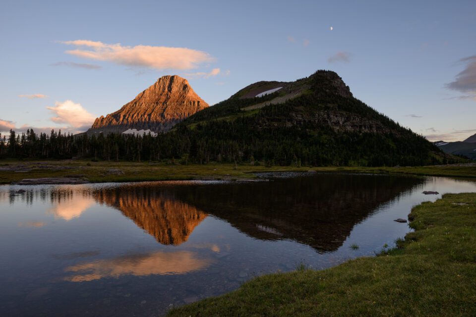
Here’s an example of a non-deliberate composition that I didn’t put very much thought into. As you can see, the moon has almost no breathing space against the top of the frame, and the important reflection of the mountain is covered by a bunch of unimportant rocks:

I found a different spot to frame a second photo of the scene, and I paid more attention to breathing spaces and the edges of my composition. The result is an image that feels more deliberate:
Always watch the edges of your frame and the amount of space around your subject. Unless you have a good reason to do otherwise, try to give every important part of your photo enough breathing room in your composition.
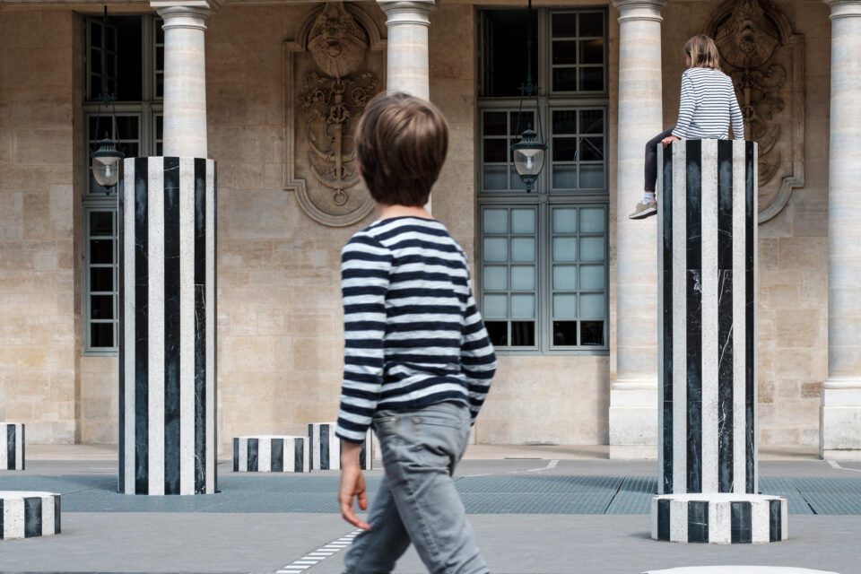
Balanced Composition
When a photograph is balanced, it has a roughly equal distribution of visual weight throughout the image from left to right. In other words, you can imagine putting the image on a fulcrum, with each subject “weighing” a different amount based on its importance, and seeing if it tilts to either side or stays centered.
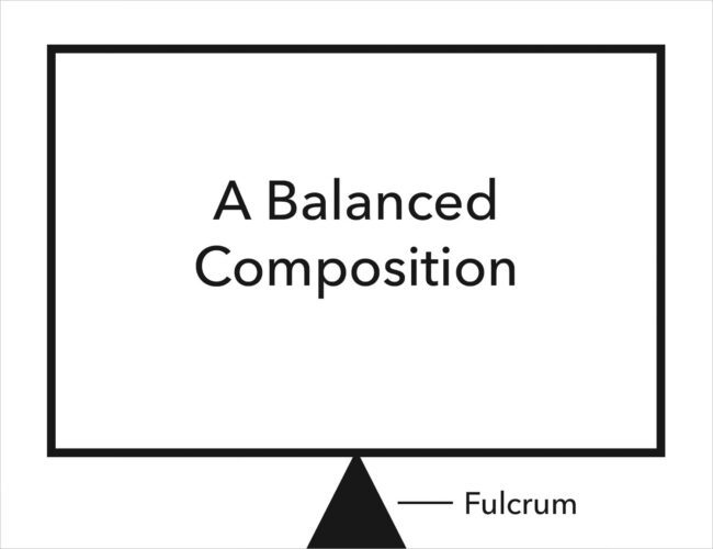
There’s nothing wrong with imbalanced compositions that lean in one direction or the other. It’s certainly possible to take good imbalanced photos. But it’s also true that most “blindfolded photos” – where there is no deliberateness in the image – are likely to be imbalanced. That’s because at any given scene, there may only be one balanced composition compared to a thousand imbalanced compositions; it’s just how the world is arranged.
So, when a photo looks like it has an even distribution of visual weight from left to right, it is very likely the photographer composed it that way deliberately. Balanced photos rarely happen by accident – and even though imbalanced photos can look just as good, balance is usually the easier path to a photo that feels deliberate.

Few Distractions
Distractions abound in almost every genre of photography. Landscape photographers have to deal with footprints, trash, and various other manmade objects they don’t want in their photos. Portrait photographers have to deal with distracting backgrounds that draw attention away from the subject. And so on.
As with balance, it is very unlikely that a “random chance” composition will be free from distractions. Usually, images which have a good flow and nothing to pull the eye away from the subject were composed deliberately. Deliberate post-processing can also play a role, such as dodging and burning subjects to emphasize or de-emphasize them, and even spot healing to remove distractions if you want to be more aggressive about it.
This all ties into simplicity: the idea that nothing in an image should distract from your message. Photos that don’t have very many distractions almost always feel deliberate and intentional.
Level Horizon
Something that I see fairly often in otherwise good photos is that their horizons don’t look very level.
Sometimes, this is because the photographer didn’t pay close enough attention in the field or post-processing and took an off-kilter photo. Other times, it may be that the photographer paid perfect attention to a bubble level or virtual horizon in the field, but the perceptual horizon of the scene is still tilted! This can happen if your photo’s background is actually a bit sloped in the real world, like a gentle hill. In any case, getting the horizon to look level in the final image will tend to look more deliberate.
That said – as with most of what I’ve talked about so far – it’s totally possible to take good photos with a crooked horizon. You’ll see it sometimes in documentary photography to add a sense of tension and chaos. So, I’m not saying that all your photos need to have a totally level horizon. Rather, a level horizon is usually a signal of a deliberate composition, whereas a non-level horizon may not be.
Visual Puns
One of the clearest signs of a deliberate composition – although not something you’ll see all that often – is a visual pun of some kind in the image. A visual pun is when two or more seemingly unrelated parts of the photo have something surprising or amusing in common.
Maybe a tree and a mountain in your shot have remarkably similar shapes. Maybe two unrelated people in a street photo are wearing identical dramatic outfits. Maybe a moose is crossing the street next to a “moose crossing” sign.
Visual puns are a staple of some genres like street photography, and they tend to be less common (or more subtle) in others like landscape photography. But in any case, when you recognize a visual pun in someone else’s photo, the odds are astronomically in favor of it being a deliberate choice. It just isn’t the type of thing that usually happens by accident.
Post-Processing Choices
Lastly, along with the field-based side of photography, your post-processing decisions can also convey a sense of deliberateness.
There are a few obvious examples – converting the image to black and white or cropping to a panorama, for instance – that are almost certainly intentional at some level. And then there’s just “good editing.” It’s hard to define but easy to recognize: no weird colors, no halos, and a good sense of emphasis on your various subjects.
It’s a nice surprise but rare that all of this will look right directly out of camera. There’s usually something you can do in post-production to improve an image, even if it’s just boosting contrast or saturation in a flat raw file. You can almost always make a photo look better with a bit of careful editing.
That word “careful” is key, though. A gaudy Instagram filter or poorly-chosen processing style can indicate the opposite of deliberateness. Admittedly, it shows that you did some processing on the photo – but if that processing isn’t a match for the image, it will only increase a photo’s sense of carelessness.
In other words, you can’t just slap a noir filter on an image and instantly have a deliberate shot. Instead, your post-processing style should heighten the best qualities of an image without calling undue attention away from your subjects.
Conclusion
Taking a photo that looks deliberate is all about eliminating “unhappy accidents” that tend to creep in if you’re not careful. The way to achieve that is to do something I explained in a recent article: really look at your subject when you’re deciding on a composition. Focus on what’s in front of you and try to perceive it beyond the surface level. Then take what you notice and spin it into the image – as well as into your emotional message.
When you do that, you may not even need to think consciously about things like breathing space, balance, or distractions (although I still find that thinking about them is useful). The result is all but guaranteed: You’ll end up with a deliberate composition that gets your message across smoothly.
I hope this article helped in achieving that goal. If you missed part one, Levels of Perception in Photography, check it out to get a better sense of the “seeing” side of composition.