Here’s a creative technique to add to your bag of tricks. In this 9.5-minute video, we’ll show you from start to finish how we took an ordinary scene and turned it into to go from day to night in one single exposure, in-camera.
Full disclosure: We want to thank Profoto for sponsoring this video and making it possible to create these incredible pieces of free education for photographers worldwide.

Before we jump into this tutorial, I want to mention the source of inspiration for this shot. Years prior, I saw this photograph on Sam Hurd’s Instagram and later found out he even taught this technique on his Patreon.
What’s funny to me is how his image stuck with me for years. One day in downtown Los Angeles while filming for the SLR Lounge workshop Lighting 3, I came to a scene where I thought, “man, this would be a perfect spot to split the scene into day vs night.” At that moment, I realized an image I’d seen Sam capture a long while back was still in my mind. At the end of this article/video, I’ll share a little message with you all, but for now, let’s get to the shot.
Before we walk you through the steps on how to capture this image, let’s discuss the gear you’ll need to make this shot happen in one single exposure:
Gear You’ll Need
Now, let’s walk through the setup using the acronym we devised for our Lighting 3 workshop that’s going to help really dial in the vision for this image: C.A.M.P.:
Composition: What do we want our scene to look like? Where do we want the camera to be? What’s the angle? What do we want our subjects to be doing?
Ambient Light Exposure: Choose the intention of the scene. Do we want a dramatic image (darkening the ambient light and using more flash) or do we want a softer image (brightening the ambient light and using a more natural power of flash)?
Modify/Add Light: Are your subjects visible in the frame or do they need to be chiseled out? Do you need to add an additional light source?
Pose & Photograph: Take your shot!
The reason why we created this was to try and establish the importance of thinking before doing. Before you even pick up your camera or touching your flashes, run through our C.A.M.P. framework and simplify your lighting process. Here’s how this shot broke down into 4 simple steps:
1. Decide On Your Composition
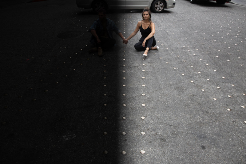
I immediately saw the leading lines created from the dots on the floor and my first instinct was to place our couple, BC and Taylor, in a position that would lead directly into them. I had them sit on either side of the center divider already knowing that that would stand as the partition for my night to day transition. I then had them hold hands over the center but look in opposite directions.
I placed the ND filter onto BC’s side to create a more dramatic/nighttime half of the image while keeping Taylor on the brighter/daytime side for a softer look. I then realized I would need a tripod to make this shot happen because holding the filter in front of my lens while balancing the Canon EOS R and Canon 28-70 f/2 is no easy task. It also comes in handy later because I needed to create a plate shot to composite out the flash to camera left, but more on that in a bit.
2. Dial-In Your Desired Ambient Light Exposure
This shot is rather unique when it comes to dialing in the perfect exposure simply because we are creating 2 different exposures: the right side of the frame needs to be just bright enough to ensure we aren’t losing details in the highlights, and the left side needs to be bright enough so that we aren’t losing details in the shadows because we are going to use that 4 stop ND filter over the frame.

I first set my camera to ISO 100, f/4, at 1/200th of a second to arrive at my first test shot for Taylor’s side of the frame (on the right). What you see above is that exposure, which is nice, but when I brought the ND filter over the left side of the frame and realized that 4 stops brought my ambient light on the left down too much, causing us to lose information in the shadows. I had some room to push the exposure on the right so I raised the ISO to 200 which kept the right side of the frame bright without blowing anything out while maintaining the drama on the left. This was the final ambient light exposure:

3. Modify/Add-In Off-Camera Light
Now that we’ve dialed in our ambient light exposure, we can see that BC is getting lost in the left side of the frame because of the ND filter. The first light that we start with is our main light — a Profoto A1 with a Grid and CTO Gel — (the flash that will light up BC’s face) placed to his right and a slightly behind his body. This light is firing at 8.0–9.0 power, which is around 1/2 or 1/4 w/s on a standard speedlight. We want this light to act as a spotlight on his face and body while still maintaining our shadows.

Next, we place a second light mainly for effect. My thought here was that if the sun were actually setting behind the scene, it might be reflecting off the street and coming into the frame. So we placed a second Profoto A1 with a CTO Gel sitting on the ground aimed at an upward angle. When working through the C.A.M.P. framework, always start with one light and then add as you go if necessary.
4. Pose, Direct, Shoot!
I wanted their expressions to be a bit more stoic since they were looking off in opposite directions. I placed the ND in front of the left side of the frame and ended up with this final shot:

And this is when my handy dandy tripod comes into play. You can clearly still see my main light on a stand in the left corner of the frame. This serves as my main shot with my subjects lit the way I want them to look in the final photo. I then asked my assistant to remove both lights and asked my couple to step out of the frame to get my plate shot. Once we drop these into Lightroom, we process both images the same way, open them in Photoshop, align the layers and place a Mask over one of the images and paint out the light stand. Working on a tripod, this process literally takes 5 seconds as you’ll see in the video tutorial.
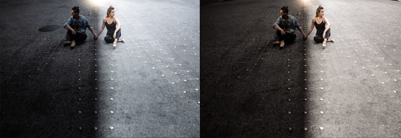
You can see two different versions of the image here, one processed with more warmth while the other has a cooler tone to juxtapose the warmth from the lights.

Conclusion and Message
I wanted to leave you all with this message. It was Sam’s image that inspired me to get out there and play and try to put my own spin on this awesome technique. All of us are inspired by other photographers and artists around us in the industry. Stop being shy about sharing your sources of inspiration.

There is obviously a clear difference between downright plagiarizing someone’s work versus drawing inspiration from it. If you are a new photographer, don’t be afraid to credit the sources that inspire you. As an artist, it is wonderful to see that other people create ideas from the work that we create.
If you’re an established professional at the top of your game who refuses to credit your sources of inspiration, then maybe it’s worth thinking about why you’re afraid to do so.
P.S. If you enjoyed this tutorial make sure you check out more from SLR Lounge‘s location lighting series Lighting 3 and more of our photography education in our Premium membership.
About the author: Pye Jirsa is a wedding photographer based in Southern California and the co-founder of SLR Lounge. The opinions expressed in this article are solely those of the author. You can find more of Jirsa’s work here. This article was also published here.