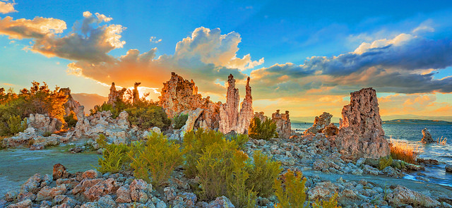
Image: Rennett Stowe / CC BY 2.0
While it’s something that we tend to overlook, color plays an important role in photography.
The right use of color can help to present your composition in a visually appealing manner. It can also have a dramatic impact on how you, and others, view the image. The colors in an image can help to convey emotion, set a scene, or highlight the main point of interest in an image; helping an image to feel alive, mysterious, somber, or even melancholic.
While you won’t have complete control over the colors in a scene, being aware of the impact that different colors have can help you to spot excellent color combinations when you see them. And knowing what to look for is an important part of capturing exciting and vibrant images. With this in mind, let’s take a look at color theory; and see the impact that colors can have on your landscape and nature images.
Color Theory
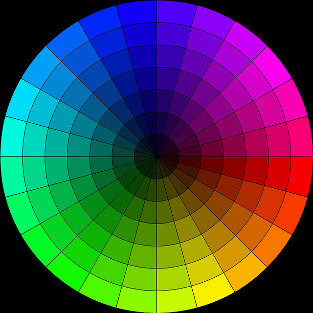
Image: Robson#
The color wheel is an illustrative organization of different colors in a circle. It’s designed to show the relationship between primary colors, secondary colors, tertiary colors, and more. Color theory involves using this wheel, to create a specific grouping of colors for an effect that’s visually and emotionally appealing.
While there are many groups of colors that could be considered harmonious, some work especially well together. Here’s a look at some of the main color combinations, and examples of how they work.
- Analogous Colors
Analogous colors are a series of colors that lie directly next to each other on the color wheel. This group of colors can consist of anywhere from two colors to on up to half the wheel. Consider a landscape such as a waterfall in the woods. The greens and blues would be a good example of an analogous color scheme.
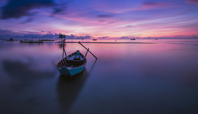
Image: Lenny K Photography / CC BY 2.0
- Complementary Colors
Complementary colors are found directly across from each other on the color wheel. Warm-cool color combinations could often be considered complementary. For example, blue skies and warm orange tones of the sun being cast on a mountainside would be complementary.
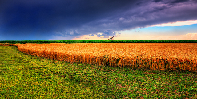
Image: James Watkins / CC BY 2.0
- Split Complementary Colors
Split complementary is another combination that’s found in nature. This combination would feature two complementary colors, as well as an additional color that’s located directly next to one of the complementary shades. It’s a common color scheme that is often found in the natural world –and it’s one that works beautifully.
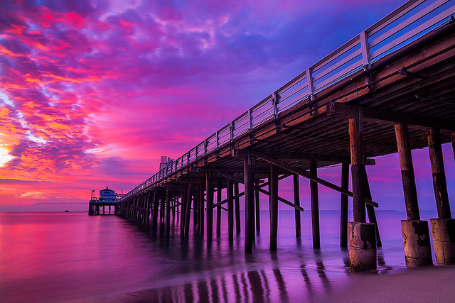
Image: ™ Pacheco / CC BY-ND 2.0
- Triadic
A triadic color scene features a combination of any three colors that are spaced out evenly from each other on the wheel; another combination that’s often found in nature photography.
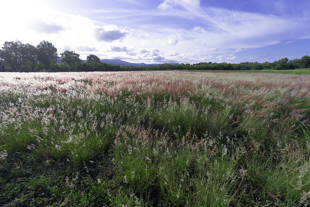
Image: Lenny K Photography / CC BY 2.0
- Quadratic
A quadratic color scheme involves combining two complementary color schemes. This combination could also be called a double complementary scheme.
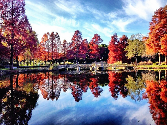
Image: Yusuke Umezawa / CC BY 2.0
- Monochromatic
A monochromatic color scheme consists of the same color, in varying degrees of brightness or saturation. Most commonly, this color scheme can be seen in black and white images.
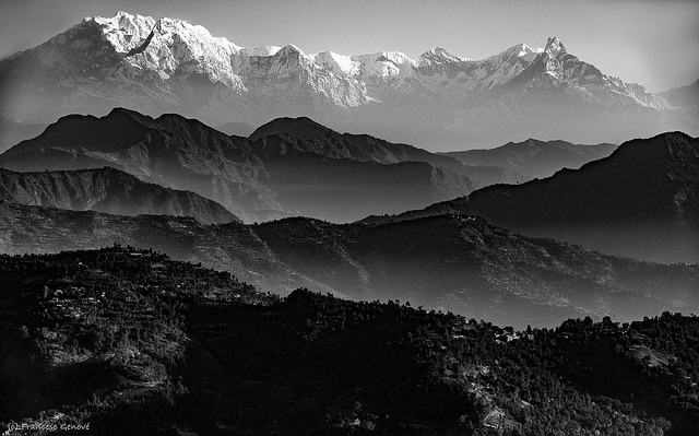
Image: Francesc Genové / CC BY 2.0
There are, of course, many other color combinations you can choose from to help make your landscape photography stand out. It’s also important to note that in many ways, color theory, and understanding which combinations work well –is more of an art than a science. Learning what looks good together is often the result of practice, and trial and error. Eventually, you’ll be able to tell at a glance when a combination just works.
Colors and Emotions
In addition to creating a visually interesting image when used in a combination, individual colors can evoke an emotional response on their own. Featuring certain colors in an image can result in a composition that has a certain feel to it; whether it’s tranquility, life, energy, and more.
Here’s a look at some emotions that different colors are often associated with, as well as some tips for working with these colors.
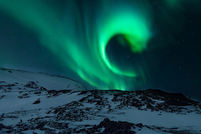
Image: Lenny K Photography / CC BY 2.0
Blue
On the cool spectrum, the color blue is often associated with tranquility and calm. Darker blues tend to signify dignity and intelligence while light blue is most often associated with peace. Blue is also one of the easiest colors to find in landscapes and nature since it can be found in the sky and water.
Green
Also on the cool spectrum, green is commonly associated with feelings such as hope, life, and growth. Green is found abundantly in nature scenes as well. In many cases, greens work well when used in analogous combinations, featuring a range of different shades of this color. When post-processing, keep in mind that adding a bit of blue to your greens can really help them to come alive.
Red
Colors that are at the warm end of the color spectrum tend to stand out. Red, in particular, is a warm shade that demands to be seen. This color tends to convey a sense of courage, urgency, or caution. Red is also one of the easiest shades to blow out, so take care when applying saturation in post-processing.
Yellow
Also on the warm side, yellow is a warm and energetic color that evokes feelings of happiness, possibly due to the fact that it’s most often associated with the sun. Most of the yellows in landscape photography will be in the sky, in fields, or flowers.
Orange
Another warm shade, orange, much like yellow, tends to appear in the sky and in flowers in landscape photography. During post-processing, you’ll want to take special care to prevent orange hues from becoming too dark and desaturated as this will cause them to turn brown –not a good color for a sky.
Brown
An unsaturated warm color, brown doesn’t command attention like some of the other fiery colors in the warm spectrum. Brown tones tend to add a sense of stability and dignity to an image.
Dominant Colors
Color is wonderful, but too much bold color will result in a chaotic and overwhelming image. Too many bright colors will create multiple focal points, making it difficult for the viewer to identify the main point of interest. When composing your image, keep in mind that in most cases, the brightest and strongest colors will usually signify the main point of interest; and will naturally be where your eye will be drawn as well. In post-processing, take care to avoid making all of the colors fully saturated; instead –use selective saturation and brightness to intentionally draw the eye toward the main focal point.
Controlling Color
While you can’t control the color in the landscape, per se, there are a few things that you can do to adjust the color in your composition. The first thing that you can do is to adjust the composition itself to feature more, or less, of a particular color; for instance, you can adjust your position or angle, or zoom in or out. Light can also greatly impact the colors in a landscape image, so consider the timing of your shots. If you’re hoping to incorporate more golden, yellow tones, you’ll want to arrive at golden hour, the time of day just after sunrise, and again late in the evening. If you are looking for softer, more muted shades, you might choose early morning before the sun is fully out. Of course, you can also adjust the tone, saturation, and brightness of your colors in post-processing. Just remember to shoot in RAW, as this will give you the most control over your resulting images.
If you’re looking to capture amazing landscape images, you’ll want to pay attention to the colors. This doesn’t mean that you’ll have to identify a color scheme as ‘analogous’ or ‘triadic’ in order to create compelling images, but it doesn’t hurt to brush up on different color combinations and learn about why they work so well. In time, you’ll develop an eye for what works and will be able to tell at a glance whether a certain combination of colors looks good. Soon working with different colors in your compositions will become second nature to you.
Have you applied color theory to your landscape photography? Or do you have an eye for what looks good?
Photo license links: CC BY-ND 2.0, CC BY 2.0