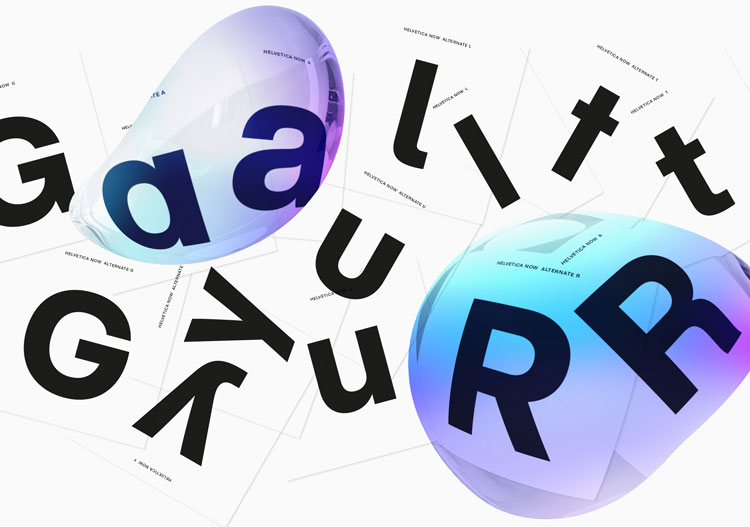
The type foundry has released the first redesign of the well-used typeface in 35 years, giving designers more options for glyphs and sizes in a bid to improve its readability and versatility.
Helvetica is one of the most widely used typefaces of the 20th and 21st centuries. Originally created 62 years ago by Swiss type designers Max Miedinger and Edouard Hoffmann, the sans-serif has graced everything from public transport signage and government websites to public health warnings on cigarette packets. It is a functional, every day typeface, popular for its legibility and simplicity, which has been translated to accommodate alphabets as broad as Hebrew, Greek, Japanese, Hindi and Vietnamese.
For the first time in 35 years, type foundry Monotype has created a new version of Helvetica called Helvetica Now, which looks to update the classic type for the digital age, by improving its readability on-screen and offering designers a wider variety of glyphs to play with.
The last update was Neue Helvetica, launched in 1983, which saw the typeface reworked to give letters more unified heights and widths, as well as heavier punctuation marks, increased spacing between numbers, and generally improved legibility.
Charles Nix, type director at Monotype and lead designer on Helvetica Now, says that, in a bid to simplify and unify the typeface, Neue Helvetica saw nuances and variability removed. The new typeface family hopes to restore a sense of choice for designers, by offering many more alternate glyphs, and different sizes for text that needs to be small, medium and large.
“Pre-digital Helveticas had subtle-but-important adjustments for small, medium and large sizes,” he says. “We wanted to add that size-specific detail — the ‘optical sizing’ or ‘multiple masters’ – back into the design.”
Unlike its predecessor, Helvetica Now is available in three optical sizes — variations of a type that work best at different sizes – of micro, text and display. Micro caters for small fonts, of 4-7-point, and aims to make tiny text more legible through a larger x-height, more open apertures, larger accents, plus other adjustments.
Display, intended for large size heading text of 14-point and above, has been designed with a range of weights from the thinnest, hairline, to the thickest, extra black. Letter spacing, or tracking, has been tightened, to “stand up to the scrutiny of a close-up”, says Nix.
Text, used for body copy and big passages of text, has also been given a range of weights from thin to black, and tracking has been widened for better legibility.
“Helvetica Now has been designed as a screen-first font,” says Nix. “The micro size meets the modern requirements for small text, low-resolution environments, while the display range bring a level of finesse to the curves and spacing of Helvetica for setting in larger sizes.”
Aside from introducing three core sizes to the type family, new glyphs have also been added, offering designers many more options in terms of types of character. This includes a straight-legged capital “R”, and a single-story lowercase “a” – which is the traditional, calligraphic “a” form – and a new suite of arrows.
“There are alternate characters that some brands want, which had existed in pre-digital versions, but where removed when Neue Helvetica launched,” says Nix. “We also thought some new characters would simply make a typographic designer’s life easier, like Helvetica arrows, and numbers encased in circles and squares.”
The final major update to Helvetica has been the careful redrawing of all 40,000 glyphs in the type family, giving them more even spacing and better forms, to improve legibility and readability overall.
The Helvetica Now typeface has been two years in the making, with Monotype starting the design work in 2017. But the work is not done, says Nix, who says that while the type foundry has optimised key elements such as weight and optical sizes, character width and translation across more alphabets for other languages are on the horizon.
“Adding condensed and expanded family members is a must, and while the current Helvetica Now fonts cover 136 languages, continually increasing global language support for our fonts is a fundamental Monotype value,” he says.
While there is a great amount of precision involved in redesigning a typeface – 40,000 glyphs in the case of Helvetica – compared to a broader rebrand, which would involve everything from type choice and colour palettes to photography, illustration and copywriting, Nix says that there is an overlap between the two; both require the designers to be conscious of retaining personality.
“One very important similarity is to change whatever is necessary but preserve the brand equity,” he says. “While Helvetica means a lot of different things to lots of different people, it does espouse basic brand values of clarity, simplicity and neutrality.”
A key difference lies in the need for flexibility when designing a typeface, giving it a chameleon-like quality that enables it to adapt to any given situation – from road signs to a Fortune 500 brand identity. “While branding seeks to shape perceptions, a typeface yields itself to any message,” says Nix.
Helvetica Now has launched, and the typeface family is available to buy for £249 via Mosaic, Monotype’s online font library. It is also available through online font library My Fonts at a discounted rate.