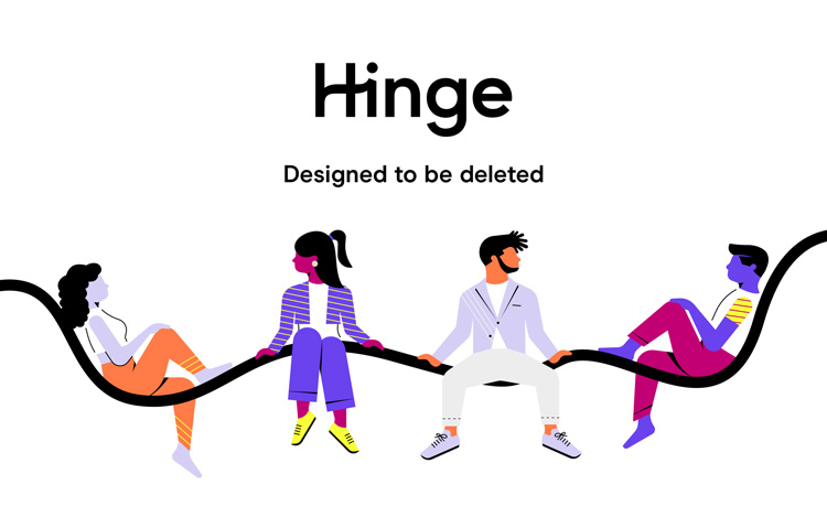
The app has a new look that aims to discourage users from “game-like” swiping and mass-dating, and instead inspire them to form long-term relationships.
Dating app Hinge has a new brand identity and interface design that looks to push its ethos of “designed to be deleted”, by encouraging users to have meaningful relationships rather than short flings.
The app has been given its new look by Hinge’s in-house creative team, led by chief product officer (CPO), Tim MacGougan.
It was founded in 2012 by Justin McLeod amid dating app popularity, with Tinder launching the same year, then later Bumble in 2014.
Its slogan was “the relationship app”, and it looked to set itself apart from swipe-heavy apps that encouraged users to keep searching for different potential partners.
In 2016, Hinge underwent a redesign, adopting a more “sophisticated” app that implied a more “intentional dating app experience”, says the company, which included muted colours, light typefaces and simple illustrations.
Despite Hinge trying to differentiate itself, it is part of a wider online dating conglomerate — it is owned by Match Group, which owns many other dating services including Tinder and Match.com.
Since launch, the US-based app has gone international, and can now be used in the UK, Australia, Canada and India too.
The new branding for Hinge features a bespoke, sans-serif logotype, that sees the “H” and “i” letters in “Hinge” joined with a curved ligature. The “H” with the curved flick has been used as a shorthand version of the logo, such as for the app icon.
The wider user experience (UX) and interface design looks to be more “positive and optimistic” than the previous, demure and muted look, says MacGougan, and is coupled with the new strapline “designed to be deleted”.
It features a “vibrant” colour palette of purple, pink, orange, yellow, peach, lavender, light grey, black and white, he says, as well as 60 “humanised” illustrations showing a “diverse” range of people doing hobbies with different fashion styles.
Illustrations have also been brought to life through movement, but these animations are used more sparingly than previously, says MacGougan.
“Animations are gracefully smoothed out, to help users focus on each other and not on the interface,” he says.
Before, animations would pop up and bounce on the screen after a user “liked” someone else’s profile, received a match, or sent them a message, but now the user only receives a notification, which then fades into the background. This looks to reduce the “game-like” feeling of matching with someone, says MacGougan. Animations are still used throughout the app but with a greater focus on welcome pages at the start of the user experience.
The UX has been rethought, with profile layouts and the registration process now “feeling more conversational and less transactional”, says MacGougan.
The sign-in process now features an initial page with video footage of couples, followed by short, explanatory pages with limited text, giving users an “in-app guided tour” on how to use it.
A mix of different animated characters play with Hinge’s new ethos “designed to be deleted”, by finding different ways to “delete” words on-screen, such as by blowing them away with a hairdryer or covering over them with a paint-roller.
There is now a greater focus on specific features of a person’s profile, with wider spacing between different text areas, and photos scattered throughout. Users scroll down to see photos, key facts such as job, age and location, and more personal, eclectic things such as their desired “superpower”, what they’re “looking for” and what someone else couldn’t beat them at. Users can “like” these individual statements, and comment on them, a feature which has been in place for the last three years.
Two new typefaces have been used, including a serif for explanatory text on initial sign-up pages, and a sans-serif for people’s profiles and the in-app chat system.
The renewed focus on typography aims to “bring added attention to written answers”, says MacGougan, especially as now users can comment on individual parts of a profile.
The button that appears on the main screen letting users delete their profile is now grey rather than red, in a bid to “take away feelings of negativity or guilt” associated with deleting the app.
A feature was recently added enabling people to provide Hinge with feedback on their dates — the “We Met” function confidentially asks users about a particular experience, to help tailor suggestions for future matches based on a person’s opinions and tastes.
Hinge has also redesigned its email newsletters, putting a greater focus on photography to help it feel “authentic to real life experiences”, says MacGougan.
According to the company, Hinge users set up a date every four seconds, and three out of four first dates made through the app lead to second dates.
MacGougan says the main aim of the redesign is anti-retention, encouraging users to “be themselves”, get to know each other on a deeper level, form relationships, and ultimately delete Hinge.
“We only really want people in our community who are serious about dating,” says MacGougan. “What our members want is to get off dating apps. That’s why we measure success by the number of dates we set up each week, not the number of minutes user spend in the app.”
The new branding and interface design has rolled out for iOS users, and will roll out for Android users in coming months. It has launched across email communications, the Hinge website and social channels, and is currently rolling out across print marketing, office interiors and branded merchandise.