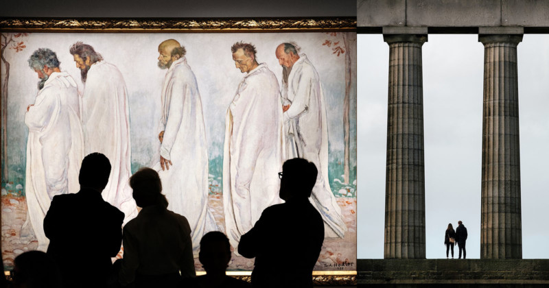
I’ve always had a fascination with geometry and man-made structures, their perfection has a strong attraction on me. It took me time to realize that what I appreciated most wasn’t necessarily their symmetry or the simple repetition of shapes but the parallelism between the various elements of the construction of an image.
To better understand what parallelism is, you first need to deconstruct photography and bring it back to its essence. A photograph is light, shapes and colors (or tones, if we speak about black and white photography). Those are the visual blocks that form a photograph. Sometimes there are similarities between those different parts, for example, a rectangular shadow on the ground in the foreground projected by a traffic sign and the rectangular shape of a window of a building in the background.
I have the conviction that our eyes and our brains are naturally attracted by those “connections”, those visual similarities that surround us. I’m probably even more sensitive to them due to my past career in graphic design.
For me, photographs become more interesting when they have visual links between the parts that compose them, it’s not a necessity but it brings a little something more. It’s like the cherry on top of the cake.
In this article, I will explain to you the different types of parallelism and how to use them to further improve your photographer eye on the long term.
Note: The following is purely subjective and reflect my own findings, they should not be followed to the letter but used as a base for further experimentation.
Parallelism in nature
Some people believe that nature and everything that envelop us is organized in a rigorous manner. The order of things isn’t trivial, from the alignment of planets to the cells inside our body, there is an underlying system that makes our world somehow structured. There is even occasionally a unity and regularity in fauna and flora.
When you take a walk in the woods the trees that surround you are a finite number of vertical lines pointing at the sky, the feeling of unity is in this case caused by the repetition, the parallelism of the trunks. Same goes for a chain of mountains, the curves of mountainsides blend together and form a mound of soft lines that look alike.
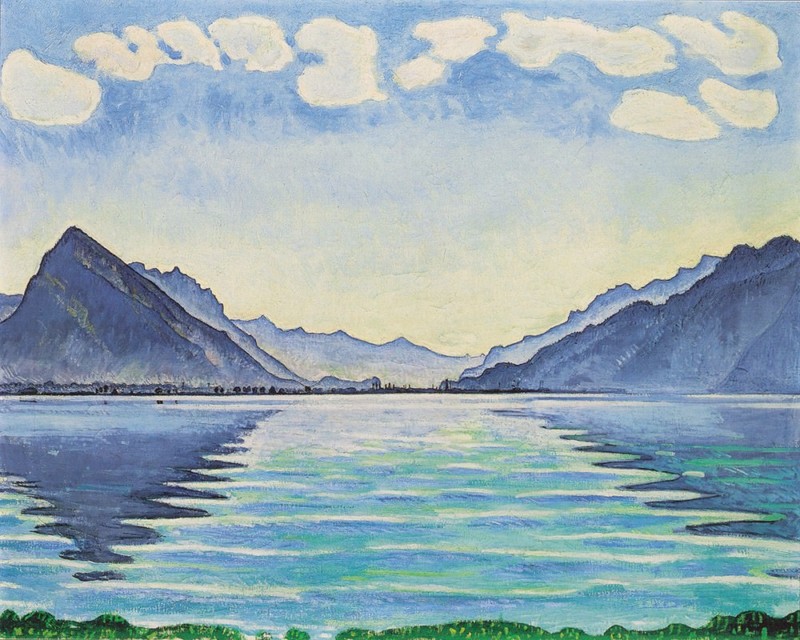
We can also take the celestial vault and its thousands of visible stars, would that vision still be as beautiful if each of those points of light where of different shape, size, and color?
Parallelism in the human figure
Our anatomy is full of similarities, symmetry, and asymmetry. We just have to look at our left and right side, the opposition of our arms, the space between our eyes, the repetition of our fingers.
This goes even further with our clothes, the pleats and folds forms repeated lines. Our movements are often formed by two or more of our limbs. Our figure, slender, is a line that gets on together with other human beings around us.
A crowd grouped around a speaker, a group of friends crossing the street (or the Beatles Abbey Road album cover), a line of people waiting for the bus. Those are all parallelisms.
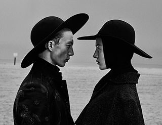
Those two persons above that gaze at each other are a great example of parallelism in photography. Look at their hats, the silhouette of their faces, and the lapels of the man coat contrasting against the sand in the background, which shape is oddly similar than the woman face. The empty area between them and on the sides of the frame, they are also very similar in area and shape. Those are little details that we don’t necessarily notice at first sight but they speak to our subconscious. Our photographer eye takes delight.
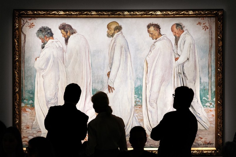
The picture above is another example of parallelism in the human figure. In the painting “Eurythmie,” five men wearing a white cape are walking at the same speed, deep in their thoughts and arched over the ground. “Eurythmie” literally translates to rhythmic harmony, are those priests or hermits in harmony with themselves or with God?
I chose to photograph the painting including the foreground museum visitors, they are aligned in a similar fashion than the subjects of the painting creating another layer of parallelism in the frame.
Construction principles
We saw before that a photograph is an assembly of visual elements and that some of them are linked to each other. There is a number of construction principles, methods that can help you take the various visual “blocks” composing a scene and order them. A photograph can be built following rules, just like how an architect would design a house.
Note: I strongly encourage you to break rules from time to time.
Verticality
We are surrounded by vertical structures, starting from the walls that form our houses and the buildings in our streets. Verticality is to me the easiest construction principle to put into practice, as it’s the most represented in urban areas. By including two or more vertical elements in your frame you’re already creating parallelism. Here are a few examples.
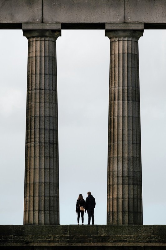
I shot this photograph above while on a trip to Scotland, I was there to make images for my first book, Botanical, and I also took some time for myself to explore various cities. In Edinburgh, there is a hill with a monument on top of it that looks like a part of an ancient Roman temple and feature twelve columns. A lot of tourists are taking pictures of themselves standing in the middle of the central columns, but I went to the other side and waited until this couple showed up.
I framed two columns and the couple to give a sense of scale, and while doing so I also realized that I created a parallelism. The two columns are a vertical parallelism to the two people, and there is even a second repetition if you consider the people’s legs, which mimic the columns as well. It gives the image a rhythm and an interesting structure.

Another example: a photograph of three metal poles used to the docking of ships in Lausanne a city in Switzerland on the shores of Lake Leman. They are not perfectly straight but they create a verticality and a repetition in the frame. The reflection in the water becomes part of the composition as an extension of the poles themselves.
Horizontality
Same as verticality but rotated ninety degrees, jokes aside it’s probably one of the easiest construction principles to find in nature. The horizon is often a good starting point to build up parallelism in your images, look for elements that are similar to this line. Here are a few examples.
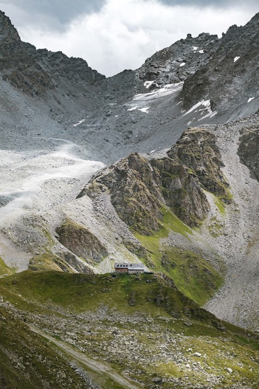
How can mountains shot in a vertical orientation be a good example of horizontal parallelism? Well if you decompose the image above you’ll notice that it’s made of three planes, the foreground hill with the house, the denuded rocks behind it and the cold gray mountain in the background. Those three areas of the images are separating the frame in a horizontal way. By layering different elements in your photograph on top of each other you’re instinctively using this horizontality principle.

The very delicate image above has a bit more than meet the eye. We already saw that parallelism can also be based on textures and colors and here the gradient from the sea is reflecting the gradient showing on the island itself, it’s also a gradient that repeats itself in the sky. Those elements are all parallel to each other in a horizontal way. Using the horizon line definitely helped here in building up the composition of the image, it acts as a base.
Symmetry
When we think about symmetry we picture a shape that becomes exactly like another if you flip, slide, or turn it. But symmetry doesn’t exclude it’s opposite, asymmetry, it should be a whole. Asymmetry and symmetry are big contributors to beauty. Stop considering the purely mathematical aspect of it and embrace its duality. Here are a few examples of photographs that are exposing in their construction this principle.

Two boats in a dry dock, a pure and simple photograph. The composition is straightforward but also masterful, the two lines formed by the hull are converging and directing the viewer eye to the center of the frame. The symmetry created here is imperfect but that is also the beauty of it, if it was geometrically exact it wouldn’t have the same fineness.

Sergio Larrain is another photographer that I admire, he was a true master and decided to give it all up for a spiritual life. If you haven’t read about his work I suggest that you check out this article by Lars Mensel. I included the image above because for me it perfectly represents the duality between symmetry and asymmetry. There is a parallelism between those two kids, they’re both sleeping, they have the same calm faces and hair yet they’re not exactly mirrored.
Perfect symmetry is cold, imperfections give life and I love life, that’s how French-American sculptor Niki de Saint Phalle put it up and I couldn’t agree more. Thinking about balance in your photographs rather than symmetry in its geometric aspect is a good starting point.
Rhythm
I initially wanted to name this principle “repetition” but I realized that it could be too restrictive. You’ll understand why in an instant. Entropy is everywhere around us, and all things come and go. There’s this perpetual flow and cadence in life. The beating of your heart, the waves on the shore, the music you listen to, even this article is defined by a rhythm between paragraphs and images. It is probably my favorite construction principle to play with.

A few years ago I was walking down the seaside of Nazaré, Portugal when I noticed this door at the end of a little street. It reminded me instantly of the geometrical compositions of Dutch painter Piet Mondrian that I had seen many times before in various museums. If you look a bit closer you start to notice the many horizontal and vertical lines formed by the different colors of paint and the two white gutters.
Then if you keep looking you’ll maybe see that the many rectangles, the window in the door, the door itself, the bottom part of the door, the two electrical panels and all the other “invisible” rectangles defined by the colored parts and divided by the gutters. This photograph has a complex structure, a rhythm.
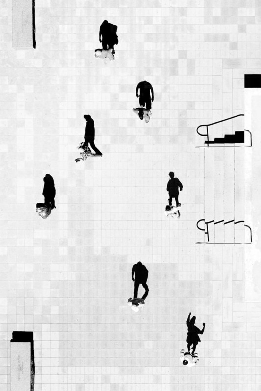
Rhythm can also be a repetition of elements. Harry, who’s running a blog called Photographer’s Note, is a great inspiration for me, this picture is probably one of my all time favorite from his body of work. By looking at the world from above we better discern its composition. There’s no wonder why we are attracted by photographs shot with drones, it’s not just because it allow us to see the world from a different vantage point but it’s also because it let us discern the patterns and the rhythm that’s all around.
In this particular case, the image was not shot with a robotic flying device but probably from a bridge or a building. Next time you’re outside with your camera, try to find those elements that repeat themselves, intersect and play with each other and get a few of them in your frame.
Mimetism
The imitation and resemblance of elements can be used as a construction principle. We can find that in biology and evolution too. For example, the Phasmatodea or stick insects who mimic the aspect of small twigs to better camouflage themselves in nature. Our brains are very good at making visual associations. Here are a few examples of parallelism that share this principle.
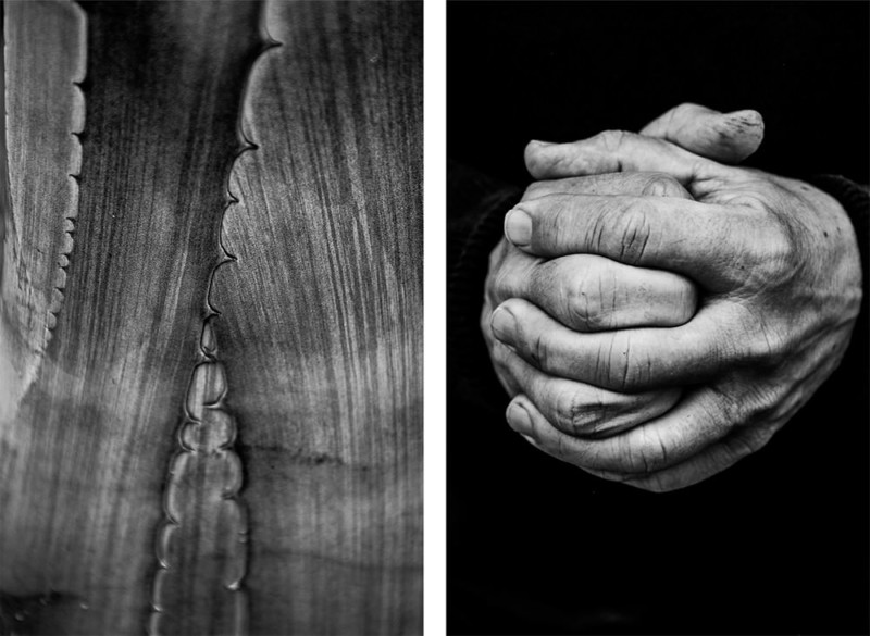
This photograph above is part of a bigger series called “Visual Exercises” by photographer Alicja Brodowicz which I featured before on Fujifeed, the blog I edit. It’s an exercise of associations — black and white diptychs showing two very different subjects that look alike. Here the hands on the right are mimicking the intersection of the two cactus stems on the left. Parallelism doesn’t necessarily have to happen in the same frame, it can also be used in series (for example when you have a spread inside a book with two images) or here in diptychs.

Sebastião Salgado is probably my favorite contemporary photographer and his monograph on the catastrophe of the torched Kuwaiti oil fields is hauntingly beautiful. I found this photo above to be a great example of parallelism, the texture of the fire is very similar to the water being poured on the firefighter. It’s a mirroring between two very opposite elements. It creates a visual link that’s helping the narrative and aesthetic of the image.
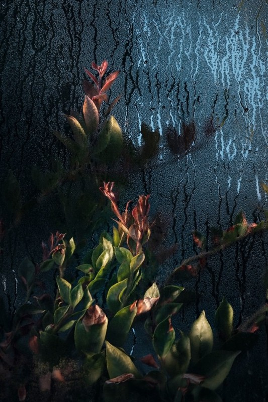
This is a photograph that I took for my book Botanical, the project itself contains about a hundred photographs yet this is one of the most appreciated. There are a few reasons to it (composition, color contrast) but one of them is the resemblance between the leaves and the shapes created by the water droplets. They share the same structure, like a tree branch dividing itself into smaller twigs. There’s a natural mimetism happening between those elements that is very pleasing to the eye.
Ferdinand Hodler theory
A Swiss symbolist painter without a traditional academic art background and an infinite source of inspiration for my photography, that’s how I would describe Hodler.
He was convinced that beauty and aesthetics are based on an underlying order — a symmetry and a rhythm. Most of his paintings have a very graphic aspect and they are composed using parallelism, a notion that he borrowed in the 1890 and that was first introduced by Charles Blanc in “Grammaire des arts du dessin” in 1867 and by Gottfried Semper in “Der Stil” between 1860 and 1862.
He repeats in a recurring (but not perfectly exact) way the elements and patterns like lines, colors, movement or subjects to create a visual unity.
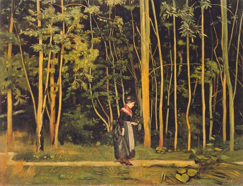
He believed that it was more than just a composition principle but truly a moral and philosophical thought. A natural law of organizing the world.
We can see an echo to the correspondence theory between the macrocosm and the microcosm which is based on a text by Platon: “For that comprehends and contains in itself all ideal animals, even as this universe contains us and all other creatures that have been formed to be visible. For since God desired to liken it most nearly to what is fairest of the objects of reason and in all respects perfect, he made it a single visible living being, containing within itself all animals that are by nature akin to it.”
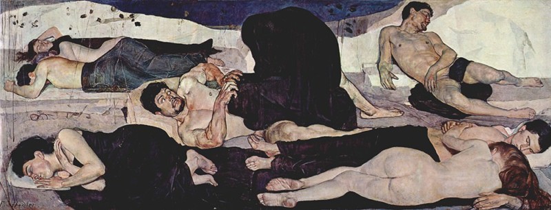
The structure of the universe is the same in all its elements, no matter their scale. From a cosmic to a cellular level. Everything is inside everything. A city expanding itself over the years seen from the sky strangely look like lichen growing on a tree.
We then better understand this idea of parallelism and why some artists were so attracted to it.
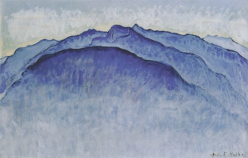
Parallelism is a law that goes beyond art, it dictate life itself —Carl Albert Loosli
What is incredibly beautiful about Hodler pictures is that they are reduced to fundamental forms and an almost harmonious austerity. The notion of time and space get lost and the paintings reach eternity, his work is timeless because it layers upon an immutable system that is a reflection of the organization of the world itself.
Conclusion
There is far more to photography than meet the eye and I think that the more connections we make between it and other art forms the better. I’ve heard first about parallelism in painting and I naturally try to apply it to my work, I’m thankful for my parents who introduced me at a very young age to the work of masters through the visit of many different museums in Europe. I hope that this piece inspired you to explore other aspects of photography.
About the author: Samuel Zeller is a freelance photographer based in Geneva, Switzerland, who’s available for assignments worldwide. The opinions expressed in this article are solely those of the author. Zeller is an ambassador for Fujifilm and the editor of Fujifeed. You can find more of Zeller’s work on his website and Instagram. This article was also published here.